Table of Contents >> Show >> Hide
- What Makes a Color Feel Like Spring (Without Going Full Bunny)
- How Architects Choose Paint (So You Don’t Repaint Twice)
- The 10 Easy Pieces: Architect-Approved Spring Paint Picks
- 1) Farrow & Ball Cinder Rose (No. 246)
- 2) Valspar Cathedral Stone (4003-2A)
- 3) Farrow & Ball Oval Room Blue (No. 85)
- 4) Farrow & Ball Elephant’s Breath (No. 229)
- 5) Benjamin Moore Cedar Path (454)
- 6) Benjamin Moore Linen White (912)
- 7) Valspar Royal Gray (4006-4A)
- 8) Modern Masters English Brown (Metallic)
- 9) Benjamin Moore Palladian Blue (HC-144)
- 10) Sherwin-Williams Alabaster (SW 7008)
- Quick Palette “Recipes” (Because Choosing One Color Is Hard)
- Sampling Tips That Save Time, Money, and Your Last Nerve
- Conclusion: Spring Paint That Ages Gracefully
- Lived-In Lessons: What Spring Paint Colors Feel Like After the “New Paint” High (Experience Section)
Spring has a funny way of making perfectly reasonable adults stare at a wall and think,
“You know what would fix my entire personality? Paint.” If that’s you right now, welcome.
This isn’t a sugar-rush “Easter aisle” palette. It’s spring color the way architects and designers
actually use it: softened, grounded, and a little bit grown-uplike pastels that went to grad school.
The trick is choosing colors that feel fresh without turning your living room into a marshmallow.
Think “light through leaves,” “sea-glass,” “linen shirt,” “rose with a little dirt still on it.”
Those are the shades that play nicely with real homeswood floors, moody weather, kids, pets, and
the fact that your hallway lightbulb is probably lying to you.
What Makes a Color Feel Like Spring (Without Going Full Bunny)
“Spring color” isn’t a single hueit’s a mood. Architects tend to reach for colors that:
- Reflect more light (so rooms feel open and awake).
- Have complex undertones (so they don’t look flat at 2 p.m. and weird at 9 p.m.).
- Connect to naturegreens, blues, warm whites, and rosy neutrals that feel organic.
- Pair well with honest materials like oak, plaster, brick, rattan, stone, and brushed metals.
If you’re torn between “airy” and “cozy,” here’s the good news: many spring-leaning colors do both.
The secret is undertone discipline. A pale paint isn’t just “light blue.” It might be blue-green
with a gray base (calm), or blue with violet in cool light (mysterious), or blue that goes minty next to
warm wood (surprise!).
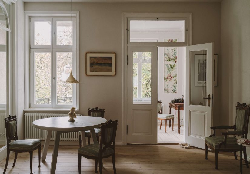
How Architects Choose Paint (So You Don’t Repaint Twice)
Color choice isn’t only taste; it’s physics with feelings. Before you commit, think like a pro:
1) Start with the light (and its personality)
- North-facing: cooler, steadier light; warm whites and rosy neutrals help.
- South-facing: bright light; many colors look clearer and more saturated.
- East-facing: warm morning glow, cooler later; watch for “washed out” afternoons.
- West-facing: dramatic golden hours; some grays can turn lilac or peachy.
2) Use LRV as a sanity check
LRV (Light Reflectance Value) is the paint’s “how much light do you bounce back?” score. Higher LRV
usually reads brighter and airieruseful in small rooms and hallways. Lower LRV reads richer and more
intimategreat for dining rooms, libraries, and “I want this to feel expensive” moments.
3) Pick a finish that matches real life
Flat/matte hides wall sins but can show scuffs. Eggshell/satin is more wipeable. Semi-gloss is a trim
classic but will highlight texture. If your home includes fingerprints (kids) or enthusiastic tail wagging (pets),
durability matters as much as color.
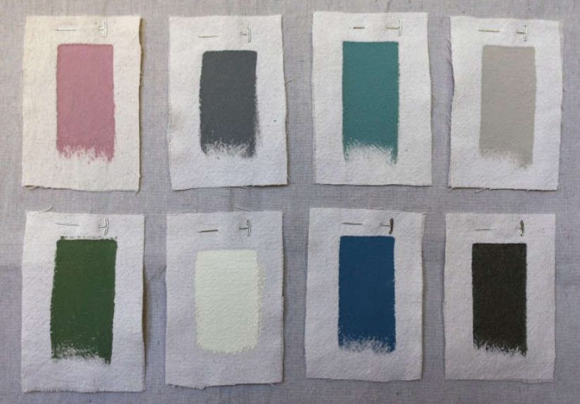
The 10 Easy Pieces: Architect-Approved Spring Paint Picks
These ten shades are spring-ready in the most livable way: soft, layered, and adaptable. Each one can stand
alone or join a palette without picking a fight.
1) Farrow & Ball Cinder Rose (No. 246)
A rose pink that skips the sugary yellow base and leans cooler and more romanticthink “old garden rose,” not
“cupcake frosting.” It’s especially good when you want pink to read as a neutral: in a bedroom, a reading nook,
or even a garden room that needs a little warmth. Pair it with creamy whites, pale stone, or natural oak to keep it
grounded. Bonus: it plays beautifully with linen textures and brushed brass for a quietly elevated spring vibe.
2) Valspar Cathedral Stone (4003-2A)
This is the “architect gray” that doesn’t feel icy: a flatter, stonier greige that behaves like a calm backdrop.
It’s perfect for open-plan spaces where you want continuity without monotony. Cathedral Stone is also the kind of
color that makes art look betterlike a gallery wall that suddenly got confident. Use it with white oak, blackened
steel, or warm whites so it stays sophisticated instead of drifting into “office waiting room.”
3) Farrow & Ball Oval Room Blue (No. 85)
A historic-feeling blue with depthslightly “blackened,” subtly aged, and far more interesting than basic navy.
It’s a spring pick for people who like fresh air but also like a little drama. Try it in a foyer, powder room, or
dining room for instant character. It balances beautifully with warm neutrals (stone, greige, soft white) and loves
brass, walnut, and vintage rugs. If you want “spring” without “pastel,” this is your grown-up answer.
4) Farrow & Ball Elephant’s Breath (No. 229)
A warm mid-gray with a hint of magenta that can read almost lilac in cooler lightbasically, it’s a neutral with
a secret personality. This is a classic spring refresh color because it feels brighter than taupe but softer than
stark gray. Use it in kitchens, hallways, and living rooms when you want something modern that still has a “historic”
comfort. Pair with creamy trim, natural stone, and soft greens for a calm, layered look.
5) Benjamin Moore Cedar Path (454)
Green is spring’s love language, and Cedar Path speaks it fluently. It’s a forest green that can feel rustic or refined,
depending on what you put next to it. Use it on cabinetry, built-ins, or as a confident accent wallespecially in a
mudroom, office, or dining area where you want energy that still feels grounded. Pair it with warm whites, leather,
and natural fibers for an “outdoors, but make it design” effect.
6) Benjamin Moore Linen White (912)
A creamy white with gentle warmthlike sunlight on cotton. It’s the spring reset button for walls, trim, ceilings, and
anything else you want to feel relaxed rather than clinical. Linen White is especially useful in north-facing rooms that
crave warmth, and it pairs beautifully with soft blues, muted greens, and clay-toned pinks. If you want your home to feel
brighter without feeling “paint store white,” start here.
7) Valspar Royal Gray (4006-4A)
Despite the name, this reads more like a nautical blue than a true grayclean, classic, and surprisingly friendly.
It’s great for a front door, a built-in, a bathroom vanity, or a bedroom where you want calm with a little structure.
Pair it with crisp whites and warm woods for a coastal-adjacent look that doesn’t require you to own a sailboat.
Add woven textures and off-white ceramics, and it practically decorates itself.
8) Modern Masters English Brown (Metallic)
Spring doesn’t have to be all petals and pastelssometimes it’s a little shimmer that catches late-afternoon light.
English Brown is a metallic paint option that adds depth and warmth, especially on ceilings, niche backs, furniture,
or a single statement wall. Use it like jewelry: one bold piece, not the whole outfit. It pairs beautifully with creamy
whites, dusty pinks, and muted blues, and it can make even a simple space feel intentionally designed.
9) Benjamin Moore Palladian Blue (HC-144)
This soft blue-green is basically “clear skies, but indoors.” Palladian Blue is a spring MVP for bathrooms, bedrooms,
and kitchens where you want airy calm without going cold. It’s also famously good with natural lightbright but not loud,
gentle but not bland. Pair it with warm white trim, pale wood, and soft grays for a coastal feel that reads timeless rather
than themed. If your goal is “fresh,” this delivers.
10) Sherwin-Williams Alabaster (SW 7008)
Consider this the supportive friend of spring palettes: warm, balanced, and never stealing the spotlight. Alabaster gives
you the brightness of white with a cozy softness, which makes it ideal for walls, trim, or whole-house continuity. It’s a
strong partner for the bolder picks aboveCedar Path becomes richer, Palladian Blue becomes breezier, and Cinder Rose feels
more sophisticated. If you want spring to feel clean and calm, Alabaster is your anchor.
Quick Palette “Recipes” (Because Choosing One Color Is Hard)
If you want that “designer” look, it’s usually just a smart combination. Try these simple mixes:
- Soft & Sunny: Linen White + Cinder Rose + touches of English Brown metallic.
- Coastal Calm: Palladian Blue + Alabaster + Royal Gray accents.
- Modern Garden: Cedar Path + Linen White + Cathedral Stone for balance.
- Moody Spring: Oval Room Blue + Alabaster + warm woods and brass.
- Neutral, Not Boring: Elephant’s Breath + Linen White + black hardware.
Sampling Tips That Save Time, Money, and Your Last Nerve
Paint samples on a movable board
Put a large sample on a poster board (or buy peel-and-stick) and move it around the room. Walls can lie because of shadows
and nearby colors. A movable sample tells the truth.
Check the color in “real life” lighting
Look at it morning, afternoon, and night. Turn on your lamps. Stand in the doorway. Sit on the couch where you actually live.
A color that’s gorgeous at noon can look like “hospital corridor” at 7 p.m. under cool LEDs.
Match undertones, not just “color families”
If your floors skew warm (oak, honey maple), cool grays can feel disconnected. If your tile has pink-beige undertones,
a green-gray might suddenly look like mint toothpaste. Undertones are the hidden directors of the movie.
Conclusion: Spring Paint That Ages Gracefully
The best spring paint colors don’t scream “seasonal.” They just make your home feel lighter, cleaner, and a little more alive.
These architect-approved picks lean into nature, balance, and complexityso you get freshness without the cloying sugar rush.
Whether you go for a calm white reset, a sea-glass blue-green, a grounding forest green, or a romantic rose that behaves like
a neutral, the win is the same: your rooms feel renewed, and you don’t have to apologize to your future self in six months.
Lived-In Lessons: What Spring Paint Colors Feel Like After the “New Paint” High (Experience Section)
Here’s the part nobody tells you at the paint counter: the first 48 hours are a honeymoon, and then real life shows up with a
latte, a backpack, and a dog that believes every wall is a leaning post. That’s why spring colors that look subtle on a swatch
often end up being the most satisfying long-term. In lived-in spaces, you start noticing that “fresh” isn’t about brightness
it’s about how the color behaves when the day changes.
Take a soft blue-green like Palladian Blue: in the morning it can feel like a deep breathcool, clean, and lightly luminous.
But the best part is later, when the room gets quieter. It doesn’t turn gray and gloomy; it stays gentle, especially next to warm
whites and natural wood. People who choose shades like this often describe a subtle shift in how they use the room: they keep the
blinds open more, they add lighter textiles, they stop fighting the space and start leaning into it. It’s the paint equivalent of
finally drinking water on purpose.
Warmer whites like Linen White or Alabaster have a different kind of “experience payoff.” They don’t wow you like a bold color
does on day one; they win slowly. You notice how skin tones look better in the mirror. You notice that plants look happier (even if
you’re not sure they are). And you definitely notice that your home photographs better without needing a filter that makes everything
look like a beige smoothie. In spaces that don’t get great daylight, warm whites can make evenings feel softer and more relaxedless
“overhead light interrogation” and more “cozy, we live here.”
The grown-up pinks and rosy neutralslike Cinder Rosetend to surprise people the most. The fear is always, “Will this feel childish?”
But in real rooms, once the furniture is back and the art is on the walls, these pinks often read as earthy and architectural.
Designers like them because they behave like a warm neutral while still giving the room a pulse. In a bedroom, they can make the space
feel calmer without dimming it. In a small office or studio corner, they can make the room feel more humanlike you’re allowed to have
feelings and a to-do list.
Then there are the deeper picksCedar Path and Oval Room Bluethat don’t shout “spring” but absolutely belong in a spring refresh.
The lived-in experience here is about contrast: when trees outside get greener and daylight stretches longer, deeper colors feel richer,
not heavier. Cedar Path on cabinetry can make a kitchen feel steadier and more “rooted,” especially with warm hardware and creamy walls.
Oval Room Blue in an entry or dining room can feel like a tailored jacketstructured, classic, and oddly energizing when everything else
outside is blooming. And if you add one controlled shimmer moment (English Brown metallic) in a niche or on a piece of furniture, you
get that springtime light-catching magic without turning your home into a glitter craft accident.
The most common “real life” takeaway? People rarely regret choosing a color with complexity. They regret choosing something too clean,
too neon, or too literal. Spring paint that lasts is the kind that still looks good when it’s raining, when it’s blazing hot, when the
Christmas tree shows up, and when you’re eating cereal for dinner. That’s the real testand these picks are built for it.