Table of Contents >> Show >> Hide
- Why Green Works So Well in Kitchens
- Before You Pick Tile: 6 Quick Design Decisions That Save Regret
- 30 Green Backsplash Ideas
- 1. Classic Green Subway Tile (But With a Twist)
- 2. Soft Sage Zellige-Look for Warm, Lived-In Texture
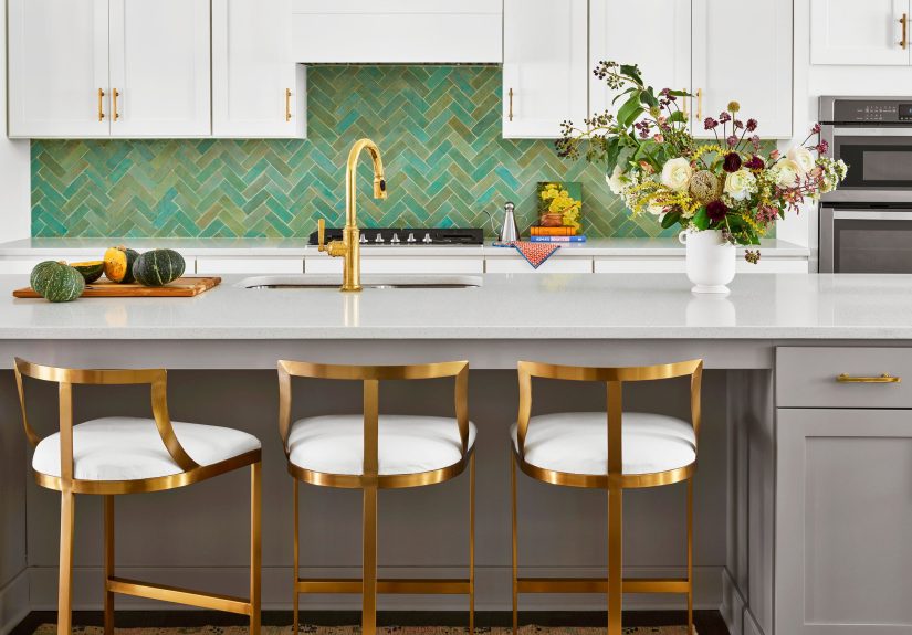
- 3. Emerald Gloss Tile + Brass = Instant Jewelry
- 4. Vertical “Kit Kat” Tile in Moss Green
- 5. Sea-Glass Green Glass Tile for a Brighter Kitchen
- 6. Deep Olive Tile with Cream Cabinets
- 7. Two-Tone Green Ombré
- 8. Green Herringbone for Subtle Movement
- 9. Penny Tile in Mint or Celadon
- 10. Green + White Checkerboard (Small Scale)
- 11. Marble Countersplash with Green Veining
- 12. Green Ceramic Tile with Handmade Edges
- 13. Glossy Forest Green Tile with Matte Black Fixtures
- 14. Pale Green Tile in a Cottage Kitchen
- 15. Green Mosaic “Confetti” for a Playful Punch
- 16. Bottle Green Tile + White Grout for Graphic Contrast
- 17. Green Tile Behind Open Shelving Only
- 18. Fluted/3D Green Tile for Shadow and Depth
- 19. Green Hex Tile for a Modern-Classic Shape
- 20. Green Brick-Bond (Offset) Layout
- 21. Green “Watercolor” Glaze for Artful Variation
- 22. Green Tile to the Ceiling (Especially Behind a Hood)
- 23. Pair Green Tile with White Oak Cabinets
- 24. Green + Warm Beige = Understated Luxury
- 25. Green Moroccan-Inspired Pattern Tile (Used Sparingly)
- 26. Green Subway Tile in a Vertical Stack
- 27. Dark Green Tile + Light Stone Countertop
- 28. Green Tile + Stainless Steel = Clean and Fresh
- 29. Green with Natural Stone Accents
- 30. “Green-Adjacent” Teal for a Bold, Modern Punch
- Mini Cheat Sheet: What Green Backsplashes Pair With Best
- Cleaning & Maintenance: Keep the Gorgeous, Lose the Grime
- Real-World Experiences (500+ Words): What People Learn After Installing a Green Backsplash
Green is the kitchen equivalent of opening a window on the first warm day of spring. It feels fresh, a little optimistic,
and somehow makes even a Tuesday-night pasta situation look more “intentional.” A green backsplash does the most with the least:
it’s a relatively small surface area that can deliver big personalitywithout committing you to painting every cabinet a moody forest hue
(unless you want to, in which case: live your truth).
Below you’ll find 30 green backsplash ideasranging from whisper-soft sage to dramatic emeraldthat work in real kitchens with real cooking
(yes, including the splatter zone behind the stove). Along the way, we’ll talk about undertones, finishes, grout, and maintenance so you don’t end up
with a backsplash that’s gorgeous in photos but grumpy in daily life.
Why Green Works So Well in Kitchens
Green plays nicely with the materials kitchens already love: warm woods, bright whites, creamy off-whites, stainless steel, matte black fixtures,
and natural stone. It can read classic (green subway tile), earthy (olive stone), coastal (sea-glass tones), or glam (emerald with brass).
The best part: green is colorful without being chaoticlike a personality that’s fun at parties but still pays the electric bill.
Before You Pick Tile: 6 Quick Design Decisions That Save Regret
1) Choose your “green family” first
Greens aren’t one big happy family; they’re more like cousins who show up to the same reunion wearing wildly different outfits.
Decide if you’re going warm (olive, moss, avocado), cool (mint, seafoam, teal-leaning), or neutral-quiet (sage, eucalyptus).
Then match that direction to your countertop and cabinet undertones.
2) Decide if you want “calm” or “movement”
If you want a clean, modern vibe, pick uniform tiles with minimal variation (many porcelain and ceramic options do this well).
If you want depth and sparkle, go for handmade-look tiles (like zellige-style) or variegated glazes that create natural movement across the wall.
3) Finish matters: glossy vs. matte
Glossy tile bounces light around and can make small kitchens feel largerbut it can also highlight streaks or smudges in harsh lighting.
Matte tile hides fingerprints and feels modern and earthy, but it can make darker greens look extra moody (which can be a pro, not a con).
4) Grout is not an afterthought
Matching grout makes a backsplash feel seamless and “expensive.” Contrasting grout emphasizes pattern and layout.
In a busy kitchen, mid-tone grout can be the sweet spot: it won’t yellow like bright white and won’t shout like charcoal unless you want drama.
5) Know your maintenance comfort level
Some materials are basically “wipe and go” (glazed ceramic/porcelain). Others ask more of you (certain natural stones and some handmade tiles),
especially around cooking grease. There’s no wrong choicejust be honest about whether you’re a “Sunday reset” person or a “maybe I’ll clean it in April” person.
6) Sample like you mean it
Green changes dramatically with lighting. Order samples, tape them up, and check morning light, nighttime light, and “I forgot to turn on the under-cabinet lights”
light. Your future self will thank you.
30 Green Backsplash Ideas
1. Classic Green Subway Tile (But With a Twist)
Subway tile is timeless for a reasonclean lines, easy layout, and it works with nearly everything. Give it a modern edge by choosing a deep hunter green glaze
or a slightly elongated subway shape.
2. Soft Sage Zellige-Look for Warm, Lived-In Texture
Love that handmade, slightly imperfect look? A sage zellige-style backsplash adds texture without feeling busy. Pair with creamy cabinets and warm brass hardware
for a cozy, “I bake bread on weekends (sometimes)” vibe.
3. Emerald Gloss Tile + Brass = Instant Jewelry
Emerald tile is the statement necklace of backsplashes. Keep surrounding finishes simplewhite cabinets, light countersthen let the green shine. Brass or unlacquered
brass looks especially luxe here.
4. Vertical “Kit Kat” Tile in Moss Green
Skinny vertical tiles create height and rhythm, making ceilings feel taller. Moss green keeps it grounded and modern, especially with flat-front cabinetry and minimal hardware.
5. Sea-Glass Green Glass Tile for a Brighter Kitchen
Glass tile reflects light like it’s trying to help you out. Choose a soft sea-glass green to brighten a darker kitchen and keep the look airy. Bonus: it’s typically easy to wipe clean.
6. Deep Olive Tile with Cream Cabinets
Olive is underrated: it’s green’s sophisticated, earthy cousin. Olive backsplash tile looks especially good with creamy whites, warm woods, and natural stone that has beige or gold veining.
7. Two-Tone Green Ombré
Use two (or three) shades of green and blend them across the backsplashlighter near the top, deeper near the counter, or vice versa. It’s artsy without screaming “look at me,”
which is the best kind of artsy.
8. Green Herringbone for Subtle Movement
Herringbone adds texture through layout, even if the tile color is simple. A muted eucalyptus green herringbone can feel both classic and freshlike a white button-down, but for your wall.
9. Penny Tile in Mint or Celadon
Penny tile gives playful vintage energy, especially in mint or celadon. Use it on a smaller backsplash area (like a coffee station wall) if you want charm without too many grout lines to clean.
10. Green + White Checkerboard (Small Scale)
Checkerboard reads bold but can still be timeless when colors are soft. Keep the squares small, choose an off-white rather than bright white, and let the pattern do the talking.
11. Marble Countersplash with Green Veining
Instead of tile, continue your stone countertop up the wall. Look for slabs with green veining or a subtle green cast. This is clean, seamless, and makes the kitchen feel high-end fast.
12. Green Ceramic Tile with Handmade Edges
If you want the charm of handmade tile but less fuss, choose ceramic with a hand-pressed edge. The result: character without the “every tile has a personality” level of variation.
13. Glossy Forest Green Tile with Matte Black Fixtures
Forest green + matte black is moody in a good way. It’s especially striking in modern kitchens with simple cabinet lines. Add warm wood stools or shelves to keep it from feeling too severe.
14. Pale Green Tile in a Cottage Kitchen
Light green backsplashes (think pistachio or pale celery) feel sweet and classic with Shaker cabinets, open shelving, and warm metal finishes. It’s charming without being precious.
15. Green Mosaic “Confetti” for a Playful Punch
Mix multiple green tones in a mosaicsage, mint, olive, and a deeper accent. Keep counters and cabinets quiet so the backsplash reads like texture, not visual noise.
16. Bottle Green Tile + White Grout for Graphic Contrast
If you love a crisp, patterned look, pair deep green tile with bright white grout. This emphasizes layout and adds a graphic edgebest for people who enjoy a little drama with their coffee.
17. Green Tile Behind Open Shelving Only
Want green without going full-wall? Tile only the area behind open shelves. It frames your dishes like art and keeps the strongest color moment contained and intentional.
18. Fluted/3D Green Tile for Shadow and Depth
Dimensional tile catches light and creates a subtle pattern via shadow. Choose a medium green (like sage) so the texture reads sophisticated rather than “why is the wall wavy?”
19. Green Hex Tile for a Modern-Classic Shape
Hexagon tile bridges vintage and modern, depending on finish and scale. A glazed green hex tile looks fresh with quartz counters and simple cabinetsespecially if you choose a larger format.
20. Green Brick-Bond (Offset) Layout
Offset layout adds motion without shouting. It’s a great option when you want a classic tile shape but a little more energy than straight stacked rows.
21. Green “Watercolor” Glaze for Artful Variation
Tiles with watercolor-like glazing can shift from lighter to darker within each piece. The look is organic and forgivingespecially helpful if your kitchen lighting changes a lot throughout the day.
22. Green Tile to the Ceiling (Especially Behind a Hood)
Taking tile all the way up turns the backsplash into a feature wall. It’s particularly stunning behind a range hood, where the vertical expanse can make even a standard kitchen feel custom.
23. Pair Green Tile with White Oak Cabinets
White oak’s warm grain makes green tile feel even more natural. Try sage or moss with warm counters for a soft, organic palette that doesn’t get tired quickly.
24. Green + Warm Beige = Understated Luxury
If stark white isn’t your style, use beige or creamy tones with green. Think olive tile with a warm greige wall color and a creamy countertopquiet, layered, and very grown-up.
25. Green Moroccan-Inspired Pattern Tile (Used Sparingly)
Patterned tile can be beautiful, but kitchens are already visually busy. Keep it controlled: use patterned green tile on a smaller section (wet bar, niche, or coffee station) to avoid overload.
26. Green Subway Tile in a Vertical Stack
Same tile, new attitude. Vertical stacking feels modern and can make the backsplash feel taller. Works especially well with slim countertops and contemporary cabinet styles.
27. Dark Green Tile + Light Stone Countertop
Contrast is a cheat code for looking expensive. A dark green backsplash with a light stone or quartz counter creates a crisp, intentional palette that reads designer even in a modest remodel.
28. Green Tile + Stainless Steel = Clean and Fresh
Stainless appliances already have a cool, sleek feel. Choose a cooler green (mint, seafoam, bluish green) to echo that modern tonethen warm it up with wood cutting boards and soft lighting.
29. Green with Natural Stone Accents
Mix materials: green tile backsplash with a stone shelf ledge or a stone-trimmed niche. It’s a small detail that feels custom and gives the wall depth without adding another color.
30. “Green-Adjacent” Teal for a Bold, Modern Punch
If you want green energy but a little more edge, go teal. Teal backsplashes look great with white cabinets, walnut accents, and brass. It’s bold but still rooted in nature.
Mini Cheat Sheet: What Green Backsplashes Pair With Best
Cabinet pairings
White + green is crisp and timeless. Cream + olive is warm and classic. Natural wood + sage is organic and modern. Dark cabinets + emerald can be dramatic,
but make sure you have strong lighting so the room doesn’t feel like a stylish cave.
Countertop pairings
Green loves light quartz, marble-look porcelain, and stone with warm veining. For a richer look, pair forest or emerald tile with soapstone-style surfaces or darker granite
just balance with lighter walls and good task lighting.
Hardware pairings
Brass warms green, chrome keeps it clean, matte black makes it modern, and mixed metals can work if you keep the palette consistent (one metal leads, another supports).
Cleaning & Maintenance: Keep the Gorgeous, Lose the Grime
In a real kitchen, grease happens. The easiest daily-care surfaces are typically glazed ceramic, porcelain, and many glass tiles: wipe with a gentle cleaner and move on with your life.
Grout lines need occasional loveuse a soft brush and a mild cleaner, and consider choosing a grout shade that doesn’t highlight every speck of cooking residue.
If you’re using natural stone or more porous materials, follow sealing guidance and avoid harsh, acidic cleaners.
Real-World Experiences (500+ Words): What People Learn After Installing a Green Backsplash
This is the part nobody tells you when you’re falling in love with kitchen photos online: the backsplash you pick is going to live through spaghetti sauce,
sizzling oil, and at least one incident involving a blender lid that “totally looked secure.” Over and over, homeowners and designers report the same handful of lessonsso let’s put them in plain English.
Green is a lighting shapeshifter
The #1 “I wish I’d known” moment is how dramatically green changes with light. A sage tile that reads calm and cozy in daylight can swing gray in cool LEDs,
while a minty green can suddenly look neon under bright under-cabinet strips. That’s why samples matter more for green than almost any other color.
People who test tile under morning, afternoon, and nighttime conditions tend to love the result long-termbecause they picked the green that behaves well in their specific kitchen.
Glossy tile looks amazing… and also tells on you
Glossy green tile can be breathtakingespecially in emerald and deep forest shades. But glossy surfaces reflect light, and that reflection can highlight streaks if you wipe quickly
with a not-so-clean rag (we’ve all been there). The “real life” solution most people end up using is simple: keep a microfiber cloth nearby and do quick spot wipes
right after heavy cooking. Alternatively, if you know you’re not going to do that, choose a satin or matte finish that’s more forgiving.
The goal isn’t perfectionit’s choosing a surface that matches your cleaning personality.
Grout color is the unsung hero of sanity
A bright white grout line with green tile is crisp, graphic, and photo-ready. It’s also the pairing most likely to show cooking splatter and discoloration over time,
especially near the stove. Many homeowners end up happiest with a grout that’s either a close match to the tile (for a seamless look) or a mid-tone warm gray
that hides everyday life. The “experience” takeaway: grout isn’t just aestheticit’s your future maintenance plan in color form.
“Handmade look” is gorgeousjust set expectations
Tiles with variation (handmade, hand-finished, zellige-style, watercolor glazes) create depth that flat tile can’t match. But variation means variation:
corners might not be perfectly uniform, surfaces might not be perfectly flat, and the wall can read textured in a way that surprises you if you expected a smooth, modern plane.
People who love these tiles usually love them more over time because the backsplash feels alive and layered.
People who don’t love them often expected “Pinterest-perfect uniform.” The lesson: pick texture on purpose, not by accident.
Where you stop the tile matters more than you think
A green backsplash can feel like a bold design statementor like a random stripedepending on where it starts and stops. Homeowners often report the cleanest look when tile
either (a) runs continuously across the full counter run, (b) goes to the bottom of upper cabinets consistently, or (c) becomes a feature area (like the range wall) and is clearly intentional.
The best “real kitchen” choice usually comes down to simplifying transitions: fewer awkward edges, fewer places for grime to hide, and fewer spots where you think,
“Why does it end right there?”
Green backsplashes age well when the rest of the palette stays calm
Green can absolutely be trendy, but it doesn’t have to be trend-dependent. The kitchens that still look great years later usually pair green tile with classic supporting players:
warm wood, simple cabinet profiles, neutral counters, and hardware that doesn’t scream for attention. When green is the star, you don’t need competing patterns everywhere else.
The result is a kitchen that feels designednot decoratedand you’ll be less tempted to redo it the moment the internet declares a new “color of the year.”
Bottom line: the best green backsplash is the one you’ll still like when you’re holding a dish towel in one hand and a wooden spoon in the other,
wondering how you managed to splatter sauce behind the coffee maker. Pick a green that works with your light, choose a layout you won’t tire of,
and let grout and finish do the practical heavy lifting. Gorgeous can be functional. Your kitchen deserves both.