Table of Contents >> Show >> Hide
- Why Playground Design Fails Happen in the First Place
- 30 Hilariously Inappropriate Playground Design Fails
- 1) The Slide That Ends on Concrete
- 2) The Swing Zone Crosswalk
- 3) The “Decorative” Head Trap
- 4) The Ladder to Nowhere
- 5) The Metal Slide of Doom
- 6) The “Just Add More Equipment” Problem
- 7) The Tiny-Tot Ninja Course
- 8) The Preschooler Free-Fall Platform
- 9) The Decorative Bolt Forest
- 10) The Splinter Palace
- 11) The One-Shade-Tree Strategy
- 12) The Accessibility Afterthought
- 13) The “One Cool Feature, No Access” Layout
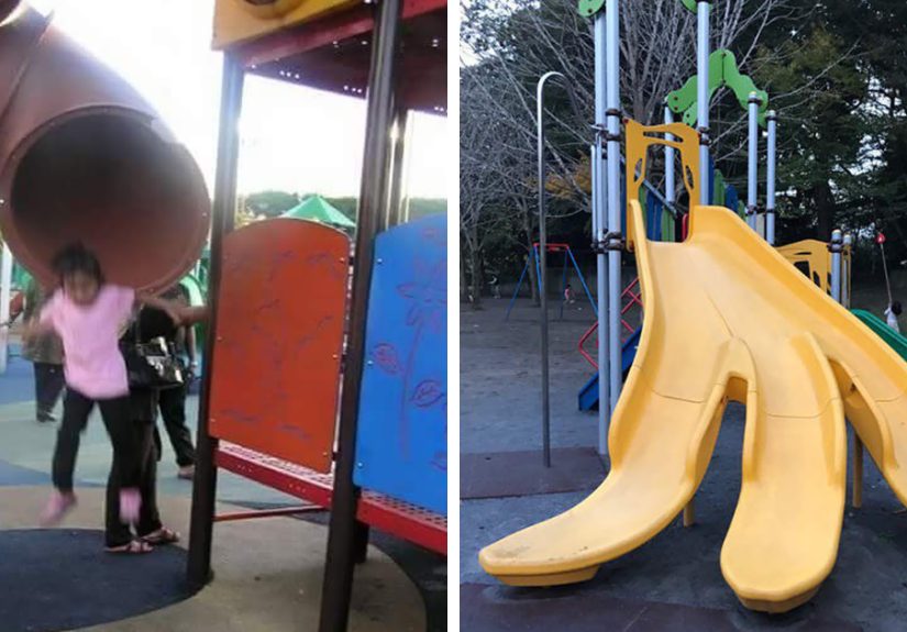
- 14) The Slide Exit Into a Fence
- 15) The “Natural Look” Trip Hazard Collection
- 16) The Swing Seat Made of Regret
- 17) The Rope Entanglement Special
- 18) The “Helmet-Friendly” Trap
- 19) The Toddler-on-Lap Slide Misfire
- 20) The Barely-There Surfacing
- 21) The Drainage Disaster Playground
- 22) The Mystery Gap on the Climber
- 23) The “Instagrammable” Color Scheme That Hides Hazards
- 24) The Bench in the Blast Radius
- 25) The “Good Luck Supervising This” Layout
- 26) The Fence Gate That Opens Into Chaos
- 27) The “Everything Is Climbable” Miscalculation
- 28) The No-Maintenance Fantasy
- 29) The “Inclusive” Playground with Segregated Features
- 30) The Giant Sign, Zero Guidance Problem
- What Good Playground Design Looks Like Instead
- Experiences From the Real World: What These Playground Fails Feel Like
- Conclusion
Playgrounds are supposed to be magical little kingdoms of climbing, sliding, and “look at me!” energy. But every once in a while, a playground shows up looking like it was designed by a committee of sleep-deprived adults, one confused contractor, and a raccoon with a clipboard. The result? Weird layouts, unsafe choices, and design decisions that make parents squint and say, “Nope. Absolutely not.”
This guide rounds up 30 playground design fails that are funny on the surface but genuinely important to understand. Because beneath the comedy is a real issue: playground safety. U.S. safety guidance consistently warns that falls are the biggest problem, and details like surfacing, spacing, maintenance, supervision, and accessibility matter more than flashy colors or trendy equipment.
Why Playground Design Fails Happen in the First Place
Most bad playgrounds are not created by evil villains twirling mustaches. They usually happen because people prioritize appearance over use, squeeze too much equipment into a small area, skip maintenance planning, or forget that kids play like kids (which means: fast, sideways, upside down, and not always in the “intended” direction).
Great playground design balances three things: fun, safety, and accessibility. Kids need challenge and healthy risk. They also need shock-absorbing surfaces, clear use zones, guardrails, durable hardware, and routes that work for children with disabilities. When any one of those gets ignored, the playground starts to look less like a play space and more like a safety training video.
30 Hilariously Inappropriate Playground Design Fails
1) The Slide That Ends on Concrete
Nothing says “we tried” like a slide exit that dumps kids onto concrete, asphalt, or packed dirt. Protective surfacing is one of the most basic playground safety rules. If the landing zone feels like a parking lot, the design failed before the ribbon-cutting even started.
2) The Swing Zone Crosswalk
A walkway running directly through the path of moving swings is classic bad planning. Kids sprint. Swings swing. These two facts should never be introduced on purpose. A good design separates movement zones so nobody gets accidentally launched into next Tuesday.
3) The “Decorative” Head Trap
Those cute little openings in guardrails or ladders? If they fall into the wrong size range, they can create head entrapment hazards. Playground openings should be designed carefully, not “eyeballed.” This is not the place for freestyle geometry.
4) The Ladder to Nowhere
Some playgrounds have ladders that lead to platforms with no meaningful play feature, no route onward, and no safe way down except reversing traffic. That is not a climbing experience. That is a tiny corporate retreat for confused six-year-olds.
5) The Metal Slide of Doom
Yes, playground equipment can get hot enough to burn, and not only on blazing summer days. Sun-exposed slides and dark surfacing can heat up fast. If adults can’t touch the surface comfortably, kids definitely shouldn’t be sitting on it in shorts.
6) The “Just Add More Equipment” Problem
Overcrowded playgrounds look exciting in a catalog and chaotic in real life. Cramming too many structures into a small footprint reduces safe spacing, creates collision points, and turns supervision into a full-time air traffic control job.
7) The Tiny-Tot Ninja Course
Age-appropriate design matters. A structure meant for older kids can overwhelm toddlers with heights, gaps, and grip demands they are not ready for. If the toddler area looks like a TV obstacle course, somebody skipped the “child development” part of the meeting.
8) The Preschooler Free-Fall Platform
Elevated surfaces without proper guardrails or barriers are a major red flag. Kids don’t stand politely in the middle of platforms. They lean, bounce, pivot, and invent games involving exactly the edge you hoped they would ignore.
9) The Decorative Bolt Forest
Exposed bolt ends, open hooks, and protruding hardware are not “industrial chic.” They’re snag, scratch, and injury hazards. A playground should invite climbing, not offer a side quest called “How I ripped my shirt in 3 seconds.”
10) The Splinter Palace
Wood playgrounds can be beautiful, but only when maintained. Splintered rails, cracked decking, and rough handholds make every climb a gamble. If the structure looks like it needs moisturizer and therapy, it needs maintenance first.
11) The One-Shade-Tree Strategy
Putting the entire play area in direct sun all day is a design fail in warm climates. Kids overheat fast, surfaces get dangerously hot, and parents start doing that weird “test touch” on every seat and slide. Shade planning is not optional fluff.
12) The Accessibility Afterthought
An “inclusive” playground is not inclusive if the accessible route stops halfway or only reaches one token feature. Accessible routes, surfaces, and connections to play components should be built into the layout from the start, not taped on later like a school project.
13) The “One Cool Feature, No Access” Layout
Designers sometimes center the whole playground around one exciting feature and forget that many kids can’t reach or use it. Inclusive design means variety, integration, and multiple play experiencesnot one giant centerpiece and a lot of wishing.
14) The Slide Exit Into a Fence
Slides need room at the bottom. A fence, pole, planter, or bench parked in the run-out zone turns a simple landing into a surprise obstacle course. It’s like ending a waterslide in a coat closet.
15) The “Natural Look” Trip Hazard Collection
Tree roots, exposed footings, big rocks, and uneven edges may look rustic, but they can also become high-traffic tripping hazards. Good playgrounds can look natural and be safe. Bad ones look like a hiking trail designed by vibes.
16) The Swing Seat Made of Regret
Heavy, hard swing seats are a bad idea, especially in busy play areas. Soft seats reduce injury risk when someone gets bumped. If a swing seat feels like gym equipment from 1974, maybe let’s not.
17) The Rope Entanglement Special
Loose ropes, added cords, and improvised tie-ons are strangulation hazards. Kids (and sometimes adults) attach random stuff to equipment all the time. A smart design anticipates that behavior and makes it harder for hazards to happen.
18) The “Helmet-Friendly” Trap
A surprising one: bike helmets don’t belong on playground structures. They can get caught in openings or equipment. A fail happens when signage and supervision guidance are missing, and the playground design gives no visual cue for safe transitions.
19) The Toddler-on-Lap Slide Misfire
Many caregivers assume riding down a slide with a toddler is safer, but pediatric research has linked this to leg injuries when a child’s foot catches while the adult’s momentum keeps going. If the slide design encourages awkward lap-riding, that’s a usability fail too.
20) The Barely-There Surfacing
Loose-fill surfacing that looks “thin but probably fine” is not fine. Surfacing compacts, shifts, and scatters. Without regular top-offs and raking, even a properly installed surface can become a hidden design fail a few months later.
21) The Drainage Disaster Playground
Puddles under swings. Mud at the slide exit. Mulch floating away after rain. Poor drainage quietly wrecks playground safety and maintenance. If every rainy day turns the park into a swamp biome, the site plan missed a chapter.
22) The Mystery Gap on the Climber
Gaps between platforms, slide entries, or attachment points can snag clothing, pinch fingers, or create entrapment risks. These are the kinds of design flaws kids find instantly because they interact with equipment like tiny product testers.
23) The “Instagrammable” Color Scheme That Hides Hazards
Dark rubber and dark plastics may look sleek, but they can absorb heat and hide wear, cracking, or debris. A playground isn’t a boutique lobby. If style choices make hazards harder to spot, safety loses.
24) The Bench in the Blast Radius
Benches placed too close to active play zones create collision risks and block supervision sightlines. Parents deserve a seat, yesbut not one positioned like courtside tickets to the swing-impact arena.
25) The “Good Luck Supervising This” Layout
Blind corners, stacked structures, and visual clutter make it hard for adults to supervise. Playground safety is not just equipment specs; it’s also visibility. If one adult needs three mirrors and a drone to watch the play area, redesign time.
26) The Fence Gate That Opens Into Chaos
Gates should help protect kids from wandering toward streets or parking lots, not open directly into active equipment paths or pinch zones. A poorly placed gate can turn every arrival into a high-speed merge.
27) The “Everything Is Climbable” Miscalculation
Kids climb what you think is decorative. They climb signs. They climb rails. They climb the weird fake boulder that “isn’t part of the play feature.” If the design includes tempting non-play surfaces without safety planning, that’s a fail by prediction.
28) The No-Maintenance Fantasy
Some playgrounds are clearly designed as if inspections are optional. They are not. Equipment loosens, coatings wear off, surfacing shifts, and parts age. A real playground plan includes maintenance access, inspection routines, and record keeping.
29) The “Inclusive” Playground with Segregated Features
Putting all accessible features in one isolated corner misses the point. Inclusive playground design should support shared play and social interaction. If one group gets the “real” playground and another gets the side station, the design failed the assignment.
30) The Giant Sign, Zero Guidance Problem
Some parks install expensive equipment but skip basic safety signage: age ranges, supervision reminders, helmet warnings, or hot-surface cautions. A playground without clear guidance is like a roller coaster with no height marker and a shrug.
What Good Playground Design Looks Like Instead
A well-designed playground is not boring. It is organized. It separates high-motion areas (swings, spinning features) from quieter zones, uses impact-absorbing surfacing, offers age-appropriate challenge, and keeps sightlines open for supervision. It also plans for weather, heat, drainage, and maintenance instead of pretending those issues belong to “future us.”
It is also inclusive by design. Accessible routes should connect meaningful play experiences, not just the edge of the playground. Ground-level features, elevated components, and social spaces should work together so more children can play side by side.
In short: the best playgrounds don’t just look fun in a photo. They work beautifully when 25 kids arrive at once and immediately ignore all adult expectations.
Experiences From the Real World: What These Playground Fails Feel Like
Here’s the part people don’t always talk about: playground design fails are rarely obvious until the playground is full. On paper, everything can seem fine. In real life, the problems show up in about 90 seconds.
A common experience is the “swing surprise.” A parent sits on a nearby bench, thinking they chose a safe spot, and then realizes the bench is right behind the swing arc. Suddenly they’re doing the awkward half-stand, half-duck motion every time a kid comes flying backward. Nobody planned for that bench to be a hazard, but poor layout made it one.
Another very real moment is the “hot slide test.” You arrive at a playground on a day that feels totally reasonable, and a caregiver quietly taps the slide with their palm before letting a child go down. Then comes the instant reaction: “Nope, too hot.” The kids are confused, the adults are negotiating, and the biggest feature in the park is basically out of service because the design ignored sun exposure and material heat.
Then there’s the supervision problem. In a badly designed playground, one child disappears behind a climbing wall, another runs toward the swings, and a toddler starts up the “big kid” structure because the age zones aren’t clearly separated. The adult in charge isn’t being careless; they’re being set up to fail by a layout with blind spots and mixed traffic patterns.
Maintenance issues create a different kind of experience. Families often notice the same problems over and over: thinning mulch under swings, loose caps on bolts, rusted spots on handholds, or puddles that never drain. None of these feel dramatic in isolation. But together, they tell a story: the playground was built, then forgotten. That’s when trust drops. Parents stop relaxing. Kids get more restrictions. Everyone loses.
And finally, there’s the accessibility experience, which many playgrounds still get wrong. A family arrives excited about an “inclusive” playground, only to find that the accessible route reaches a few features but not the main play action. The child can participate in part of the space, but not the part where other kids are gathering and playing together. That moment is frustrating, and it’s completely preventable with better planning.
The good news? These issues are fixable. Communities can improve surfacing, add shade, adjust layouts, replace hardware, improve signage, and design better upgrades over time. The best playgrounds usually aren’t the fanciestthey’re the ones where kids can play hard, adults can supervise calmly, and nobody has to say, “Who approved this?” every five minutes.
Conclusion
Funny playground fails make great internet content, but they also reveal something important: playground safety is design. When surfacing, spacing, supervision, accessibility, heat, and maintenance are treated as “extras,” the whole play experience gets worse. When they’re treated as core features, kids get what they actually needa place to explore, take healthy risks, and have fun safely.
If you’re evaluating a local park, school playground, or community upgrade, use these 30 examples as a practical checklist. Laugh a little, absolutely. But then look closer. The best playgrounds aren’t just cute. They’re smart.