


Winter exposes one of America’s harshest policy failures: too many homeless people must choose between the danger...
The Rookie Season 8 is bigger, faster, and more emotionally loaded than many fans expected. From its...
Want a backyard putting green that actually rolls true and lasts? This in-depth DIY guide covers everything...
Schizophrenia does not look exactly the same in every person, and that is the key idea behind...
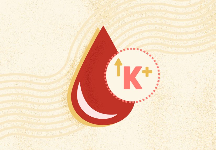
Hyperkalemia, or high potassium in the blood, can be silent at first but serious when it affects...
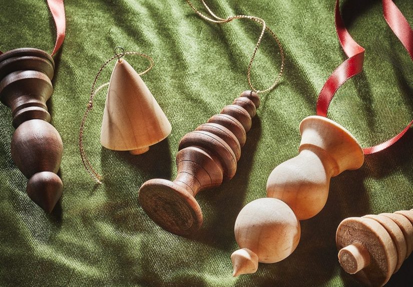
Want handmade holiday decor that actually feels special? This in-depth guide shows you how to turn simple...
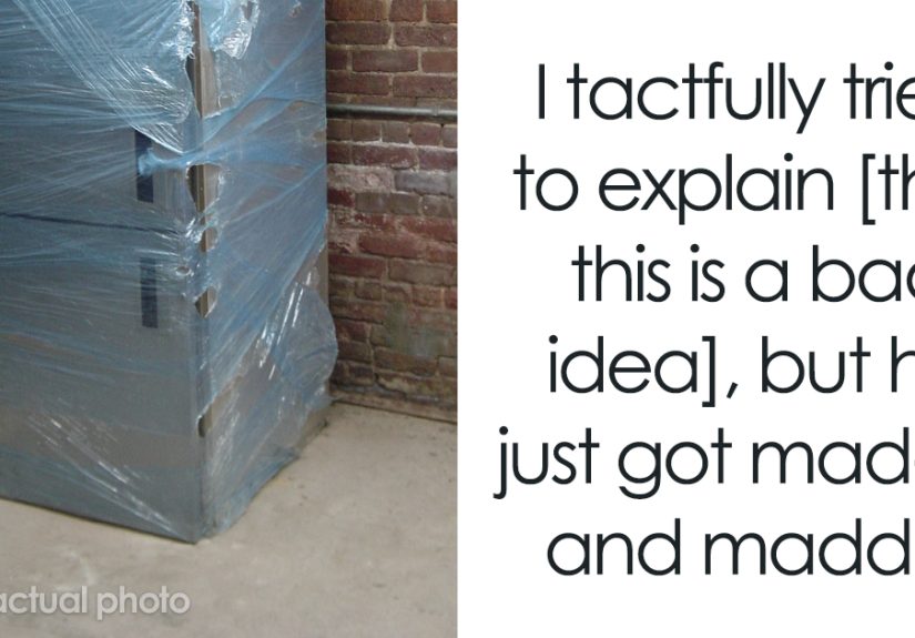
An angry customer, a Sears employee, a refrigerator, and a length of TV cable sounds like the...

Helping someone with addiction who does not want help can feel frightening, frustrating, and lonely. This guide...

Looking for the best meal replacement bars that actually keep you full? This guide breaks down 10...
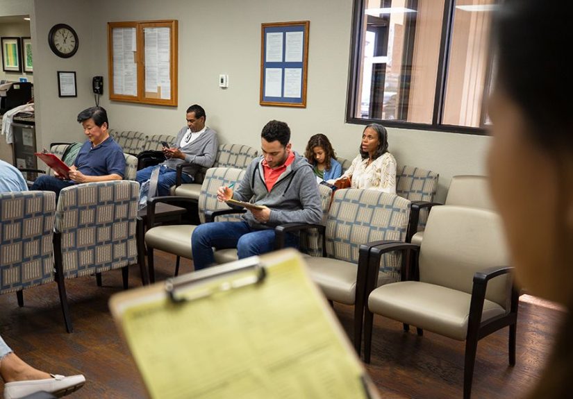
Need urgent mental health support and not sure where to start? This in-depth guide explains how behavioral...