Table of Contents >> Show >> Hide
- What the Idris Collection Actually Is (And Why It Doesn’t Look Perfect on Purpose)
- Why Designers Keep Coming Back to Idris
- Formats, Sizes, and the Color Palette
- Where Idris Works Best in a Home
- Design Moves That Make Idris Look Intentional
- Installation: How to Avoid Regret and Re-Do Costs
- Care and Maintenance: Keeping the Glow Without the Drama
- How Idris Compares to “Zellige Look” Tile
- Is Idris Right for Your Project?
- Extra: Real-World Experiences With the Ann Sacks Idris Tiles Collection (About )
- Conclusion
If subway tile is the plain white T-shirt of interiors, the Ann Sacks Idris Tiles Collection is the vintage jacket you “accidentally” wear every day because it makes everything else look cooler. Idris has that rare combo designers chase: it’s rooted in a centuries-old craft, but it reads fresh in modern homes. It can look quietly classic in a white-on-white showeror turn into a full-on statement wall the moment sunlight hits the glaze and starts showing off.
This guide breaks down what Idris is, what makes it different from “zellige-inspired” lookalikes, which colors and formats matter most, and how to plan a project so the end result feels intentionalrather than “handmade, but in a stressed-out way.”
What the Idris Collection Actually Is (And Why It Doesn’t Look Perfect on Purpose)
Idris is an exclusive zellige-style collection created with Moroccan artisans, offered through Ann Sacks. It’s made from terra cotta and crafted through a deeply hands-on processtiles are hand-formed, hand-glazed, and hand-cut. That “hand-cut” part matters: edges aren’t laser-straight, surfaces aren’t uniformly flat, and glaze pools in ways that machine-made tile simply can’t fake.
In other words, if you’re shopping for crisp, identical tiles that line up like graph paper, Idris is going to feel like it’s winking at you from across the showroombecause it is. The charm is in the variation: the gentle ripples, the shifting sheen, the slightly different tone from tile to tile that makes a wall feel alive instead of printed.
Zellige: a craft that uses light as part of the design
Zellige isn’t only “tile.” It’s also a lighting effect. Uneven surfaces reflect light in tiny, changing highlightsso the wall can look calm at noon and a little glam at golden hour. Idris leans into that by offering glazes that sparkle subtly instead of shouting.
Why Designers Keep Coming Back to Idris
1) It makes neutral rooms feel expensive without screaming “Look at me!”
A white kitchen backsplash can be beautiful… or it can be a blank rectangle of “meh.” Idris changes the game because even the quietest colors (think warm whites and soft greys) have depth. The surface isn’t flat, so it catches light. The glaze isn’t uniform, so it reads layered. You get richness without needing a bold pattern.
2) It plays well with both old-house character and clean-lined modern design
Traditional homes love Idris because it feels handmade and timeless. Modern homes love it because it’s simple geometry with high materiality. It’s one of those rare finishes that can sit next to plaster walls, reclaimed wood, or sleek slab cabinets and somehow look like it belongs.
3) It can be subtle or dramaticdepending on how you use it
A small run behind a sink? Refined. A floor-to-ceiling shower? Spa energy. A fireplace surround in a moody color? Suddenly your living room has a “main character.” The same collection can cover a tiny niche or wrap an entire room without feeling like two different design languages.
Formats, Sizes, and the Color Palette
Idris isn’t a one-shape wonder. It’s a system: field tiles for broad coverage, mosaics for pattern and detail, and trim pieces to finish edges cleanly. That’s why it shows up so often in fully designed spacesthere’s enough flexibility to create a complete look.
Core field tiles
- 2" x 6" field tile: the modern workhorse (great for stacked, staggered, vertical, and herringbone layouts).
- 4" x 4" field tile: the classic zellige-scale square (the one that makes walls feel artisanal and old-worldin a good way).
- Box liner trim (1" x 8"): a clean way to cap edges, frame niches, or end a backsplash without awkward cuts.
Mosaics and patterned sheets
Idris mosaics range from simple 2" x 2" sheets (for shower floors and accents) to more decorative patterns (for feature walls, fireplace surrounds, and statement zones). If you love the look of Moroccan mosaic but want something that can still feel modern, this is where Idris really shines.
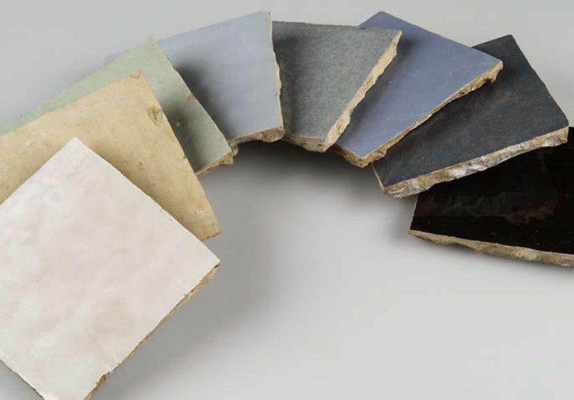
Colors that matter most (and how they tend to read in real homes)
- White Carrare: a snowy white with natural variationbright without feeling sterile.
- Nacre White: a softer, pearly white that reads warmer and slightly more luminous.
- Royal Cream: gentle warmth; great for rooms that need softness without “beige fatigue.”
- Pearl Grey: an elevated neutral; chic in fireplaces and bathrooms.
- Pepper Grey: deeper and moodier, but still flexible with many finishes.
- Forest Green: rich, saturated, and dramaticespecially in kitchens and bars.
- Powder Pink: surprisingly versatile; can read vintage, playful, or refined depending on surrounding materials.
- Black Kôhl: high-contrast and architectural; great for graphic moments.
- Grey Chine / Metal Grey: more contemporary greys that can read slightly industrial next to brass or warm wood.
- Matte Black / Matte White: when you want the handmade shape but less shine.
Also worth knowing: the Idris universe includes custom options, including metallic glazes like an 18-karat gold finish and a broad range of custom colors. If you’re designing a truly one-of-one project, this is where a showroom consult becomes your best friend.
Lead times and planning reality
Idris often comes in both in-stock and special-order options. That means your timeline can be “soon-ish” or “design patience practice,” depending on what you choose. When projects stall, it’s usually not because the tile is hard to loveit’s because someone forgot to order it early. If you’re working with a contractor, confirm the exact color/format availability and lead time before demo begins.
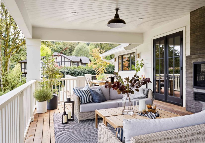
Where Idris Works Best in a Home
Kitchens
Idris is a backsplash superstar, especially in 2" x 6" layouts. A simple stacked pattern can feel clean and modern, while a traditional offset pattern leans classic. In white or nacre tones, Idris can make a kitchen feel brighter without looking glossy in a “builder-grade” way. In green or black, it becomes an instant focal pointlike jewelry for your walls.
Bathrooms (especially showers)
This is where the “light play” factor pays off. In a shower, Idris can look calm when the bathroom lights are offand then glow under task lighting. Designers often use a quiet field tile on the walls and bring in mosaics on the floor or niche back for contrast.
Fireplace surrounds
A fireplace is basically a built-in stage. Idris works here because it can handle being seen from across the room, and it adds tactile depth that paint can’t. Pearl greys and darker tones are especially good when you want the fireplace to feel designednot just “there.”
Light-duty floors and accent zones
Idris can be used in light-duty flooring applications and select wet/outdoor contexts with the right planning. Practically, most homeowners treat it as a wall-forward material and use mosaics thoughtfully where slip and wear matter most. When it’s used on floors, the payoff is bigbut so is the importance of proper installation and realistic expectations about variation.
Design Moves That Make Idris Look Intentional
Pick grout like you’re choosing a paint color (because you kind of are)
- Low-contrast grout (white tile + white grout): calmer, more seamless, lets the surface texture do the talking.
- Mid-contrast grout (cream tile + warm grey grout): adds structure without turning the wall into a checkerboard.
- High-contrast grout (white tile + dark grout): graphic and bold, but it also highlights every irregular edgeso be sure you want that.
Use layout to control the vibe
- Stacked: modern, clean, slightly architectural.
- Running bond: classic and forgiving; great when you want “timeless.”
- Vertical stack: makes ceilings feel taller and looks current without being trendy.
- Herringbone: a statement, especially in 2" x 6"; works best when the surrounding materials are simple.
Pair Idris with materials that respect it
Idris looks especially sharp with:
- Brass or unlacquered brass (the warmth balances the glaze).
- Natural wood (white tile + oak is basically a cheat code for cozy-modern).
- Stone with movement (like veined marble or quartzite) if you keep the tile color quieter.
- Plaster or limewash for a soft, tactile “handmade meets handmade” look.
Installation: How to Avoid Regret and Re-Do Costs
Idris is not hard to install because it’s “bad tile.” It’s hard to install because it’s honest tile. The same irregularities that make it gorgeous also demand more attention during layout. Here’s how to keep the final surface beautiful (and your group chat peaceful).
1) Dry-lay and mix boxes
Variation is the point, but clumping similar tones together can create accidental stripes or patches. Lay out tiles before setting them, pull from multiple boxes, and balance the highs and lows of shade and texture across the wall.
2) Accept “handmade straight” instead of “laser straight”
Idris lines won’t look like a spreadsheet. A great installer aims for visual consistencymeaning the wall reads aligned overallwhile still respecting the tile’s natural character. If your installer only feels comfortable with perfectly uniform tile, that’s a sign to pause and have an honest conversation.
3) Seal thoughtfully, especially around grout
With terra cotta-based and handcrafted surfaces, sealing practices matter. Many pros use a penetrating sealer before and after grouting to protect the surface and make cleanup easier. Your installer should follow product-specific guidance and test first.
4) Inspect before installationalways
This should be true for any tile, but it’s extra important here. Sort tiles, confirm the batch meets your expectations, and flag anything that’s beyond the normal handmade range before it’s on the wall. Once installed, changes get expensive fast.
Care and Maintenance: Keeping the Glow Without the Drama
- Use gentle cleaners: Think pH-neutral, non-abrasive products. No harsh scrubbing that dulls glaze over time.
- Wipe stains promptly: Handmade surfaces can be more reactive than factory-perfect ones, especially in kitchens.
- Re-seal as recommended: If your installer sealed the tile, ask what was used and when (or if) it should be refreshed.
- Be cautious in chemically intense environments: Areas like pools can be tough on glazes over time, depending on climate and chemistry.
How Idris Compares to “Zellige Look” Tile
Plenty of brands sell tiles that mimic zellige: glossy surfaces, slight ripples, soft color variation. Those can be great choicesespecially if you want the vibe with easier installation and a more predictable finish. But Idris sits in a different category.
Here’s the simplest way to think about it: lookalikes are designed to resemble handmade tile; Idris is handmade tile. That changes everythingfrom edge irregularity to how light bounces to how “alive” the wall feels in person. It also changes the demands on planning, budgeting, and installation skill.
Is Idris Right for Your Project?
Idris is a great fit if you:
- Love handcrafted materials and want a surface that looks layered and dimensional.
- Prefer “character” over “perfect.”
- Are willing to budget for a thoughtful install (and maybe a little extra tile for selection and waste).
- Want a backsplash, shower, or fireplace to feel designed and elevated.
You might choose something else if you:
- Need ultra-uniform lines and repeatable precision.
- Are on a very tight schedule with zero flexibility for lead times or ordering surprises.
- Don’t have access to an installer comfortable with handcrafted tile.
Extra: Real-World Experiences With the Ann Sacks Idris Tiles Collection (About )
Idris tends to inspire the kind of homeowner commentary that sounds suspiciously like a love letter. People talk about it the way they talk about a great piece of furniture: it’s functional, yes, but it also makes the room feel “finished.” A common theme is how the tile looks different throughout the daycalm in the morning, luminous at night, and occasionally sparkling when sunlight hits it at just the right angle. That shifting look is exactly why many choose a simple color like White Carrare or Nacre White: even “plain” becomes interesting.
The most positive experiences usually share two behind-the-scenes decisions: (1) they ordered samples and lived with them, and (2) they hired someone who understands handmade tile. Samples matter because photos can’t fully show glaze depth or the way the surface throws highlights. In a bathroom, for example, some homeowners love how the gloss feels glamorous without being flashyespecially when paired with a straightforward grout color that doesn’t compete. The tile ends up reading both organic and polished, which is a tricky balance to pull off with mass-produced materials.
The “learning moments” are predictable tooand totally avoidable. The biggest one is expectations: Idris won’t give you perfectly identical edges, and it won’t pretend it does. Some people are thrilled by that; others get nervous when they see the tiles laid out before grout, when everything looks a little chaotic. The magic often happens after the full install is complete, the layout reads as a whole, and the grout visually ties the surface together. That’s why experienced installers dry-lay sections, mix tiles from multiple boxes, and step back constantly to check the overall rhythm rather than obsessing over any single tile.
Grout decisions are where homeowners feel the most pressurebecause grout can either make Idris feel softly blended or sharply graphic. White grout with a white tile keeps the look calm and spa-like. A slightly deeper grout can emphasize the handmade shapes and make the wall feel more “patterned,” even if the tile is a single color. Neither is wrong, but the vibe is different. If you’re the type who notices crooked picture frames from across the room, you’ll probably be happier with a lower-contrast grout that lets the tile’s texture be the star instead of the grout lines.
The final common experience is something designers love and homeowners don’t always anticipate: Idris can become the reference point for everything else. Once it’s installed, other finishescabinet color, metal tones, even paintsuddenly get judged against it. The tile has so much depth that it can make a flat, cool white paint look harsh, or make a too-yellow brass look overly warm. The good news? When you choose the supporting cast well, Idris rewards you with a room that feels intentional, layered, and genuinely customlike it was designed, not just assembled.
Conclusion
The Ann Sacks Idris Tiles Collection is for people who want surfaces with soul. It’s not “perfect”and that’s the point. With the right color, layout, and installer, Idris can make a simple kitchen feel collected, a bathroom feel luminous, or a fireplace feel like a centerpiece instead of an afterthought. Plan ahead, sample thoughtfully, embrace variation, and you’ll end up with tile that looks better the longer you live with it.