Table of Contents >> Show >> Hide
- What Makes a Bedroom Color Scheme Work?
- How to Choose Bedroom Colors Based on Light and Room Size
- 10 Bedroom Color Schemes That Look Great and Feel Even Better
- 1) Soft Blue + Warm White + Natural Wood
- 2) Sage Green + Cream + Clay or Terracotta
- 3) Warm Greige + Crisp White + Black Accents
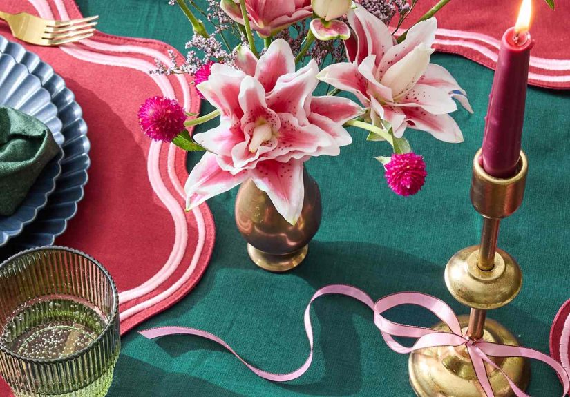
- 4) Blush + Soft Gray + Brass
- 5) Navy + White + Sand
- 6) Charcoal + Linen + Cognac
- 7) Lavender + White + Soft Wood
- 8) Earthy Beige + Olive + Off-Black
- 9) Monochrome Neutrals (Layered Whites + Soft Grays)
- 10) Jewel Tones (Emerald + Deep Blue + Warm Metals)
- Smart Finishing Touches That Make Any Palette Look “Designed”
- Common Bedroom Color Mistakes (and Easy Fixes)
- Real-Life Lessons: What It’s Like Living With Your Bedroom Colors (Experience Section)
- Conclusion: Build a Bedroom Palette You’ll Actually Love Living In
Choosing a bedroom color scheme sounds easyuntil you’re standing in the paint aisle holding 47 “soft whites” that all look identical… and yet somehow
one of them will turn your room into a butter factory the moment it touches a wall. The good news: a great bedroom palette isn’t about chasing the
“perfect” color. It’s about picking a mood, matching your light, and building a scheme that makes the room feel like a calm exhale at the end of the day.
In this guide, you’ll get practical, design-forward bedroom color schemes (from airy neutrals to moody jewel tones), plus how to choose the right one
based on room size, natural light, and your personal sleep style. Yes, “sleep style” is a thingsome people need cloud-like calm, others need cozy cave.
No judgment. Your bedroom is not a museum. It’s a recharge station.
What Makes a Bedroom Color Scheme Work?
A bedroom color scheme is more than wall paint. It’s the full cast: walls, ceiling, trim, bedding, curtains, rug, wood tones, metal finishes, and the
little accents (like art and pillows) that keep the room from looking like a catalog page you forgot to finish.
Start with a “dominant mood,” not a random swatch
Ask yourself how you want the room to feel at 10:30 p.m. after a long day:
calm and airy, warm and cozy, crisp and clean, romantic and soft, bold and dramatic, or nature-inspired and grounded. If you pick a mood first, your
color decisions stop feeling like a guessing game and start feeling like a plan.
Use the 60-30-10 approach (it’s simple, not strict)
A classic way to keep color balanced: about 60% dominant color (usually walls), 30% secondary color (bedding, rug, drapes), and 10% accent (art,
pillows, a throw, or a statement chair). You don’t need to measure with a rulerjust use it as a “does this feel lopsided?” checkpoint.
Undertones and lighting matter more than you think
Two grays can look like cousins in the store, then fight like rivals in your bedroom. That’s undertone at work. Natural light direction (north/south/east/west),
time of day, and warm vs. cool bulbs all shift how paint reads. Always test large samples on multiple walls and look at them in morning, afternoon, and night.
How to Choose Bedroom Colors Based on Light and Room Size
If your bedroom gets low or cool natural light
Rooms with cooler light often make colors look a bit grayer or flatter. In those spaces, warmer neutrals (creamy whites, soft taupes, gentle greiges)
can keep the room from feeling chilly. If you prefer cool colors (like blue or green), choose versions with a soft, muted quality rather than icy brightness.
If your bedroom gets bright, warm natural light
Sun-filled rooms can “heat up” colors, making warm tones look extra warm. If you love warm neutrals, this can be amazinghello, cozy glow. If you’re
worried about things turning too yellow or peachy, pick balanced neutrals or slightly cooler versions of the shade you like.
If your bedroom is small
Light colors can visually open a smaller room, but you don’t have to default to plain white. Soft, light-mid tones (like misty blue, pale sage, warm off-white,
or gentle greige) can still reflect light while adding personality. If you want a darker bedroom in a small space, do it intentionally: add layered lighting
(bedside lamps, a soft overhead option, maybe wall sconces), and use lighter bedding to keep the room from feeling like a stylish shoe box.
If your bedroom is large
Larger rooms can handle deeper colors beautifully. A moody color scheme can make a big bedroom feel more intimate and “finished.”
If you want airy calm in a large room, add warmth and texture so it doesn’t feel like an echo chamber: linen curtains, a plush rug, layered whites,
and wood tones that ground the space.
10 Bedroom Color Schemes That Look Great and Feel Even Better
Below are bedroom color schemes you can adapt to almost any stylemodern, farmhouse, coastal, traditional, minimalist, maximalist, and “I just moved
in and my bed is still on the floor” chic.
1) Soft Blue + Warm White + Natural Wood
This scheme is a classic for a reason: it reads calm without being boring. Soft blue feels airy and restful, warm white keeps it clean, and natural wood
adds warmth so the room doesn’t feel like a dentist office with throw pillows.
- Walls: muted sky blue or blue-gray
- Trim/ceiling: warm white (not stark)
- Secondary: sandy beige bedding or oatmeal linen
- Accents: navy, matte black, or brushed brass
Works best for: coastal, transitional, Scandinavian, and “I want calm but still want color.”
2) Sage Green + Cream + Clay or Terracotta
Sage is a “new neutral” that brings nature indoors. Pair it with creamy whites and add clay/terracotta accents for warmth. The result feels grounded,
cozy, and subtly sophisticatedlike your bedroom drinks herbal tea and has its life together.
- Walls: soft sage or muted olive
- Secondary: creamy bedding, warm white curtains
- Accents: terracotta, rust, camel leather, aged brass
Pro tip: bring in texture (linen, woven baskets, a wool rug) to keep green from feeling flat.
3) Warm Greige + Crisp White + Black Accents
If you want “hotel calm” without going fully beige, warm greige is your friend. It’s neutral, modern, and flexible. Add crisp white for contrast and a
few black accents for structure.
- Walls: warm greige or light taupe
- Secondary: white bedding and trim
- Accents: black frames, matte black hardware, charcoal throw
Works best for: modern, minimalist, transitional, and small bedrooms that need brightness.
4) Blush + Soft Gray + Brass
Blush isn’t just “pink.” In the right tone, it reads warm, flattering, and quietly romantic. Paired with soft gray, it feels grown-up. Brass adds glow.
(Basically: you’re building a sunset, but indoors.)
- Walls: muted blush, dusty rose, or pink-beige
- Secondary: soft gray bedding or rug
- Accents: brass lamps, ivory curtains, warm wood nightstands
Avoid: neon pink accents unless your bedroom theme is “bubble gum adrenaline.”
5) Navy + White + Sand
Navy brings depth, white keeps it crisp, and sandy tones prevent the palette from feeling too stark. This is a timeless scheme that can look classic,
coastal, or modern depending on your furniture and textiles.
- Walls: navy (full room) or navy accent wall behind the bed
- Secondary: white bedding with subtle texture
- Accents: sand, tan, rattan, light oak, striped pillows
Lighting note: deep colors look best with layered lightingthink two bedside lamps plus a soft overhead option.
6) Charcoal + Linen + Cognac
Moody but warm, this palette is a favorite for creating a cozy “cocoon.” Charcoal sets the scene, linen adds softness, and cognac leather (or faux leather)
brings richness. It’s like a good leather-bound book… but your bed.
- Walls: charcoal or deep warm gray
- Secondary: linen-colored bedding, ivory curtains
- Accents: cognac, walnut, antique brass, creamy ceramics
Style match: modern, industrial, rustic-modern, or masculine-leaning bedrooms (but truly, anyone can use it).
7) Lavender + White + Soft Wood
Lavender can feel dreamy and peaceful when it’s mutednot candy-bright. Keep the rest of the palette light and warm so it reads serene instead of
“kids’ party room.”
- Walls: pale lavender or gray-lilac
- Secondary: white bedding, light neutral rug
- Accents: light oak, silver, soft sage, or dusty blue
Best for: small-to-medium bedrooms where you want a gentle color wash.
8) Earthy Beige + Olive + Off-Black
This scheme feels organic and modern. Earthy beige keeps it warm, olive adds depth, and off-black gives a little drama without going full “bat cave.”
- Walls: earthy beige or warm oatmeal
- Secondary: olive textiles (curtains, pillows, duvet)
- Accents: off-black frames, dark bronze, natural stone
Pro tip: add plants and woven textures to make the palette feel intentional (not accidental).
9) Monochrome Neutrals (Layered Whites + Soft Grays)
A neutral bedroom can be deeply relaxing when it’s layered. The key is contrast through texture and tone: matte walls, crisp sheets, nubby throws,
woven rugs, and a mix of warm and cool neutrals so the room doesn’t look “flat.”
- Walls: warm white, soft ivory, or pale gray
- Secondary: layered bedding (white + cream + a hint of gray)
- Accents: black-and-white art, light wood, stoneware
Good for: minimalist, modern farmhouse, and anyone who wants their bedroom to feel like a calm cloud.
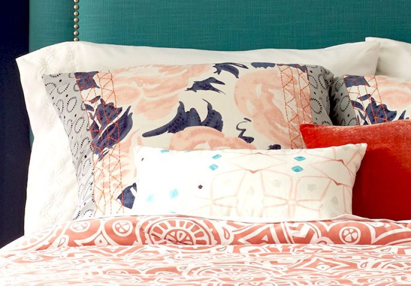
10) Jewel Tones (Emerald + Deep Blue + Warm Metals)
Want drama that still feels luxurious? Jewel tones can be surprisingly restful when they’re rich and grounded. Balance them with warm metals and
lighter neutrals so the room feels curated, not chaotic.
- Walls: emerald, deep teal, or inky blue (full room or statement wall)
- Secondary: cream bedding or a light neutral rug
- Accents: brass, walnut, velvet pillows, moody art
Design note: jewel tones look best when you repeat them at least twice (e.g., wall + pillow + art detail).
Smart Finishing Touches That Make Any Palette Look “Designed”
Don’t forget the ceiling
A bright ceiling can make a room feel taller and lighter. A slightly tinted ceiling (a softer version of the wall color) can make the room feel cozy and cohesive.
If you’re doing a moody scheme, consider painting the ceiling toothis creates a wrapped, cocoon-like effect that can feel very high-end.
Pick a trim strategy
Trim can either blend (calm, seamless) or contrast (crisp, graphic). For serene bedrooms, blending trim in a similar tone often feels softer. For modern
bedrooms, a clean contrast can look sharp and intentional.
Use texture as “color’s best friend”
Texture adds depth without shouting. If your scheme is neutral, texture is how you keep it interesting. If your scheme is colorful, texture is how you keep
it rich instead of loud. Think linen, cotton, wool, velvet, rattan, and natural wood grain.
Let your bedding do some of the work
Not ready to commit to bold walls? Keep walls neutral and bring color through bedding, curtains, and a rug. This is also the easiest way to “seasonally rotate”
your bedroom without repainting every six months like a very tired art student.
Common Bedroom Color Mistakes (and Easy Fixes)
-
Mistake: Choosing paint under store lighting only.
Fix: Test large samples on multiple walls and check them morning + night. -
Mistake: Going too cool in a room that already feels chilly.
Fix: Add warmth through creamy whites, wood tones, brass, and warm bulbs. -
Mistake: Too many “main colors” competing.
Fix: Pick one dominant, one supporting, one accentand repeat them. -
Mistake: A neutral room that feels flat.
Fix: Layer textures, add tonal contrast, and include one darker anchor (like a headboard, frame, or lamp base).
Real-Life Lessons: What It’s Like Living With Your Bedroom Colors (Experience Section)
Bedroom color schemes don’t just sit there looking pretty. They live with youthrough groggy mornings, late-night scrolling (we’re not here to judge),
rainy days, bright weekends, and the occasional “Why does my wall look green today?” crisis. That’s why the most helpful advice often comes from the
way a color behaves over time, not how it looks in a perfect, staged photo.
One of the biggest “aha” moments people report is how dramatically lighting changes everything. A soft blue that feels airy at noon can look cooler and
more serious at night. A warm greige that seems calm in afternoon sun can lean a little beige under warm lamps. The fix usually isn’t repaintingit’s
adjusting the supporting cast: bulbs (warm vs. neutral), curtains (sheer vs. blackout), and textiles (creamy vs. crisp whites). In other words, if your
wall color feels “off,” don’t panic-buy three gallons of new paint. Try swapping the lightbulbs first. That’s the cheapest plot twist.
Another common experience: people fall in love with a bold color in theory, then realize they don’t want that much intensity on every wall. The solution
is almost always “strategic boldness.” A deep navy or forest green behind the bed can feel dramatic and cozy, while the other walls stay lighter and
calmer. This creates a focal point without making the room feel heavy. It’s like adding eyeliner instead of painting your whole face black. Same vibe,
less commitment.
Homeowners also learn quickly that neutrals aren’t automatically easy. A plain white bedroom can look crisp and sereneor it can look sterile, especially
if everything is the same shade and the textures are flat. People who love their neutral bedrooms tend to do two things: they layer textures (linen duvet,
knit throw, woven rug) and they introduce at least one grounding element (a wood headboard, a darker nightstand, or black frames). The room still feels
calm, but now it has a pulse.
There’s also the “color identity” effect: your bedroom palette starts influencing the choices you make later. Choose sage and cream, and suddenly you’re
drawn to warm wood, handmade ceramics, and earthy art. Choose navy and white, and you might crave crisp bedding and cleaner lines. Choose blush and gray,
and brass finishes start calling your name like they’re paying rent. When your color scheme is cohesive, decorating gets easier because you’re not deciding
from infinite optionsyou’re choosing from options that fit your story.
Finally, people often discover that their best bedroom color scheme is the one that supports rest and real life. If you love bright white but you
have pets, kids, or a talent for spilling coffee like it’s an Olympic sport, you might prefer warm off-white walls plus washable bedding. If you love dark,
moody walls but hate waking up in a cave, you can keep walls deep and add lighter curtains and bedding to brighten the morning experience. The “right”
palette isn’t the trendiest. It’s the one that makes you feel good when you walk inand makes you want to stay long enough to actually recharge.