Table of Contents >> Show >> Hide
- What You’ll Learn
- What “Colorful Starburst, Toned Down” Actually Means
- Build a Calm-But-Bright Quilt Palette (Without Guessing)
- Fabric Strategy for a Starburst That Looks Intentional
- Piecing Plan: Sharp Points, Flat Blocks, Fewer Regrets
- Quilting and Finishing: Make the Starburst Look Even More “Burst-y”
- Common Starburst Quilt Problems (and How to Fix Them)
- Three Easy Variations to Match Your Style
- FAQ: Colorful Starburst Toned Down Patchwork Quilts
- Bring the Fireworks, Keep the Calm
- Real-World Experiences: What Quilters Learn Making a Toned-Down Starburst (Extra )
A starburst quilt is basically a fireworks show made out of fabricsharp points, radiant energy, and a big “ta-da!” moment when you step back.
The tricky part? Keeping all that excitement from turning into visual noise. That’s where the “colorful but toned down” approach shines:
you get the punch of bright starbursts with the calm, modern feel of a softened palette.
In this guide, you’ll learn how to plan a colorful starburst toned down patchwork quilt that looks intentional (not accidental),
feels cohesive (not chaotic), and comes together with fewer “why do my points hate me?” moments.
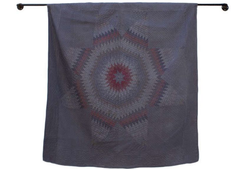
What “Colorful Starburst, Toned Down” Actually Means
A starburst quilt is any patchwork layout that creates a radiating star effectoften using classic units like
half-square triangles (HSTs), flying geese, and sometimes oversized star blocks arranged so the eye reads
“bursting outward.”
“Toned down” doesn’t mean boring. It means you’re controlling intensity on purpose. In color terms, a tone is a color that’s been softened with gray
(or visually behaves like itthink dusty teal instead of electric teal). A toned-down starburst quilt usually includes:
- One calm background system (solids, low-volume prints, or tone-on-tone blenders)
- One or two “hero” color families that repeat across the quilt
- Planned value contrast so the star points don’t disappear
- Breathing room so the starburst looks crisp instead of crowded
Think of it like styling an outfit: your starburst is the statement jacket. The toned-down fabrics are the perfectly chill jeans and sneakers that make
the jacket look even cooler.
Build a Calm-But-Bright Quilt Palette (Without Guessing)
Start with value before color (yes, really)
Quilts don’t “read” in real life the way they do in your head at 1 a.m. with 47 fabrics on the floor. What makes starbursts pop is value:
the light-to-dark relationship between pieces. You can use gorgeous colors and still end up with a starburst that looks like it’s whispering from under a blanket
if your values are too similar.
A fast trick: take a quick phone photo of your fabric pull and switch it to black-and-white. If you can still see the star shape in grayscale,
you’re on the right track. If everything turns into one medium-gray soup, you need either darker darks, lighter lights, or a clearer background.
Use a “3-layer” palette: background, support, sparkle
For a toned-down starburst quilt that still feels colorful, plan three layers:
- Background layer (60–70%): low-volume creams, soft whites, pale grays, oatmeal, or a quiet print that reads neutral from a distance.
- Support layer (20–30%): muted mid-valuesdusty blues, soft sage, warm taupe, faded denim, smoky lavender. These connect the quilt.
- Sparkle layer (10–15%): your “pop” fabricscoral, marigold, cobalt, hot pink, bright aquaused deliberately in star points or centers.
This ratio is the difference between “wow, that’s a starburst!” and “wow, my eyes are filing a noise complaint.”
Specific palette examples you can copy
Need real combinations that behave well in a starburst layout? Try one of these:
- Desert Fireworks: warm cream background + dusty terracotta + muted teal + small hits of mustard
- Modern Coastal: pale gray background + faded denim + sea-glass green + pops of coral
- Berry Calm: soft white background + smoky lavender + charcoal accents + bright raspberry “sparkle”
- Retro-but-Refined: oatmeal background + sage + faded navy + pops of orange
The common thread: a quiet base, a steady set of mid-tones, and a small amount of high-energy color.
Fabric Strategy for a Starburst That Looks Intentional
Low-volume backgrounds: your secret weapon
Low-volume fabrics are light prints that behave like solids from a distancetiny dots, subtle grids, faint text, delicate motifs.
They’re perfect for toned-down patchwork quilts because they add texture without stealing attention from the starburst.
If your starburst fabrics are busy (think modern florals, energetic geometrics, or high-contrast batiks), low-volume backgrounds help everything settle.
If your starburst fabrics are mostly solids, low-volume backgrounds add “soft interest” so the quilt doesn’t feel flat.
Print scale matters more than people admit
In star quilts, pieces can be smallespecially if you’re building points with HSTs or flying geese. Large-scale prints can look amazing in bigger patches
but may turn into visual confetti in tiny units.
- Use small-to-medium prints for star points and repeated units.
- Save large prints for larger patches, borders, backing, or the star “center” if you’re using bigger blocks.
- Mix in blenders (textures, tone-on-tone, subtle speckles) to keep the quilt from feeling over-patterned.
Precuts vs. yardage: both workchoose your sanity level
Starburst-style patchwork is famously friendly to precuts because repetition is built into the design. Layer cakes and charm squares can speed up cutting
and help your colors stay evenly distributed.
Yardage gives you more control (especially if you want a truly “toned down” set of specific dusty colors), but it also means more cutting.
If your goal is a relaxed weekend project, precuts are the “treat yourself” option.
Piecing Plan: Sharp Points, Flat Blocks, Fewer Regrets
Guard your seam allowance like it’s the last cookie
Star points are basically math in fabric form. Most patchwork patterns assume a consistent 1/4-inch seam allowance.
If yours drifts, your blocks shrink, your points misalign, and suddenly you’re “designing” with creative trimming.
A practical approach:
- Sew a small test: two fabric strips, press, measure.
- If it’s off, adjust your needle position or guide placement.
- Consider a scant 1/4-inch seam (just a hair under) if your units consistently come out small after pressing.
Half-square triangles: make them slightly big, then trim
HSTs are a starburst quilt’s best friend and worst frenemy. The best way to keep everything crisp is to
make HSTs a touch oversized and trim them down. This fixes tiny cutting errors, wobbly seams, and the “how is this square not square?”
mystery.
Trimming tips that actually help:
- Press first, then square up (don’t trim a wrinkly unit and expect magic).
- Line your ruler’s 45-degree line up with the seam.
- Trim two sides, rotate, trim the remaining sidesconsistent units = consistent blocks.
Pressing: “press” is not a synonym for “shove”
Pressing is where accurate piecing is either saved or quietly sabotaged.
The goal is to flatten seams without stretching the bias edges that show up in triangles.
- Set the seam: press the stitched seam closed first to settle the thread.
- Then open and press: lift-and-lower, don’t iron back and forth like you’re mad at the fabric.
- Choose a strategy: pressing to one side can help seams “nest”; pressing open reduces bulk. Either can workjust be consistent.
Layout: distribute color so the starburst feels balanced
Starburst quilts look best when color is sprinkled intentionally. Before you sew your final rows together, lay blocks out and check:
- Are all the bright pops clumped together? (Spread them out.)
- Do you have a dark area that feels heavy? (Swap in a lighter support fabric.)
- Are the star points clearly visible against the background? (Increase contrast.)
If you want a truly “toned down” finish, keep your brightest fabrics repeating in small amountslike confetti, not like wall-to-wall fireworks.
Quilting and Finishing: Make the Starburst Look Even More “Burst-y”
Batting choice affects the vibe
Batting is the quilt’s invisible personality. A higher loft can add puffiness and make quilting lines more dramatic. A flatter batting gives a sleek,
modern lookperfect for a toned-down starburst style.
- Cotton or cotton blend: classic, slightly flatter, great for crisp modern quilts.
- Poly or high-loft blends: lighter and puffier, makes the quilting texture stand out.
- Wool/bamboo options: can add warmth and loft, often with a softer drape (usually pricier).
Walking-foot quilting ideas that complement a starburst
You don’t need fancy free-motion skills to make this quilt look high-end. Straight-line quilting can be stunning, especially with geometric patchwork.
Try:
- Echo lines radiating outward from the star center (instant starburst emphasis).
- Random-spaced straight lines across the whole quilt for modern texture.
- Grid quilting to calm busy prints and make color choices feel intentional.
- Stitch-in-the-ditch around key shapes, plus a few additional lines for texture.
Pro tip: test your stitch length on a mini “quilt sandwich” first. Many quilters prefer a slightly longer stitch for walking-foot quilting than for piecing
because it looks smoother on thicker layers.
Binding that doesn’t steal the spotlight
For toned-down starburst quilts, binding can go one of two ways:
- Quiet binding: match the background or a mid-tone support fabric. This frames the quilt softly.
- Confident binding: choose one bright sparkle color and repeat it as a thin “final pop.”
Machine binding is fast and durable. Hand-finished binding has a classic look. Either way, pressing the binding well and keeping it even is what makes it look
polished rather than “I survived and that’s what matters.”
Common Starburst Quilt Problems (and How to Fix Them)
“My star points look chopped off.”
- Check seam allowance consistency (test strip method).
- Square up HSTs and flying geese units before assembling blocks.
- Pin at the point intersections and sew slowly through the “money spot.”
“My quilt top is wavy.”
- Avoid stretching bias edges when pressingpress, don’t drag.
- Stay-stitch the outer edge if your quilt has lots of triangles at the perimeter.
- Square the quilt top before quilting; add borders only if the center is stable.
“The colors look muddy, not toned down.”
- Muddy usually means values are too similar or there are too many mid-tones.
- Add a few darker accents (even small ones) to define the star shape.
- Reduce competing prints: swap some busy fabrics for blenders or solids.
“It’s pretty… but it doesn’t read as a starburst.”
- Increase contrast between star points and background.
- Repeat your sparkle colors more deliberately (same bright appears in multiple places).
- Consider quilting lines that radiate outward to reinforce the burst effect.
Three Easy Variations to Match Your Style
1) Modern Minimal Starburst
Use a single background (soft white or pale gray), two support colors (dusty blue + taupe), and one sparkle color (coral).
Keep prints subtle and let negative space do the heavy lifting.
2) Scrappy but Sophisticated
Choose one “temperature” (warm or cool) and build scraps inside that lanethen unify everything with a consistent low-volume background.
It feels playful without looking random.
3) Vintage-Modern Blend
Use classic star colors (navy, cheddar, red) but pick softened versions (faded navy, warm gold, brick red) and pair with an oatmeal background.
The result feels traditional and fresh at the same time.
FAQ: Colorful Starburst Toned Down Patchwork Quilts
What size is best for a first starburst quilt?
A throw size is a sweet spot: big enough to show the design, small enough to finish without turning it into a multi-season documentary.
If you’re testing the style, a baby quilt or wall hanging works too.
Do I have to use solids to make it look toned down?
Nope. Toned down is about overall visual volume. Low-volume prints, tone-on-tone blenders, and dusty mid-tone prints can all read “calm”
if the values are controlled.
How many colors is too many?
If you’re using a calm background, you can use lots of colorsif they share a common “softened” feel. If your palette includes very bright,
very dark, and very busy prints all together, limit your sparkle colors and add more blenders to keep peace in the kingdom.
What’s the fastest way to check contrast?
Phone photo in black-and-white. If the star points still show, you’re good. If everything blends, adjust values.
Should I press seams open or to the side?
Either can work. Pressing to the side can help seams nest and reduce point bulk in some layouts; pressing open can reduce bulk across dense intersections.
The key is to press gently and consistently.
How do I keep basting safe and not gross?
If you use spray basting, do it in a well-ventilated area, follow the product directions, and keep it away from open flames or high heat sources.
A little goes a long way, and your lungs deserve nice things.
Bring the Fireworks, Keep the Calm
A colorful starburst toned down patchwork quilt is the best of both worlds: bold geometry with a grown-up, modern finish.
The secret isn’t buying “the perfect fabric collection.” It’s planning value contrast, choosing a quiet background, and treating your sparkle colors like
seasoningenough to make everything sing, not so much that it overwhelms the dish.
Start with one palette, test it in grayscale, piece with consistent seams, and quilt in a way that supports the burst. Do that, and you’ll end up with a quilt
that looks intentional from across the roomand delightful up close.
Real-World Experiences: What Quilters Learn Making a Toned-Down Starburst (Extra )
Quilters who try a toned-down starburst for the first time often expect the hardest part to be the points. Surprise: the points are only the second-hardest.
The hardest part is deciding what “toned down” means when you’re holding a neon pink print that is practically yelling, “Pick me! I’m fun!”
A super common experience is the “fabric audition spiral.” You start with a neat little stack of calm colors, then you add one bright pop for energy.
Then you add another pop because the first pop looks lonely. Then you add a third pop because the second pop needs a friend.
Then you step back and realize you’ve built a circus. The fix quilters share again and again is simple: pick your sparkle colors early, cap them,
and repeat them on purpose. It’s not about using fewer fun fabricsit’s about using them consistently so the quilt looks designed.
Another frequent “aha” moment is discovering that contrast is not the same thing as brightness. A bright fabric can still disappear if it’s the same value
as the background. Quilters often report that their starburst suddenly “shows up” the moment they swap just a few pieces:
a medium gray background becomes a pale gray; a dusty teal point becomes a deeper teal; a soft cream gets nudged toward a cleaner white.
Tiny shifts create big readability.
There’s also the famous “my blocks are fine individually, but weird together” phase. This happens when fabrics look great up close but fight as a group.
Quilters solve it by adding a stabilizing elementusually more background, more low-volume, or a few blenders that act like visual commas.
One quilter described blenders as “the introverts of the fabric pile”: they don’t demand attention, but the whole party goes smoother when they’re there.
On the construction side, people often learn a surprising lesson: slowing down saves time. It sounds like quilting fortune-cookie wisdom,
but it’s true. When you rush HST trimming or skip pressing steps, you usually “save” five minutes and then spend forty minutes trying to make a block behave.
Quilters who enjoy this project most tend to build a rhythm: chain piece, set seams, press carefully, trim consistently, and stack units in order.
The process becomes almost relaxinglike a tiny fabric assembly line that ends in a starburst.
Finally, a lot of quilters describe the finished quilt as more versatile than they expected. A toned-down starburst looks modern on a couch,
playful in a kid’s room, and surprisingly elegant in neutral bedroomsespecially if your background and support fabrics are calm.
It’s the kind of quilt that gets compliments from both “I love bright color!” people and “I only decorate in beige!” people.
Honestly, bringing those groups together might be the most magical thing quilting can do.