Table of Contents >> Show >> Hide
- Why Millennial Gray Is Fading (and What People Want Instead)
- Meet Sage Green: The Calm New Neutral
- Why Designers Love Sage (and Why It Works in Real Homes)
- How to Use Sage Green Without Overcommitting
- A Simple Pairing Guide: What Looks Great With Sage
- Room-by-Room Ideas Designers Actually Use
- How to Choose the Right Sage Paint (Because Undertones Are Sneaky)
- Common Mistakes (and How to Avoid Them)
- Specific Examples Designers Point To (Without Turning This Into a Paint Aisle)
- Real-Life Experiences With Sage Green (What It’s Like to Actually Live With It)
- Conclusion: A New Neutral That Actually Feels Like Something
Millennial gray had a good run. A heroic run, even. It made open-concept homes feel “modern,” helped busy listings look
“move-in ready,” and gave every flipper in America a shared love language: cool-toned neutrality.
But like skinny jeans and aggressively worded “Live Laugh Love” signs, gray eventually became less of a style choice
and more of a default setting.
Enter the calm, nature-rooted shade designers keep circling back to as the next all-purpose backdrop:
sage green. It’s the soft-focus, deep-breath, “I definitely drink water now” successor to millennial gray.
And unlike graywhich can swing sterile faster than you can say “stainless steel everything”sage has warmth, depth,
and just enough color to feel intentional without feeling loud.
Why Millennial Gray Is Fading (and What People Want Instead)
Gray rose during an era obsessed with simplifying: decluttering, streamlining, editing life down to a tidy capsule wardrobe
and a tidy palette. As a wall color, it was safe. As an identity, it was “minimalist.” As a mood, it was… fine.
The problem is that “fine” can start to feel flatespecially when the same gray shows up on walls, floors, cabinets,
and the neighbor’s dog crate.
Today’s interiors lean toward comfort and character: warmer neutrals, natural textures, and colors that feel grounded.
You don’t have to paint your dining room aubergine and start serving olives unpromptedbut many homeowners do want
their spaces to feel less like a showroom and more like a home that gently lowers your blood pressure.
Meet Sage Green: The Calm New Neutral
Sage green sits in that sweet spot between color and neutral. It’s a muted greenoften with gray, blue, or even
slightly brown undertonesthat reads soft and livable rather than “look at me!” green. Designers describe it as an
alternative to overused gray because it still behaves like a backdrop, just with more soul.
Think of sage as millennial gray’s cool older sibling who travels, owns plants that are still alive, and knows how to
pronounce “charcuterie” without panicking.
Why Designers Love Sage (and Why It Works in Real Homes)
1) It reads like a neutraljust more flattering
Sage green has the versatility people loved in gray: it can cover a whole room without hijacking it. But unlike many
cool grays, sage doesn’t automatically make a space feel chilly or clinical. It softens edges, plays nicely with
natural materials, and adds a hint of lifeliterally, because it lives in the green family.
2) It taps into the “nature at home” mindset
A lot of current design energy revolves around bringing the outdoors inthink biophilic design, organic modern style,
and rooms that feel restorative. Sage fits right in because it echoes foliage, herbs, and soft landscape tones.
People consistently describe greens and blue-greens as soothing, especially in bedrooms and unwind zones.
3) It’s flexible across styles
Sage can skew traditional (paired with warm woods and creamy trim), modern (with black accents and clean lines),
cottage (with beadboard and vintage brass), or coastal (with sandy neutrals and airy whites). It also works as an
exterior color, especially in neighborhoods where you want “distinct” without “what on earth is happening over there?”
4) It plays better with mixed metals and warm materials
Gray often demanded cool companions: chrome, brushed nickel, icy marble, stark white. Sage is friendlier. It looks
great with brass, bronze, matte black, natural oak, walnut, travertine, and woven textures. In other words: it won’t
pick a fight with your lamp the second you bring it home.
How to Use Sage Green Without Overcommitting
Start with “high impact, low risk” moves
- Paint a vanity or built-in to test the vibe without changing every wall.
- Try sage in a hallway where it reads intentional and ties rooms together.
- Use it on interior doors for a subtle upgrade that feels custom.
- Add textiles first (curtains, bedding, rugs) to see how the undertone behaves in your light.
Go big in rooms that benefit from calm
Bedrooms, reading nooks, nurseries, and bathrooms are natural sage territory. A soft sage with gentle undertones can
feel spa-likeespecially with warm white trim, layered linens, and lighting that doesn’t scream “interrogation lamp.”
Consider “color drenching” for a cocoon effect
If you’re tired of the accent-wall era (we all have regrets), sage is a great candidate for painting walls and trim
in the same family. Done right, it looks rich and enveloping, not heavyespecially if you keep the rest of the room
light with textiles and reflective surfaces.
A Simple Pairing Guide: What Looks Great With Sage
Warm whites and creams
This is sage’s most reliable partner. Creamy whites make sage feel softer and more inviting than stark bright whites,
which can exaggerate cool undertones.
Wood tones (especially oak and walnut)
Sage + wood is basically nature’s own mood board. Light oak reads fresh and Scandinavian; walnut reads richer and more
classic.
Brass, bronze, and matte black
Brass warms it up. Matte black sharpens it. Bronze splits the difference and looks expensive even when your budget is
very much “reasonable adult.”
Complementary accents: clay, terracotta, blush, and muted navy
Sage loves earthy companions. Terracotta and clay add warmth. Muted navy adds depth. Blush can feel surprisingly
sophisticated when both colors are dusty and understated.
Room-by-Room Ideas Designers Actually Use
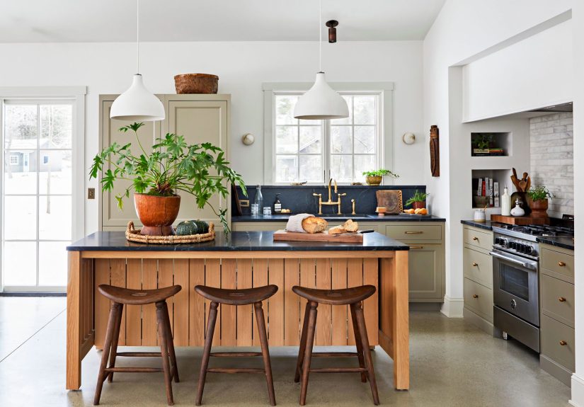
Kitchen: sage cabinets that don’t feel trendy-next-week
Sage is especially popular on lower cabinets or islands because it anchors the room without making it dark. Pair with
warm white uppers (or open shelving), a simple backsplash, and hardware in brass or matte black. If you want an even
more timeless look, choose a sage that’s less gray and more herbal.
Bedroom: the “exhale” color
Sage on bedroom walls reads restful, especially in softer, lighter versions. Layer in creamy bedding, textured throws,
and a rug with warm undertones. Keep art and accessories simple; let the wall color do the calming work.
Living room: a backdrop that makes everything else look better
In living spaces, sage can act like a filter that makes wood, leather, and textiles feel richer. A warm leather sofa,
woven shades, and a few dark accents can keep the room grounded. If your living room doesn’t get much natural light,
choose a sage with warmer undertones to avoid a swampy cast.
Bathroom: spa energy without the spa price
Sage in bathrooms pairs beautifully with stone-look tile, unlacquered brass, and warm white paint. For a subtle lift,
choose a satin or eggshell finish so the color reflects light gently. Add greenery if you want to be on-theme, but
only if you’re willing to keep it alive.
Home office: calm focus, not chaotic energy
A mid-tone sage can make an office feel focused without feeling gloomy. Pair with wood shelving, a warm desk lamp,
and artwork that adds a little contrast (charcoal, navy, or even a dusty rust).
How to Choose the Right Sage Paint (Because Undertones Are Sneaky)
Warm sage vs. cool sage
Not all sage is created equal. Some sages lean gray-blue (cooler, airier), while others lean olive or earthy-brown
(warmer, cozier). Warm sages often feel more timeless in low-light rooms; cool sages can feel crisp and modern when
the room gets plenty of daylight.
Lighting changes everything
North-facing rooms can pull colors cooler. South-facing rooms can make sages glow warmer and brighter. Morning and
evening light can shift a sage dramaticallyso sample your paint and look at it over a full day, not just at 2 p.m.
on the sunniest afternoon of the year.
Sheen matters more than people think
Flat finishes can make sage look velvety and soft (great for ceilings or low-traffic walls). Eggshel and satin are
popular for walls. Semi-gloss can make cabinetry look crisp and wipeable. The higher the sheen, the more reflective
the surfaceand the more you’ll notice undertones.
Common Mistakes (and How to Avoid Them)
-
Choosing a sage that’s too gray and ending up back in millennial gray territoryjust with a whisper
of green. If you want the trend’s “freshness,” pick a sage with a clearer green identity. -
Pairing sage with icy cool whites, which can make the room feel sterile. Choose warmer whites and
creams for a softer look. -
Ignoring existing finishes (floors, countertops, tile). Sage is adaptable, but it still needs to
coordinate with your fixed elements. -
Skipping samples. Your screen is lying to you. Your lighting is also lying to you. Samples are the
only truth.
Specific Examples Designers Point To (Without Turning This Into a Paint Aisle)
If you’ve been browsing design coverage lately, you’ll notice sage and sage-adjacent greens pop up everywhere:
designer roundups of sage paint colors, brand spotlights on calming greens, and trend forecasts that place green
firmly in the “new neutral” category. Some brands have even highlighted soft, sage-like shades as flagship colors for
wellness-forward living, while publications keep recommending sage as an antidote to overused gray.
Translation: you’re not imagining it. Sage isn’t a microtrend. It’s part of a broader shift toward nature-inspired
color that still behaves like a neutraljust one that doesn’t feel emotionally unavailable.
Real-Life Experiences With Sage Green (What It’s Like to Actually Live With It)
Here’s the part that rarely makes it into the dreamy “after” photos: the day-to-day experience of sage green is where
it wins people over. In real homes, sage has a habit of becoming the color you stop noticing in the best waybecause
it makes everything else feel easier to live with.
In kitchens, homeowners often report the same pleasant surprise: sage cabinets don’t show every smudge the way bright
white does, and they don’t feel as heavy as deep forest green. The room still reads clean, but it also reads warm.
Pair it with a simple backsplash and suddenly the countertops you were “going to replace someday” look… totally fine.
It’s not magicjust a forgiving color that doesn’t demand perfection.
In bedrooms, the most common experience is the lighting shift. A sage that looks soft and muted at noon can look
richer at night, especially with warm lamps. People often describe it as “cozier than expected,” which is a polite
way of saying, “I didn’t realize my old gray walls were making me feel like a spreadsheet.” The fix is simple:
choose warm bulbs, add layered textiles, and let sage do what it does bestsoften the edges of the day.
Living rooms are where sage proves its social skills. It doesn’t compete with artwork, it doesn’t argue with wood
furniture, and it doesn’t punish you for owning a colorful rug. If you’re someone who likes to rearrange decor
seasonally, sage is unusually cooperative: it works with wintery creams and blacks, springy florals, and earthy fall
tones without needing a whole new identity each time.
Another real-world takeaway: sage is a confidence-builder for color-shy households. It’s common for people to start
with “just the powder room” or “just the built-in,” then realize they actually like living with colorso they expand
into a hallway, a bedroom, maybe even kitchen cabinetry. Sage is often described as a “gateway” shade because it
feels safe, but not boring. It gives you permission to move past default gray without having to become the person who
paints a ceiling fuchsia on a whim.
The biggest practical lesson? Sample more than one sage. Many people find their first pick pulls too gray in the
morning or too olive at night. Testing a few swatches (and looking at them on different walls) is the difference
between “calm and grounded” and “why does my wall look like guacamole in this corner?” Once you land the right
undertone, sage tends to be remarkably easy to live withquiet, steady, and consistently flattering.
Conclusion: A New Neutral That Actually Feels Like Something
Sage green is stepping into millennial gray’s old job: making rooms feel cohesive, livable, and broadly appealing.
But it does it with more warmth and humanity. It’s calming without being cold, neutral without being blank, and
trendy without being the kind of trend that makes you cringe in your own photo memories.
If you’re ready to move on from the gray era, sage is a smart next step. Start small, sample carefully, pair it with
warm whites and natural textures, and enjoy the subtle flex of having a neutral that looks like you chose it on
purpose.