Table of Contents >> Show >> Hide
- Meet Vining Ivy: The Blue-Green That Refuses to Choose Sides
- Why Glidden Picked a Moody Teal for 2023
- Where Vining Ivy Looks Incredible (and Why)
- Undertones and Lighting: How to Predict What You’ll See
- Color Pairings That Make Vining Ivy Look Like a Designer Pick
- Finish Choices: The Secret to Making the Color Look “Right”
- Common Mistakes to Avoid (So Your Moody Teal Stays Moody-Chic)
- The Takeaway: Why Vining Ivy Still Feels Relevant
- Experiences With Vining Ivy: What It’s Like to Actually Live With This Moody Blue-Green (500+ Words)
Some paint colors politely introduce themselves. Others kick open the door, toss a velvet throw over your sofa, and
announce, “We’re doing character now.” Glidden’s Color of the Year 2023, Vining Ivy, falls into the second category:
it’s a rich, moody teal that lives right in the happy middle between two crowd-pleasersblue and green.
Glidden even leaned into the “wait…is it blue or green?” debate with a wink, because the answer is basically: yes.
And that “in-between” personality is exactly why Vining Ivy works. It can read cozy and grounded like a deep green,
then turn around and feel calm and watery like a bluesometimes in the very same room, depending on the light.
If you’ve been craving a color that feels expressive without looking like you lost a bet, this is one of the smartest
ways to go bold.
Meet Vining Ivy: The Blue-Green That Refuses to Choose Sides
Vining Ivy (often listed as PPG1148-6) is a saturated blue-green/teal with a jewel-toned moodthink deep water,
shaded botanical leaves, and that one perfectly worn-in vintage blazer that somehow goes with everything. In technical
terms, it’s a darker color (its LRV, or Light Reflectance Value, is low), which means it absorbs more light and creates
a cozy, enveloping feel rather than bouncing brightness around the room.
Here’s what that means in real life: Vining Ivy isn’t trying to be “safe.” It’s trying to be worth it.
It’s the kind of shade you use when you want a space to feel intentionaldesigned, not default.
Why the blue + green combo is such a fan favorite
Blue and green are perennial “yes” colors because they do a lot of emotional heavy lifting without being loud.
Blue often reads calm, steady, and clean. Green feels restorative, natural, and balanced. Put them together,
and you get a shade that can be soothing and sophisticated at the same timelike a spa that also has great taste in jazz.
Vining Ivy leans into that mix, offering a color that feels both modern and familiar.
Why Glidden Picked a Moody Teal for 2023
The broader design vibe around 2023 leaned into comfort and self-expressionpeople wanted homes that felt personal,
not just “neutral enough to avoid comments from relatives.” Vining Ivy fits that moment because it’s versatile:
it can look luxe, organic, traditional, contemporary, or slightly dramatic (in a good way, not in a reality TV way).
Glidden also positioned Vining Ivy as a color that simplifies decisions: you can treat it like a statement color,
or use it as a deep backdrop that makes everything else look more expensivewood tones richer, metals shinier,
whites crisper, and art more intentional.
Where Vining Ivy Looks Incredible (and Why)
Because it straddles blue and green, Vining Ivy has a rare superpower: it can feel grounded like an earth tone while still
acting like a “color.” Below are the best places to use it, plus the styling logic behind each one.
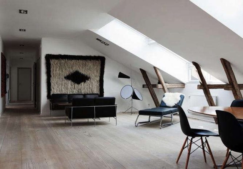
1) Living rooms: instant depth without the cave effect
In a living room, Vining Ivy creates a cozy, collected feelingespecially on a single accent wall behind a sofa or around a fireplace.
Pair it with warm woods (walnut, oak, teak) and you’ll get that “tailored library” vibe even if your bookshelf is 40% novels and
60% board games.
- Best pairing: off-white walls + Vining Ivy accent wall + warm wood + textured neutrals (linen, boucle, wool).
- For a more modern look: black hardware, charcoal accents, and streamlined lighting.
2) Bedrooms: moody, sleep-friendly, and grown-up
Darker blue-greens are popular in bedrooms because they help the room feel calm and tucked-in. Vining Ivy is especially good
behind a bed as a feature wall, or for “color drenching” (walls and trim in the same shade) if you want a boutique-hotel vibe.
- Best pairing: creamy whites, warm beige textiles, and brass accents for a soft luxe feel.
- Tip: add at least one lighter element (headboard, bedding, curtains) so the room stays balanced.
3) Kitchens: cabinet drama that still feels timeless
If you’ve been tempted by colorful cabinetry but fear commitment (same), Vining Ivy is a smart choice because it reads classic.
Use it on lower cabinets with lighter uppers, or on an island for a focal point that doesn’t overwhelm the room.
It plays beautifully with white counters, warm butcher block, and mixed metals.
- Go modern: Vining Ivy cabinets + matte black pulls + white quartz.
- Go warm: Vining Ivy island + brass hardware + natural wood shelves.
- Go traditional: Vining Ivy lowers + cream uppers + classic subway tile.
4) Bathrooms: spa energy, but make it interesting
Blue-green shades naturally support a “water + wellness” theme. Vining Ivy on a vanity, wainscoting, or even a ceiling can make
a bathroom feel curated instead of purely functional. Add white tile and warm lighting, and suddenly your hand soap looks like it
has a skincare routine.
5) Exteriors and front doors: curb appeal with personality
Vining Ivy is also a strong exterior pick, especially as a front door color. It pops against light siding, complements stone and brick,
and looks fantastic alongside landscaping (greens love other greensplants are team players).
Undertones and Lighting: How to Predict What You’ll See
The biggest “surprise” with a blue-green is that it can lean either direction depending on light. That’s not a flawit’s part of the charm.
But you’ll want to test it the right way so you get the vibe you’re paying for.
How Vining Ivy shifts in common lighting scenarios
- North-facing rooms: often cooler; Vining Ivy may lean bluer and moodier.
- South-facing rooms: warmer light; it can read a touch greener and more “botanical.”
- Warm bulbs (2700K–3000K): can pull out richness and deepen the green side.
- Cool bulbs (3500K+): can emphasize the blue and make it feel crisper.
The non-negotiable sampling method (that saves regrets)
- Paint a large poster board (at least 2’ x 2’) instead of a tiny swatch.
- Move it around the roomnear windows, in corners, and on the wall you actually plan to paint.
- Look at it morning, afternoon, and night.
- Compare it next to your trim color and your main furniture pieces.
Tiny swatches lie. Big samples tell the truth. (And yes, this is also life advice.)
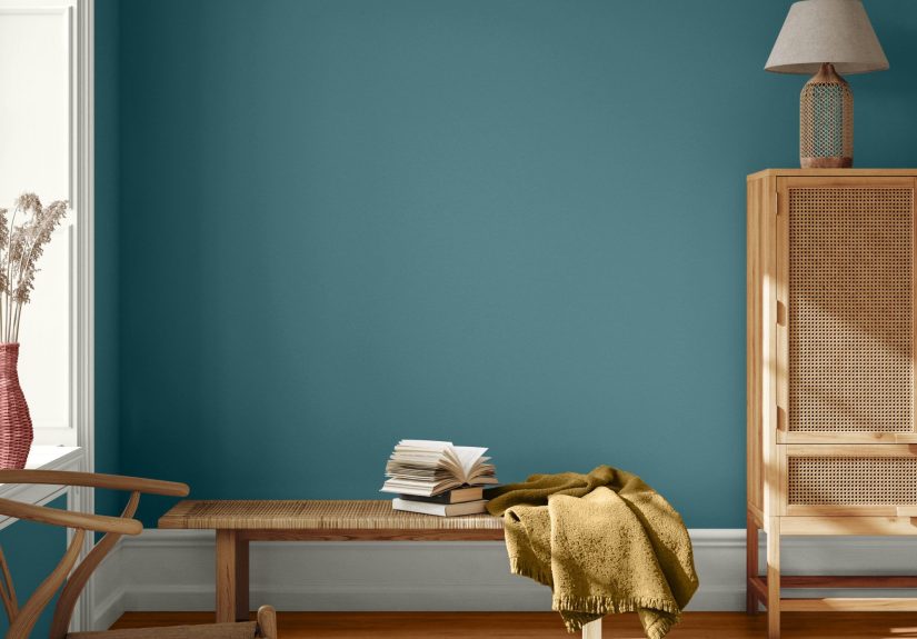
Color Pairings That Make Vining Ivy Look Like a Designer Pick
One reason Vining Ivy earned Color-of-the-Year status is how easily it harmonizes with both warm and cool palettes.
Below are pairing ideassome pulled from coordinated trend palettes, others based on classic color logic that works in real homes.
Palette 1: Natural + cozy (earthy, welcoming, grounded)
- Neutrals: warm off-white, creamy beige, soft stone
- Accents: cognac leather, terracotta pottery, woven baskets
- Metals: aged brass, warm gold
- Works best for: living rooms, bedrooms, reading nooks
Palette 2: Modern + tailored (clean, architectural, slightly dramatic)
- Neutrals: greige, charcoal, crisp white
- Accents: black-framed art, sculptural lighting, glossy ceramics
- Metals: matte black, polished nickel
- Works best for: kitchens, dining rooms, entryways
Palette 3: Playful contrast (bold but balanced)
Want Vining Ivy to look extra intentional? Pair it with a warm counterpointmustard, clay, or sunbaked neutrals.
The contrast makes the teal feel richer without getting cartoonish.
- Try: Vining Ivy + spicy mustard accents + creamy walls
- Or: Vining Ivy + warm clay textiles + light wood
- Works best for: studios, creative spaces, powder rooms
A quick guide to trim colors
- Off-white trim: softer, more organic, slightly vintage.
- Bright white trim: crisp, luxe, higher contrast.
- Color-matched trim: dramatic, immersive, designer-forward.
Finish Choices: The Secret to Making the Color Look “Right”
Vining Ivy can look velvety or sharp depending on sheen. Choose based on the surface and how much durability you need.
- Walls: eggshell or satin for most rooms (satin handles moisture better in baths).
- Cabinets/trim: satin or semi-gloss for durability and wipeability.
- Ceilings: typically flat, unless you’re intentionally going glossy for drama.
Deep colors also benefit from careful prep: patch, sand, dust, and prime as neededespecially if you’re painting over a very light wall
or a glossy surface. A little prep up front keeps your finish from looking streaky or uneven.
Common Mistakes to Avoid (So Your Moody Teal Stays Moody-Chic)
- Painting without testing: blue-green shifts are real. Sample first.
- Using cool lighting everywhere: it can make the room feel colder than intended.
- Skipping contrast: add lighter textiles or trim so the space doesn’t feel heavy.
- Ignoring undertones in fixed finishes: check how it looks next to floors, counters, and tile you aren’t changing.
- Over-accessorizing: Vining Ivy is the star. Let it sing; don’t make it compete with neon throw pillows.
The Takeaway: Why Vining Ivy Still Feels Relevant
Trends come and go, but certain colors stick because they solve a problem. Vining Ivy solves the “I want color, but I want it livable”
dilemma. It’s deep enough to feel special, balanced enough to be versatile, and flexible enough to lean warm or cool depending on styling.
Whether you use it as a front-door flex, an accent wall, or full cabinetry, it’s a confident choice that doesn’t feel like a phase.
Experiences With Vining Ivy: What It’s Like to Actually Live With This Moody Blue-Green (500+ Words)
People often imagine a bold paint color as a single decisionpick the shade, paint the wall, bask in compliments. In real homes, the
experience is more like a mini-season of a TV show: a little suspense, a plot twist involving lighting, and a satisfying finale once you
style it correctly.
A common first experience with Vining Ivy happens at the sampling stage. On a small chip, it can look straightforward“teal, got it.”
But once it’s on a larger board, the personality shows up. In bright daylight, many homeowners notice the color feeling cleaner and bluer,
almost like deep ocean water. Then evening arrives, lamps turn on, and suddenly it leans greener and cozierlike a botanical shade that
belongs near warm wood and soft textiles. That shift can be surprising the first day, then oddly comforting after you live with it a week.
Instead of feeling inconsistent, it starts to feel dynamiclike the room has range.
Another experience people report is how dramatically Vining Ivy changes the “value” of everything around it. Light furniture looks sharper.
Brass or gold accents pop more. Even inexpensive frames and décor can look more intentional because the wall color creates a rich backdrop.
It’s the same phenomenon as putting a simple outfit against a great coatsuddenly the basics look styled. This is why Vining Ivy works so well
behind open shelving, gallery walls, or a headboard: it makes the foreground feel curated without you having to replace every piece you own.
In kitchens, the lived experience is often about balance. People love the “wow” of Vining Ivy cabinets, but the happiest outcomes usually come
when something else stays lightcountertops, backsplash, or upper cabinets. That contrast keeps the room from feeling heavy and prevents the
teal from swallowing the space. Homeowners also tend to notice how forgiving the color is with everyday life: fingerprints and minor scuffs
can be less visually loud on a deeper shade than on bright white. The trade-off is that prep matters moresmooth sanding and a solid primer
make the finish look like cabinetry, not a weekend science experiment.
Bedrooms painted in Vining Ivy often deliver the most immediate emotional payoff. People describe the room feeling quieter, softer, and more
“done” the moment the second coat dries. One practical detail that comes up a lot: curtains and bedding matter more with a dark wall. Light,
textured fabricscreamy quilts, oatmeal linen, soft white sheetskeep the space from reading gloomy. Add one warm element (a wood nightstand,
brass sconce, tan leather bench), and the room usually lands in that sweet spot: moody but welcoming.
For exteriors and front doors, the experience is all about curb appeal confidence. Homeowners often worry a teal will look too playful outside,
but Vining Ivy’s depth keeps it grown-up. In sunlight, it can feel vibrant; in shade, it looks sophisticated and stately. People also love how it
works with landscapinggreens, florals, and natural textures don’t clash; they coordinate. A front door in this shade tends to photograph well too,
which is a small thing until you realize your home is in approximately 400 pictures on your phone.
The most relatable “lesson learned” experience is that Vining Ivy rewards restraint. You don’t need ten competing accent colors. In fact, many
homeowners end up happiest when they treat Vining Ivy as the anchor and keep everything else simple: warm neutrals, natural textures, a few metal
accents, and maybe one contrasting color (mustard, clay, or soft blush) used sparingly. When you do that, the color feels timeless rather than trendy,
and it becomes the backdrop for real lifemovie nights, messy mornings, and all the little moments a good home is supposed to hold.