Table of Contents >> Show >> Hide
- What You’re Drawing (So It Looks Right on Purpose)
- Supplies (Keep It Simple)
- How to Draw a Compass Rose: 12 Steps
- Design Variations (Pick Your Personality)
- Common Mistakes (and Quick Fixes)
- Mini Practice Drills (So the Final One Looks Effortless)
- FAQ
- Sketchbook Stories and Real-World Experiences (About )
- Conclusion
A compass rose is basically a directions “badge” you see on maps and charts that tells you which way is north (and friends).
It’s not actually a flower, although it can be dramatic enough to deserve a vase. The good news: you don’t need fancy
art school secrets to draw one. You just need a little geometry, a steady-ish hand, and the bravery to erase a line you loved.
What You’re Drawing (So It Looks Right on Purpose)
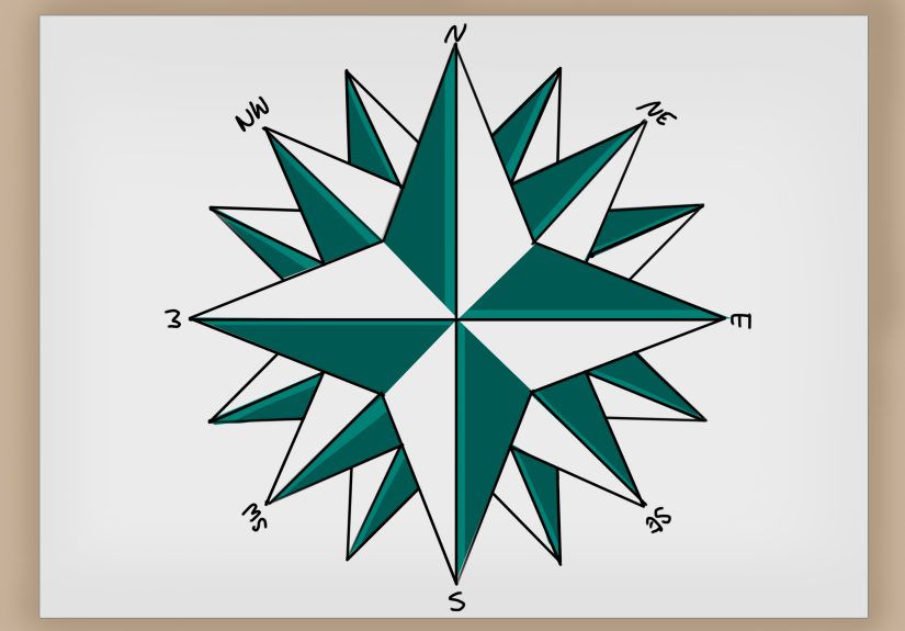
At its core, a compass rose shows cardinal directions (North, East, South, West) and often
intercardinal directions (NE, SE, SW, NW). More detailed versions can add more points, extra rings,
tick marks, or decorative elements. You can keep it simple for a school map, or go full “old-sea-chart energy” with shading,
banners, and a north marker that looks like it has opinions.
Supplies (Keep It Simple)
- Pencil (HB is fine; mechanical pencil helps for clean lines)
- Eraser (kneaded eraser is great, but any eraser works)
- Ruler (or straightedge)
- Compass (the drawing tool, not the “I’m lost in the woods” kindthough both are helpful)
- Fine liner or pen (optional, for inking)
- Colored pencils/markers (optional, for classic nautical color vibes)
How to Draw a Compass Rose: 12 Steps
This method builds a clean, classic 8-point compass rose (with optional upgrades to 16 points). It’s perfect
for maps, posters, journals, or making your geography homework look like it has a travel budget.
- Draw a light circle (your “playground”).
Use your compass to draw a circle about the size you want your compass rose to be. Keep the line lightyou’ll use it as a guide
and you may erase parts later. If you don’t have a compass tool, trace something round (cup, tape roll) and move on like a genius. - Mark the center clearly.
If you used a compass tool, you already have a center point. Darken it slightly (still not too heavy) so your ruler lines have a
target to pass through. - Draw the North–South line.
Use a ruler to draw a straight vertical line through the center, extending to the circle’s edge. This is your main axis.
Don’t label anything yetwe’re still in “construction zone” mode. - Draw the East–West line.
Draw a horizontal line through the center, again reaching the circle. Now you’ve got a plus sign that divides your circle into four
equal parts. Congratulations: you’ve built the skeleton of a compass rose. - Create the diagonal directions (NE–SW and NW–SE).
You can eyeball this at 45 degrees, but a cleaner trick is to “bisect” each right angle:
measure halfway between the vertical and horizontal lines and draw a diagonal through the center. Do this twice so you have an X
layered over the plus sign.At this point, you have 8 evenly spaced spokes (N, NE, E, SE, S, SW, W, NW). That’s the classic base compass rose.
- (Optional) Add 16-point detail by bisecting again.
Want a more detailed look? Bisect each 45-degree angle between spokes to create 16 points. Keep these new lines slightly lighter
than the original 8 spokes so the main directions stay visually “in charge.” - Add a small inner circle (for structure and style).
Draw a smaller circle centered on the same pointabout 1/3 to 1/2 the radius of your big circle. This inner circle helps you create
a layered look and gives you a clean boundary for decorative shapes. - Turn the main four directions into longer “points.”
Make North, East, South, and West slightly longer than the diagonal points. You can do this by extending those four spokes a bit farther
(still within your outer circle) or by drawing slim arrowhead shapes on them.This is a classic design move: it makes the main directions easier to read at a glance.
- Build the compass “petals” (the iconic star look).
For each main direction (N, E, S, W), draw two lines from the tip of that spoke down toward the inner circle, creating a long diamond or
spear shape. Repeat for the diagonal directions with slightly smaller shapes.Keep your shapes symmetrical: if one side leans, the whole compass rose starts looking like it skipped leg day.
- Add tick marks or a ring (optional, but very “chart-core”).
If you want a more technical look, add small tick marks around the outer circle at consistent intervals (every 10 degrees, every 15 degrees,
or simply 8/16 evenly spaced ticks matching your spokes). If you’re drawing this for a map, don’t overdo itclarity beats decoration. - Letter the directions (make North unmistakable).
Add N, E, S, W at the tips of the main spokes. You can also add NE, SE, SW, NW if your design includes them.
Make the N slightly more stylized (or add a small emblem above it) so the viewer’s brain immediately goes, “Ah yes, up is north-ish.”Tip: Use block letters for readability, or a serif style for an antique vibe. Either way, keep it consistent.
- Ink, erase, shade, and finish.
If you’re inking: trace the final lines with a pen, let it dry, then erase your construction lines. Add shading by darkening one side of each
point (pick a single light direction, like “light from the top-left,” and commit to it). Color ideas: alternating warm/cool tones, or classic
red/black with a gold accent.Finally, clean up edges and re-check symmetry. A compass rose is basically geometry wearing fancy clothesclean lines make it look expensive.
Design Variations (Pick Your Personality)
1) Minimal Map Compass Rose
Keep it to 4 or 8 points, label only N, and skip heavy shading. This is ideal for school maps and infographics where readability matters most.
2) Nautical/Antique Style
Use thicker outlines on the main points, add a second ring, and include subtle distressing (tiny breaks in ink lines, light texture shading).
A small banner under the rose with a date or map title can be a nice touchlike your drawing has a passport.
3) Tattoo-Style Compass Star
Make bold, high-contrast shapes with clean, sharp tips. Limit lettering, emphasize symmetry, and consider dot shading (stippling) instead of gradients.
Common Mistakes (and Quick Fixes)
- It looks “tilted.”
Fix: Check that your vertical and horizontal lines are truly perpendicular, and that your center point is actually centered.
- Points aren’t evenly spaced.
Fix: Redo the spokes first. If the spokes are right, the decoration will behave.
- It’s too dark too early.
Fix: Start lighter. Think “blueprint,” not “permanent life decision.” Ink only at the end.
- Letters look wobbly.
Fix: Lightly pencil guidelines for baseline and height, then write. Your future self will thank you.
Mini Practice Drills (So the Final One Looks Effortless)
- 2-minute drill: Draw a circle + 8 spokes + N/E/S/W. Fast and clean.
- 5-minute drill: Add inner circle + diamond points. Focus on symmetry.
- 10-minute drill: Add shading + consistent lettering style.
FAQ
Do I need a compass tool to draw a compass rose?
It helps, but no. Tracing a circle works fine. The real “secret” is evenly spaced spokes and consistent shapes.
Should I make North longer than the other directions?
Usually, yes. Making the main four directions more prominent improves readability and gives the design that classic compass look.
How do I make it look professional?
Clean line weight (thicker outer lines, thinner inner details), consistent symmetry, and a single lighting direction for shading.
Also: erase construction lines fully before you photograph or scan it. Cameras love to expose pencil ghosts.
Sketchbook Stories and Real-World Experiences (About )
If you’ve ever tried drawing a compass rose on a map project the night before it’s due, you already know the first lesson:
the “quick little symbol” has a talent for turning into a whole event. A lot of people start confidentcircle, plus sign, easythen
suddenly they’re negotiating with a diagonal line that refuses to land evenly. That’s normal. In fact, most artists and students
who get good at compass roses didn’t magically develop perfect symmetrythey learned where the drawing usually goes off the rails.
One common experience is discovering that spokes decide everything. People often spend time decorating firstadding arrowheads, shading,
even fancy lettersonly to realize the base angles were slightly off. Then the whole design looks like it’s leaning into a strong wind.
The fix (and the lesson) is to treat the first few steps like setting up a tent: if the poles are crooked, the rest of the camping trip gets weird.
Once you do a few practice roses where you obsess over the center point and the perpendicular lines, you’ll notice your “final” ones suddenly look
cleaner with half the effort.
Another real-world moment: choosing your lettering style. People underestimate how much the letters change the vibe. Block letters feel modern and
“classroom map.” Slightly serifed letters feel antique. Script can look beautiful, but it’s also the fastest way to make your compass rose look like
it’s hosting a renaissance fair. Many artists end up doing a quick alphabet test in the marginjust a tiny N, E, S, Wbefore committing to the final.
That small habit saves a surprising amount of regret.
There’s also the “color confidence” phase. A lot of folks want that classic nautical lookbold reds, deep blues, maybe a gold accentbut then they
freeze because color feels permanent. A practical trick many people use is shading first in graphite, then adding color only to alternating points.
It keeps the design readable even if the colors aren’t perfect, and it makes your compass rose look intentional rather than “I colored it because I had markers.”
Finally, compass roses show up in genuinely different contexts: sketchbook warm-ups, fantasy map-making, geography worksheets, woodworking layouts, even
mural painting where you have to scale the design big enough to stand inside it. The shared experience across all of those is the same:
the best compass roses aren’t the most complicatedthey’re the most consistent. When your angles are even, your line weight is deliberate, and your
north point is easy to spot, your compass rose does its job and still looks cool doing it.
Conclusion
Drawing a compass rose is a satisfying mix of logic and style: start with clean geometry, then dress it up with line weight, lettering, and shading.
Follow the 12 steps, practice the spokes, and you’ll be able to make anything from a simple map symbol to a dramatic nautical centerpiece.
And if one line goes rogue? That’s what erasers are fortiny time machines you can hold in your hand.