Table of Contents >> Show >> Hide
- Table of Contents
- What “Blinking Text” Really Means (and why it’s tricky)
- Why the HTML <blink> Tag Is Dead (and should stay that way)
- Method 1: CSS-Only Blink with Keyframes (the best default)
- CSS Blink Variants: Subtle, Retro, Cursor-Style
- Method 2: JavaScript Blink by Toggling Classes
- Method 3: JavaScript Blink with Controls (Pause, Speed, Respect Users)
- Accessibility & Safety: WCAG flashing rules and reduced motion
- Performance Tips: Blink without burning batteries
- FAQ: Blinking Text (But Make It Safe)
- Conclusion: The modern way to blink (without becoming a meme)
- Bonus: of Real-World Blinking Text Experiences
If you’ve ever wanted blinking text on a webpage, congratulations: you’ve either got a legit UX reason
(status indicators, subtle “new” badges, attention cues) or you’re trying to summon the spirit of 1997.
Either way, we can do thismodern, clean, and not cursed.
In this guide, you’ll learn multiple ways to create a blinking text effect using CSS and JavaScript, why the old
HTML <blink> tag is basically a fossil, and how to keep your blinking from turning into
an accessibility hazard. Because “blink responsibly” should be printed on a t-shirt.
What “Blinking Text” Really Means (and why it’s tricky)
“Blinking text” usually means your text alternates between visible and invisible at a steady rhythm.
On the web, that can be done by changing opacity, visibility, or swapping
a CSS class that hides the element.
The catch: blinking is attention-grabbing by nature, which is exactly why it’s often abused. It can distract,
annoy, and in some cases (if it flashes too rapidly) create serious accessibility problems for people with
photosensitive conditions. So we’ll build blinking that is:
- Modern: standards-based CSS/JS (no deprecated gimmicks).
- Controllable: easy to pause or reduce.
- Accessible: respects “Reduce Motion” and avoids rapid flashing.
Why the HTML <blink> Tag Is Dead (and should stay that way)
The original <blink> tag was a non-standard feature from the early web era.
Modern browsers don’t support it, and standards guidance has moved on. In other words: if you use it,
you’re basically writing fan fiction for browsers.
You might also run into JavaScript’s old String.prototype.blink() method, which wraps a string in
a <blink> element. It’s deprecated toosame problem, different outfit.
So, if you want blinking text today, you’ll do it with CSS animations or JavaScript-driven class toggles.
That way, you control the speed, the styling, andimportantlythe safety.
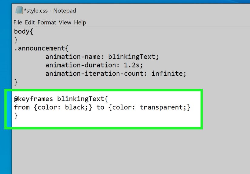
Method 1: CSS-Only Blink with Keyframes (the best default)
For most sites, a CSS animation is the cleanest and most SEO-friendly approach. It keeps behavior predictable,
avoids extra JavaScript, and plays nicely with rendering engines.
CSS Blink Using Opacity
This approach fades the text out and back in. It’s smoother than harsh on/off blinking, and it’s easy to tune.
Pro tip: If you want the layout to stay steady (no “jumping”), opacity is your friend.
The element still takes up space even when it fades out.
CSS Blink Using Visibility (for crisp on/off)
If you want a clean “on/off” blink without fading, animate visibility with stepped timing.
This produces that classic “blink” feelbut remember: subtle is usually better than shouting.
CSS Blink Variants: Subtle, Retro, Cursor-Style
1) “Subtle Nudge” Blink (for notifications)
Want attention without screaming? Keep the element visible most of the time and blink briefly.
2) Retro Terminal Cursor Blink
If you’re building a “terminal” UI, blinking is basically mandatory by law (probably). Use a pseudo-element:
3) Blink Only When It Matters (hover/focus)
If you must blink, consider blinking only on interactionhover or keyboard focusso it’s not constantly
tugging at attention.
Method 2: JavaScript Blink by Toggling Classes
JavaScript blinking is useful when you need conditions: start blinking when a request begins, stop blinking when it ends,
speed up when urgent, slow down when calm (like a caffeine intake chart).
Simple Class Toggle with setInterval
Notice we used opacity again, so the layout doesn’t shift. If you want hard on/off, you could swap
visibility instead.
“Blink while loading” Pattern
This is the classic real-world use: blink while a task is running, stop when it’s complete.
Method 3: JavaScript Blink with Controls (Pause, Speed, Respect Users)
If blinking is part of your UI (alerts, monitoring dashboards, status panels), give people control.
A pause button is tiny effort with huge UX payoff.
A Complete Example: Start/Stop + Speed Control
This pattern is easy to integrate with real states: start blinking when an alert becomes active,
stop blinking when it’s acknowledged.
Accessibility & Safety: WCAG flashing rules and reduced motion
Blinking can be more than annoyingit can be harmful if it flashes rapidly. Accessibility guidance commonly
references a “three flashes per second” threshold. As a practical rule: never blink faster than 3 times per second,
and avoid large high-contrast flashes (especially red-on-white strobe vibes).
Respect “Reduce Motion” with prefers-reduced-motion
Many users enable reduced motion at the OS level. Your site can respect that preference using the CSS media query
prefers-reduced-motion. Translation: “If the user says ‘less motion,’ you say ‘yes, chef.’”
Add a “Pause” option (especially for persistent blinking)
If text blinks automatically and doesn’t stop quickly, give users a way to pause or dismiss it.
This isn’t just “nice”it’s good product design. Blinking that can’t be controlled feels like a pop-up ad that learned CSS.
Test reduced motion in DevTools
You can emulate reduced-motion in browser developer tools (Chrome and Edge have built-in ways to simulate it),
which makes it easy to validate that your animation truly turns off.
Use blinking sparingly and avoid critical info
Don’t make essential instructions “blink-only.” If it’s important, it should still be readable and understandable
even when animation is disabled. Consider pairing blinking with a clear icon, label, or color change (while still keeping contrast accessible).
Performance Tips: Blink without burning batteries
Modern browsers handle CSS animations efficiently, especially when you animate simple properties like opacity.
Still, here are a few ways to keep things snappy:
- Prefer CSS for simple blinking: fewer timers, less JS overhead.
- Avoid blinking dozens of elements: one blinking badge is fine; a blinking paragraph army is not.
- Stop blinking when offscreen: if you’re blinking in a long page, consider pausing when the element isn’t visible.
- Keep timing human-friendly: 600–1200ms often reads as “status” without feeling like an alarm.
Optional: Pause when offscreen (IntersectionObserver)
If you’re using JavaScript blinking and want to be extra considerate, pause the interval when the element scrolls offscreen.
FAQ: Blinking Text (But Make It Safe)
Is there still an HTML tag for blinking text?
Not one you should use. The old <blink> tag is obsolete and unsupported in modern browsers.
The reliable approach is CSS animations (or JS toggles when you need logic).
What’s the best way to blink text in CSS?
A simple @keyframes animation that changes opacity is the most common and smooth option.
It’s readable, flexible, and easy to disable for prefers-reduced-motion.
Is blinking text bad for SEO?
Search engines mostly care about content quality and user experience. A small blinking status badge won’t tank your rankings,
but excessive blinking can increase bounce rates and annoy humanshumans who then leavehumans whose behavior search engines notice.
So: blink like seasoning, not like confetti.
How fast should blinking text blink?
As a safety baseline, avoid anything that flashes rapidly. Keep it well under “strobe” territoryoften around 0.6–1.2 seconds per cycle.
If you’re ever thinking “faster,” ask yourself if you’re building a nightclub.
How do I disable blinking for reduced motion users?
Use @media (prefers-reduced-motion: reduce) to remove or simplify the animation.
Bonus points if you also offer a visible “Pause animations” control for persistent motion.
Conclusion: The modern way to blink (without becoming a meme)
Making text blink on the web is easydoing it well is the part that separates “helpful UI hint”
from “my eyes filed a complaint.” Skip the ancient <blink> tag, use CSS keyframes for simple blinking,
and reach for JavaScript when you need state-based control (start/stop, speed, conditions).
Most importantly: respect reduced motion preferences, keep the blink rate gentle, and give users an escape hatch.
When blinking serves a purpose, it can improve clarity. When it’s decorative chaos, it belongs in a museum exhibit titled
“Early Internet Artifacts: Please Do Not Touch.”
Bonus: of Real-World Blinking Text Experiences
I’ve seen blinking text used in exactly two moods: “this is genuinely helpful” and “someone just discovered animations.”
The helpful version usually shows up in status-heavy interfacesthink dashboards, upload flows, monitoring tools, or a checkout page
that’s waiting on a payment confirmation. In those situations, blinking can act like a little heartbeat: it tells the user,
“Hey, the page isn’t frozen. I’m working on it.” The key is making that heartbeat calm, not caffeinated. When I’ve built
these indicators, the sweet spot was almost always a soft fade, not a harsh on/off strobe, and definitely not something that
blinked like a fire alarm.
One time, a team added blinking to error messages in a form. The idea was “make it obvious,” but the result was that users
fixated on the blinking and missed the actual instructions. We replaced the blink with a steady message, a subtle highlight,
and a clear icon. Complaints dropped immediately. Lesson learned: blinking is attention, but attention isn’t comprehension.
If the text is important, make it readable and structured first. Animation should be the garnishnot the meal.
Another lesson came from performance. A developer (not naming names, but let’s just say it was “someone on the team”)
used a separate setInterval for every blinking element in a listdozens of them. It worked… until the page started
feeling like it was running on a potato. Switching to a CSS animation for most items, and using JavaScript only for the single
“active alert,” fixed it. Browsers are very good at running one animation efficiently. They are less thrilled about managing
a timer parade.
The biggest “grown-up developer” moment, though, was learning to respect reduced motion. Once you add
prefers-reduced-motion support, you start noticing how many sites ignore it. If someone has told their system
“please reduce motion,” it’s not a suggestionit’s a request from a real human who might get dizzy or nauseated from animation.
The first time I tested reduced motion properly in DevTools and watched the page calm down (no parallax, no blinking, no bouncing),
it felt like flipping a “be kind” switch. And the best part? It doesn’t hurt your design. It makes it more resilient.
If you want blinking text to feel polished, here’s the mental checklist I use: Is it temporary? Is it subtle? Can it be paused?
Does it turn off for reduced motion? Does the message still make sense if the blinking is gone? If all answers are “yes,”
your blink is probably doing its job. If not, you’re one step away from reinventing the “under construction” GIFand history
will judge you accordingly.