Table of Contents >> Show >> Hide
- What the Color Wheel Actually Does (And Why It Works)
- Step 1: Start With What You Can’t (Or Won’t) Change
- Step 2: Choose the Mood (Because Color Is Emotional)
- Step 3: Pick a Color Scheme Using the Wheel
- Monochromatic: One Color, Many Depths (The “Grown-Up Easy Button”)
- Analogous: Neighboring Colors That Naturally Get Along
- Complementary: Opposites Attract (Use With a Seatbelt)
- Split-Complementary: The “Most People Should Start Here” Option
- Triadic: Three Colors, Evenly Spaced (Playful but Balanced)
- Tetradic: Two Complementary Pairs (For the Bold and Organized)
- Step 4: Use the 60-30-10 Rule (As a Guideline, Not a Law)
- Step 5: Account for Light (The Sneaky Villain of Paint Choice)
- Step 6: Don’t Ignore Undertones (They’re Running the Show)
- Step 7: Translate the Palette Into Real Room Elements
- Room-by-Room Examples Using the Color Wheel
- Common Mistakes (So You Can Skip the “Why Does This Feel Off?” Phase)
- A Simple “Do This Tonight” Checklist
- Real-World Experiences: What Usually Happens When People Try This
- Conclusion: Make the Color Wheel Your Room’s GPS
If choosing room colors makes you feel like you’re speed-dating 1,700 paint swatches under fluorescent lights, you’re not alone.
The good news: you don’t need a design degree or a mystical “good eye.” You need a simple tool with strong “I’ve got you” energy:
the color wheel.
Used the right way, the color wheel helps you build a palette that looks intentional (not accidental), feels right for the room,
and plays nicely with the stuff you already own. Let’s turn that spinning circle of color into a real-life room plan you can actually use.
What the Color Wheel Actually Does (And Why It Works)
The color wheel is basically a relationship map for colors. It shows which hues are neighbors, which ones are opposites,
and which combinations create harmony versus high drama.
Before you start pairing colors like you’re setting up a rom-com cast, get familiar with a few terms designers use to keep color choices consistent:
- Hue: the “color family” (blue, green, red, etc.).
- Saturation: how intense or muted the color is (neon vs. dusty).
- Value: how light or dark it is (think: pastel sky vs. midnight navy).
- Tint / Shade / Tone: tint = add white, shade = add black, tone = add gray (aka the “make it livable” button).
Step 1: Start With What You Can’t (Or Won’t) Change
The easiest way to avoid color regret is to stop treating the room like a blank canvas when it’s… not.
Most rooms already have “bossy” elements you’re keeping:
- Flooring (wood warmth, tile undertones, carpet color)
- Large furniture (sofa, bed frame, dining set)
- Countertops and cabinets
- A rug or statement art you truly love
Pick one anchor item and identify its main color and undertone. That anchor becomes your starting hue on the color wheel.
If your rug reads as teal but leans green, treat it as a blue-green family color (not pure blue).
Step 2: Choose the Mood (Because Color Is Emotional)
Color doesn’t just “look pretty.” It sets the room’s emotional volume:
- Warm colors (reds, oranges, yellows) feel energetic, social, and cozy.
- Cool colors (blues, greens, purples) feel calm, focused, and airy.
- Neutrals can swing warm or cool depending on undertonesyes, even “simple beige.”
Match the palette to the job of the room. Bedrooms usually want calm. Kitchens can handle pep. Home offices want focus without feeling like a dentist waiting room.
Step 3: Pick a Color Scheme Using the Wheel
Here’s where the color wheel becomes your personal design assistant. Choose one of these classic schemes based on how bold you want to be.
| Scheme | Where It Sits on the Color Wheel | Vibe | Best For |
|---|---|---|---|
| Monochromatic | One hue + its tints/shades/tones | Layered, calm, sophisticated | Bedrooms, minimalist spaces, small rooms |
| Analogous | 2–3 neighboring hues | Harmonious, natural flow | Living rooms, open-concept areas |
| Complementary | Opposites on the wheel | High contrast, lively | Accent-driven rooms, playful spaces |
| Split-Complementary | One hue + the two neighbors of its opposite | Bold but less intense | Most “I want personality, not chaos” rooms |
| Triadic | Three evenly spaced hues | Vibrant, balanced energy | Creative studios, family rooms, kids’ spaces |
| Tetradic (Double Complementary) | Two complementary pairs | Rich, layered, maximal | Eclectic homes, confident decorators |
Monochromatic: One Color, Many Depths (The “Grown-Up Easy Button”)
Pick one hue and use multiple values of it: light on the walls, medium on textiles, deep on accents.
This scheme looks intentional even if you’re new to colorbecause it’s hard for it to clash with itself.
Example: A blue monochrome bedroom: pale misty-blue walls, medium denim bedding, deep navy curtains, and warm wood to keep it from feeling chilly.
Analogous: Neighboring Colors That Naturally Get Along
Analogous schemes use colors that sit next to each other on the wheel (like blue, blue-green, and green).
They feel cohesive because they share common pigments.
The trick is to choose one dominant color and let the others support it. If you treat all three like divas, the room can get visually loud.
Example: A calm living room: blue-green walls, a true green sofa, and blue accents in artplus warm neutral trim to give your eyes a rest.
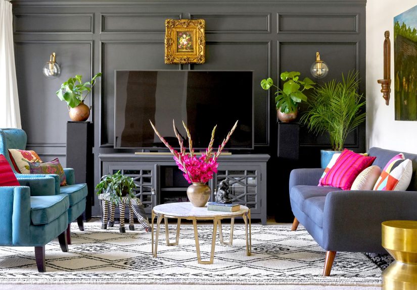
Complementary: Opposites Attract (Use With a Seatbelt)
Complementary colors are opposites on the wheel: blue/orange, red/green, purple/yellow.
This pairing creates strong contrast, which can look incrediblebut can also feel like a competitive sport if both colors are highly saturated.
How to make it livable: keep one color dominant and mute the other, or use one as a small accent.
Example: Navy walls (dominant) + burnt orange pillows and a terracotta vase (accent) = dramatic, warm, and not a circus.
Split-Complementary: The “Most People Should Start Here” Option
Choose a base color, then use the two colors next to its complement. You keep contrast, but it’s friendlier and easier to balance.
Example: If your base is blue, your split complements are yellow-orange and red-orange. Use blue as the main, then add warm accents through art, throws, and decor.
Triadic: Three Colors, Evenly Spaced (Playful but Balanced)
Triadic palettes are energetic and great for rooms that should feel lively.
The key is controlling saturation: choose one color to lead, then soften the other two.
Example: A cheerful family room: muted blue walls, warm red-toned accents in textiles, and soft yellow in lighting or small decor.
Tetradic: Two Complementary Pairs (For the Bold and Organized)
This scheme can look magazine-level richor messydepending on balance. If you try it, lean on neutrals and repeat colors in small doses.
Example: Blue + orange plus green + red accents, anchored with creamy walls and warm wood so the palette feels curated, not crowded.
Step 4: Use the 60-30-10 Rule (As a Guideline, Not a Law)
A classic way to distribute color is the 60-30-10 approach:
- 60% dominant color (walls, large rug, big furniture)
- 30% secondary color (upholstery, curtains, key accent furniture)
- 10% accent color (pillows, art, objects, small decor)
This keeps the room from feeling unbalanced. And yes, you can bend itespecially if you love tonal rooms or want a more layered, modern look.
Think of it like a recipe: measure the first time, then cook with your heart.
Step 5: Account for Light (The Sneaky Villain of Paint Choice)
Light changes color. A shade that looks like “cozy greige” in the store can look like “sad mushroom” at home at 7 p.m.
Before committing, consider:
Room Orientation
- North-facing rooms: cooler, muted light. Warm undertones often feel better.
- South-facing rooms: bright, warm light. Cooler shades can balance the warmth.
- East-facing rooms: warm morning, cooler latertest your color midday and evening.
- West-facing rooms: cooler morning, very warm late-day glowgreat for richer colors.
Light Reflectance Value (LRV) and Why It Matters
Many paint brands provide a Light Reflectance Value (LRV), a rough indicator of how much light a color reflects.
Higher LRV usually reads brighter; lower LRV reads deeper and moodier.
In small or dim rooms, choosing a higher-LRV wall color can help the room feel more openespecially when paired with reflective finishes and smart lighting.
Finish and Reflectivity
Paint sheen affects how color reads. Higher sheen reflects more light and can make colors appear brighter (and show wall imperfections more).
Flat and matte finishes soften light and can make color feel richer and calmer.
Step 6: Don’t Ignore Undertones (They’re Running the Show)
Undertones are the subtle hues underneath the main colorlike a gray that leans blue, green, purple, or warm beige.
Undertones are why “white” can look icy, creamy, pinkish, or slightly green.
To spot undertones:
- Compare paint swatches against a true white sheet of paper.
- Hold swatches next to your flooring, counters, and big furniture.
- View them in morning, afternoon, and evening light.
A simple win: keep undertones consistent across your palette. If your main neutral has warm undertones, choose supporting colors that also lean warm (or intentionally contrast in a controlled way).
Step 7: Translate the Palette Into Real Room Elements
The color wheel gives you relationships. Your job is turning those into surfaces and materials.
Here’s a practical way to assign colors:
Walls
- Choose the dominant color or a softened version of it (tint/tone) for broad appeal.
- If you want bold walls, let furniture and textiles calm things down.
Furniture
- Use the secondary color for larger furniture pieces if you want a layered look.
- Prefer timeless furniture? Keep big pieces neutral and use color on walls and accents.
Textiles (Rugs, Curtains, Pillows)
- Textiles are your safest playground for the accent color.
- Repeat the accent at least 3 times around the room so it feels intentional.
Hard Finishes (Wood, Metal, Stone)
Treat finishes as part of the palette. Warm woods and brass feel friendly with warm palettes.
Cooler grays, chrome, and black often pair well with cooler palettes (and can add crisp contrast to warm rooms).
Room-by-Room Examples Using the Color Wheel
Living Room: Split-Complementary for “Collected, Not Matching”
Start with a base like blue-green (calm but interesting). Then use the two neighbors of its complement as accents (warm oranges and golds).
Add a warm neutral on trim or in a rug to bridge the temperature shift.
Bedroom: Monochromatic for Calm That Still Has Depth
Pick a soft green as the main color, then layer deeper olive and pale sage through bedding, curtains, and artwork.
Add warm wood and creamy whites so it feels cozy, not like a hospital spa.
Kitchen: Complementary Accents That Pop (Without Overstimulation)
Use a neutral foundation (warm white cabinets, light counters), then introduce a complementary pair in small doses:
navy island + brass + a few terracotta accessories can feel bold and polished without turning your kitchen into a sports team logo.
Home Office: Analogous for Focus
Try blue, blue-green, and green in muted tones. This keeps the space cohesive and calm.
Reserve brighter accents (like a pop of coral) for small, energizing momentsdesk accessories or art.
Small Bathroom: Go Dark On Purpose
Small rooms can handle deep color beautifully. A moody navy or forest green can feel luxe and cocooning,
especially when you balance it with reflective elements like mirrors and polished metal fixtures.
Common Mistakes (So You Can Skip the “Why Does This Feel Off?” Phase)
- Using too many saturated colors: choose one bold color, then tone down the rest.
- Forgetting neutrals: neutrals create breathing room and make accent colors look sharper.
- Ignoring undertones: undertones decide whether your palette feels cohesive or chaotic.
- Not testing in the actual room: always sample colors on multiple walls and check them at different times.
- Not repeating accents: one random pop color can look accidentalrepeat it for rhythm.
A Simple “Do This Tonight” Checklist
- Pick your anchor item (rug/art/sofa).
- Identify its main hue and undertone.
- Choose a scheme (monochromatic, analogous, split-complementary, etc.).
- Select 3 colors: dominant, secondary, accent.
- Assign them using 60-30-10 (loosely).
- Test swatches in your room’s lighting (morning + evening).
- Repeat accents at least three times.
Real-World Experiences: What Usually Happens When People Try This
You can understand the color wheel perfectly and still get surprised once paint meets wall. That’s not failurethat’s reality.
Here are common, very normal “real-life” experiences people run into (and how they work through them).
1) “It looked perfect online. In my room it looks… weird.”
This is usually lighting plus undertones doing their favorite magic trick: transformation. A gray that looked soft and warm on a website
can turn icy in a north-facing room, or go yellow under warm bulbs at night. What people learn quickly is to test paint in big patches
on multiple walls, then watch it through the day. Many end up choosing the same hue, just one step warmer/cooler or one step lighter/darker.
The color wheel still helpsbecause it keeps the relationships rightwhile you adjust the exact shade for your space.
2) “I chose complementary colors and now my room feels intense.”
Complementary palettes are powerful. Real homes, however, come with laundry baskets, kids, pets, and the occasional pile of mail.
People often discover that full-strength complementary colors (both highly saturated) feel like visual caffeine. The fix is surprisingly simple:
keep one side of the pair bold and make the other side softer, dustier, or smaller. For example, navy walls with small orange accents
usually feels stylish; navy and bright orange everywhere can feel like a team pep rally. The lesson: contrast is greatjust control the dosage.
3) “My palette works… but something still feels unfinished.”
This is often a repetition problem, not a color-choice problem. In real rooms, a color needs to show up multiple times to feel intentional.
Someone might buy one mustard pillow and wonder why it looks random. Once that mustard repeats in a framed print, a throw, and one small decor object,
suddenly the room feels “designed.” People also learn to spread accents around the roomhigh and lowso the eye moves naturally instead of parking
on one corner like it’s waiting for a ride.
4) “I’m afraid of color, so I went neutral… and now it’s bland.”
The most common real-world shift is realizing that neutral doesn’t have to mean boring. People often gain confidence by using a monochromatic
or analogous scheme in gentle, low-saturation tones: warm whites with soft beiges and caramel accents, or blue-grays with navy and misty blue.
The color wheel helps here by giving structureso even a subtle palette has contrast and depth. Texture becomes the secret weapon too:
linen, velvet, wood grain, woven baskets, and metal finishes add “interest” without needing neon.
5) “Once I picked a scheme, shopping got easier.”
This is the underrated benefit: decision fatigue drops. With a color-wheel plan, people stop buying random cute things that don’t belong together.
They can look at a lamp or artwork and immediately know if it fits the palette. Even better, they can intentionally break the rules:
adding a small “surprise” accent outside the schemebecause the base is cohesive enough to support it.
Conclusion: Make the Color Wheel Your Room’s GPS
The color wheel doesn’t replace personal tasteit organizes it. Start with what you already have, choose a scheme that matches the mood you want,
and balance your palette with real-world factors like lighting, undertones, and how color is distributed in the room.
Do that, and your space won’t just look “nice.” It’ll look like you meant it.