Table of Contents >> Show >> Hide
- Table of contents
- Painted vs. artistic: what changes?
- Prep: the unglamorous secret to gorgeous
- Choosing paint like you mean it
- Artist-level techniques that wow
- Topcoats, wax, and durability
- Mistakes that scream “DIY” (and how to fix them)
- Three specific, high-impact project recipes
- Conclusion
- Experiences: what it feels like to level up (about )
Lots of people paint furniture. Some of them even do it well. But when you see a dresser that looks like it’s wearing a hand-tailored suit
(with shadow lines, crisp edges, and a finish that doesn’t flinch when you set down a cold drink), that’s not just “a makeover.”
That’s a piece with intention. A piece with composition. A piece that quietly whispers, “Yes, I know what undertones areand I’m not afraid to use them.”
This is the difference between “painted” and “art”: an artist doesn’t only change the color. An artist controls the storysurface prep,
sheen, texture, highlights, negative space, hardware choices, and where your eye lands first. If you want results that look custom (not crafty),
keep reading. We’ll cover the pro-level foundation, the artist-level upgrades, and a few “how is this even real?” techniques you can actually do at home.
Table of contents
- Painted vs. artistic: what changes?
- Prep: the unglamorous secret to gorgeous
- Choosing paint like you mean it
- Artist-level techniques that wow
- Topcoats, wax, and durability
- Mistakes that scream “DIY” (and how to fix them)
- Three specific, high-impact project recipes
- Conclusion
- Experiences: what it feels like to level up
Painted vs. artistic: what changes?
Let’s say two people paint the same thrift-store nightstand the same color. One looks “fresh.” The other looks like it belongs in a boutique
where they offer espresso and charge extra for the vibe. What happened?
1) The artist plans the finish, not just the color
Artists think in layers: base color, mid-tone, shadow, highlight, and protective finish. Even if the final look is “simple,” it’s rarely one-note.
A flat coat can be pretty, but controlled variationlike a subtle glaze in corners, or a soft highlight on raised trimcreates depth that your brain reads as “expensive.”
2) The artist controls where your eye goes
A dramatic drawer-front pattern, a painted border that frames the top, or a color-blocked base pulls attention to the best part of the piece.
The goal isn’t to decorate every inch. The goal is to compose: give the eye a place to land, then a path to travel.
3) The artist respects function
A dining chair isn’t a picture frame. High-touch pieces need harder finishes, careful cure time, and strategic sheens.
Artists choose products based on how the furniture will be usednot just how it will look on day one.
Prep: the unglamorous secret to gorgeous
If painting furniture had a caption, it would be: “Prep work did this.” Paint sticks best to clean, dull, lightly abraded surfaces.
If you rush this, the piece may look great… right up until the first time someone’s jeans button kisses the corner and the finish chips like a bad manicure.
Step 1: Clean like you’re mad at the grease
Furniture collects oils, silicone sprays, and mystery grime from a thousand hands. Clean thoroughly, especially around handles and edges.
If water beads on the surface, you’re not done yet.
Step 2: Scuff sand (or degloss) for adhesion
You usually don’t need to sand to bare wood. You need to remove shine and create “tooth.”
Use fine-to-medium grit to dull glossy finishes, then remove dust completely. This is where many projects go wrong:
paint doesn’t bond to dust; it bonds to the surface under the dust. Wipe down carefully.
Step 3: Prime with purpose
Primer isn’t only for raw wood. It’s for problem-solving: blocking tannins, helping paint grip slick surfaces, and preventing stains from telegraphing through.
If your piece is knotty pine, reddish wood, or has unknown history, a good primer is cheap insurance.
Step 4: Lead-paint reality check (especially for vintage pieces)
If you’re working on older, pre-1978 itemsespecially anything that came from older housing stocktreat dust seriously.
Dry sanding old finishes can create hazardous dust. Use containment, clean-up discipline, and the right protective gear.
When in doubt, skip aggressive sanding and consider safer surface-prep options.
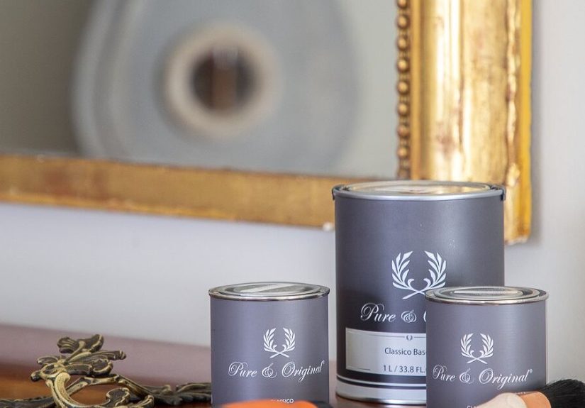
Choosing paint like you mean it
“Best paint for furniture” is like “best shoes.” Best for whatrunning, hiking, or looking amazing while doing absolutely nothing?
Here’s how to pick a paint system based on durability, style, and sanity.
Latex/acrylic: flexible, accessible, and beginner-friendly
Water-based latex (often labeled acrylic-latex) is easy to find, easy to clean up, and comes in endless colors.
It’s a solid choice for low-to-moderate wear piecesthink bookcases, accent tables, and decor furnitureespecially if you protect it well.
Look for low- or no-VOC options for indoor projects, and choose the right sheen for cleanability.
Waterborne alkyd: furniture-grade vibes with a smoother leveling finish
If you want a tougher, smoother result that feels more “factory,” waterborne alkyd enamels are popular for cabinets and trim,
and they can be excellent for furniture too. They tend to level beautifully (fewer brush marks) and cure into a harder finish than standard wall paint.
Translation: less “craft project,” more “custom built-in.”
Chalk-style paint: matte, forgiving, and made for vintage looks
Chalk-style finishes are beloved for distressed and antique aesthetics. They’re often thicker, more matte, and can be easier to manipulate for texture.
The tradeoff? Chalky matte finishes can be less forgiving in high-traffic situations unless you seal them appropriately.
If your goal is “French flea market,” chalk-style paint is your friendjust don’t forget it needs protection.
Spray vs. brush vs. roller: pick your battle
Sprayers can deliver that ultra-smooth cabinet finish, but they require set-up, masking, and a willingness to find paint dust in places you didn’t know existed.
Brushing and rolling are simplerif you use the right tools, don’t overload, and respect drying times.
Artist-level techniques that wow
Here’s the fun part: the “takes an artist” zone. These techniques don’t just recolor furniturethey transform it into a focal point.
You can use one technique as a feature, or combine two for a layered, designer look.
1) Glazing for depth and detail
Glaze is how you turn carved details from “nice” to “museum lighting.” Apply a tinted glaze, then wipe it back so pigment settles into corners,
crevices, and texture. It creates instant dimensionespecially on ornate legs, drawer trim, and routed edges.
Pro tip: work in manageable sections so you can control the wipe-back before it sets.
2) Stenciling that looks custom, not crafty
A stencil can look like a sticker… or it can look like inlay. The difference is restraint and placement.
Consider stenciling only the drawer sides (a surprise detail), a “runner” down a tabletop, or a border inside a cabinet.
Use minimal paint on the brush (almost dry) to avoid bleed, and commit to symmetryor intentionally break it like a designer would.
3) Ombre and gradient blending
Ombre on a dresser is a power moveespecially when it’s subtle. Keep the palette tight: two to three neighboring tones.
Blend while wet with light, sweeping strokes. The goal is a smooth transition, not a striped sunset.
This works beautifully on drawer fronts where each drawer is a step in the gradient.
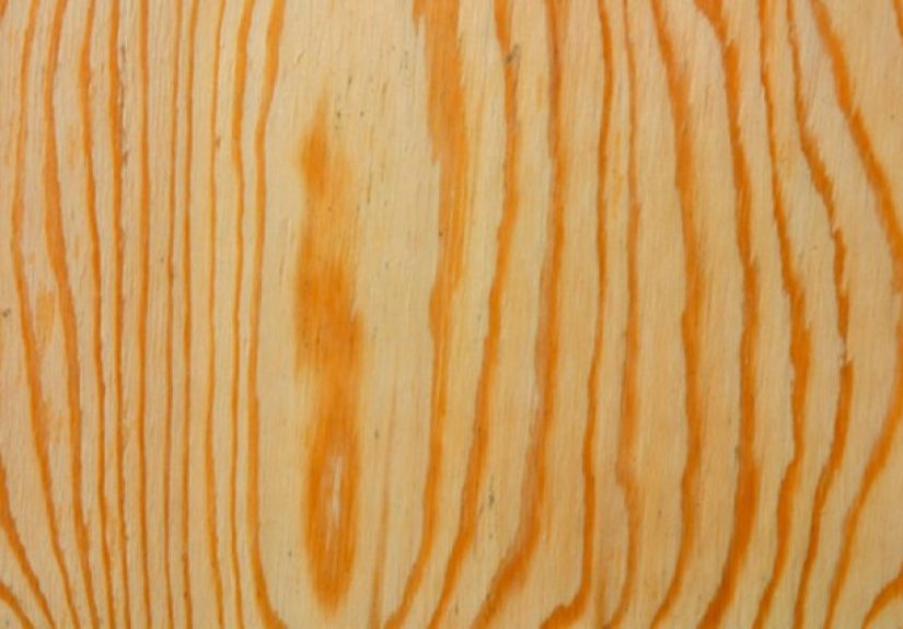
4) Faux woodgrain (yes, on paint)
Faux woodgraining can make laminate or worn surfaces look intentionally rustic or high-end. The key is a base coat plus a tinted glaze layer
that you manipulate with tools (or even a stiff brush) in the direction of “grain.”
Keep the pattern irregularreal wood is never perfectly consistent.
5) Metallic accents and “gilded” moments
You don’t need to turn your entire dresser into a disco ball. Metallics shine best as highlights: edges, carved details, drawer pulls,
or a thin line that frames the top. Think “jewelry,” not “armor.”
6) Trompe l’oeil and hand-painted motifs
This is where you cross into “artist” territory fast: painted florals, geometric linework, faux panels, or even a simple
shadow line that creates the illusion of inset drawers. Start with pencil guidelines, keep your brushes clean,
and practice the pattern once on paper so your furniture isn’t the first draft of your masterpiece.
Topcoats, wax, and durability
Topcoats are your finish’s bodyguard. They protect against scratches, scuffs, spills, and the general chaos of living indoors with humans.
The “right” topcoat depends on the paint type and the look you want.
Water-based clear coats: clear, durable, and great for many projects
Water-based protective finishes are popular because they dry relatively quickly and clean up with soap and water.
Many are designed for furniture and woodwork and help resist everyday wear.
Apply thin coats, avoid over-brushing, and sand lightly between coats if needed for smoothness.
Wax: gorgeous feel, but more maintenance
Wax can look beautiful over matte paints and can create that hand-rubbed, soft finish people love.
But wax can be labor-intensive and may need reapplication over timeespecially on tabletops and chairs.
If you have kids, pets, or a coffee mug that likes to sweat, consider a tougher topcoat for high-use surfaces.
Dry time vs. cure time: the trap everyone falls into
Paint can feel dry and still be fragile underneath. Cure time is when the finish hardens to full durability.
If you stack drawers, reinstall hardware, or put heavy items on a piece too soon, you can imprint the finish and lose that smooth look.
Be patientyour future self will send you a thank-you note.
Mistakes that scream “DIY” (and how to fix them)
Mistake 1: Painting over dust
Fix: Vacuum crevices, wipe down thoroughly, and let the surface fully dry before priming or painting.
Dust is a bond-breaker and a texture-maker (and not the cute kind of texture).
Mistake 2: Overloading the brush
Fix: Use thinner coats. Heavy coats sag, show ridges, and take forever to harden.
Two or three thin coats almost always look better than one thick coat that tries to do it all.
Mistake 3: Ignoring the furniture’s “traffic level”
Fix: Match the system to the use. A decorative console table can handle a softer, matte look.
A kitchen stool needs a tougher enamel and a protective finish that’s built for abuse.
Mistake 4: Rushing recoat and cure times
Fix: Follow the product’s timing guidance, and give the piece time to harden before heavy use.
“Dry to touch” is not “ready for a moving company.”
Three specific, high-impact project recipes
Project A: The “boutique dresser” (soft matte + glaze depth + upgraded hardware)
- Clean thoroughly and scuff sand to dull the sheen.
- Prime if needed (especially if the wood is stain-prone or the finish is slick).
- Paint in a soft, sophisticated tone (warm white, greige, muted green, or smoky blue).
- Add glaze selectively to carved details and corners; wipe back for subtle shadow.
- Protect with a compatible topcoat (especially on the top surface).
- Swap hardware to something intentional (antique brass, matte black, or glass knobs).
Why it works: you’re combining color, dimension, and jewelry. That’s the “artist” trio.
Project B: The “inlay illusion” (stencil done right)
- Paint the piece a solid base color and let it dry fully.
- Stencil only one area: drawer fronts, a tabletop runner, or the inside of door panels.
- Use minimal paint on the brush to avoid bleed; build color slowly.
- Once cured, apply a protective topcoat to unify sheen and protect the design.
Why it works: restraint makes it look like design, not decoration.
Project C: The “faux woodgrain redemption” (laminate or tired wood upgrade)
- Degloss and prime for adhesion.
- Apply a mid-tone base coat (think “light oak” or “warm walnut” base).
- Use a tinted glaze layer and pull “grain” lines with the direction of natural wood.
- Repeat lightly for variation; keep patterns imperfect.
- Seal with a durable, clear protective finish.
Why it works: you’re creating texture and visual movementtwo things flat paint can’t do alone.
Conclusion
Painting furniture is easy. Painting furniture well takes discipline. But painting furniture like an artist?
That’s where prep meets patience, and technique meets taste. Choose a finish plan (not just a color), respect cure time,
and add one intentional “signature” detailglaze depth, a crisp stencil moment, a gradient, or a metallic highlight.
The good news: you don’t need a studio or a beret. You need a system, a little practice, and the willingness to do the “boring” steps
so the “wow” steps can actually shine. And if anyone asks why your nightstand looks like it belongs in a high-end catalog,
you can just shrug and say, “Oh, this old thing?” (Then wink dramatically. Optional, but recommended.)
Experiences: what it feels like to level up (about )
Most people’s first furniture-painting experience starts with optimism and ends with a new respect for the phrase “surface preparation.”
You begin thinking, “This will take an afternoon.” Then you meet the sticky drawer fronts, the glossy topcoat that laughs at your brush,
and the tiny crumbs of sanding dust that teleport into wet paint like they’re auditioning for a close-up.
A very common turning point happens the first time someone paints a piece twice: once “just to cover it,” and a second time with a plan.
The first attempt usually teaches the basicshow far paint goes, how quickly it dries, and how many corners a brush can physically reach
before your patience files for divorce. The second attempt is when things click. You start noticing how lighting changes a color, how a satin finish
forgives more than a glossy one, and how thin coats somehow look richer than thick ones (which feels unfair, but it’s true).
People also tend to remember the first time they wait for a piece to cure properly. It’s rarely because they wanted to.
It’s usually because they didn’t, reinstalled hardware too soon, and discovered that a “dry” drawer front can still accept fingerprints like soft clay.
After that, patience stops being a suggestion and becomes part of the process. Many DIYers even create a “safe zone” where the piece can sit untouched,
because family members have a mysterious urge to test drawers the second you say, “Don’t touch.”
Another shared experience: the thrill of the first “artist move.” For some, it’s glazing a carved detail and watching it pop like a movie reveal.
For others, it’s a stencil that comes out crisp enough to look printed, not painted. And for a brave few, it’s painting a subtle shadow line that tricks
the eye into seeing a panel where none exists. That moment is addictive because it changes how you see furniture: not as a thing you own,
but as a surface you can design.
The funniest part is how your standards change. Early on, a piece that’s “better than before” feels like a winand it is.
But once you experience a truly smooth finish, you start noticing brush marks on everything in the world, like you’ve been cursed with a niche superpower.
You learn to load the brush less, to stop overworking paint, and to step away at the right moment. (Yes, “walk away” is sometimes the best technique.)
Over time, many furniture painters develop a personal style. Some fall in love with soft, historic colors and antique-style wax finishes.
Others lean modern: crisp lines, bold color-blocking, and durable enamels that can survive real life. The point isn’t perfection.
The point is intention. The best experiences aren’t about becoming a “perfect” painterthey’re about making pieces that feel like you,
and learning that an ordinary thrift-store find can become something people ask about the moment they walk into the room.