Table of Contents >> Show >> Hide
- What “Offset” Means Here (and Why That’s Good News)
- Why Fir Green + Gold Works So Well
- Best Rooms for Offset Wallpaper in Fir Green + Gold
- How to Style Fir Green + Gold Without Overdoing It
- Planning the Install: What to Know Before the First Strip Goes Up
- Keeping Gold Foil Looking Good: Care and Cleaning
- Design Recipes: Three Looks That Work Almost Anywhere
- FAQs
- Living With Fir Green + Gold: Real-World Experiences ()
- Conclusion
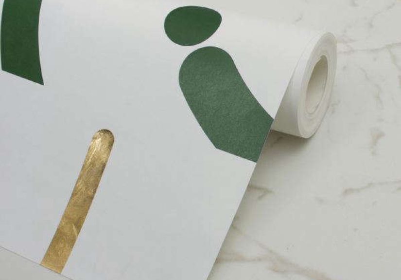
Some walls just want to be walls. Others want to show up to the party wearing jewelry.
Offset Wallpaper in Fir Green + Gold falls confidently into the second category:
a deep evergreen “fir” tone paired with a gold foil shimmer that catches light like it’s flirting with your lamps.
The look is bold but not loudmore “gallery opening” than “neon sign.”
If you’ve been hunting for wallpaper that feels modern, artistic, and a little glam without screaming “I watched one makeover show and now I’m fearless,”
this colorway is a sweet spot. It’s inspired by mid-century abstract art, uses sweeping offset curves with no rigid repeating “center,”
and (bonus) it doesn’t demand that every strip match like a marching band.
What “Offset” Means Here (and Why That’s Good News)
“Offset” is doing double duty. First, it describes the design: curved shapes that feel shifted, layered, and slightly unpredictablelike brushstrokes that decided
rules were optional. Second, it hints at the real-world wallpaper headache you’d love to avoid: obsessive pattern matching.
With this style, the final look is meant to feel organic and custom. According to the maker, the design holds no definitive pattern and can be hung from top or bottom
without wasting papermeaning you’re building an overall composition rather than chasing a perfect repeat.
Translation: fewer “Why does this leaf look like it’s wearing a hat?” moments at the seams.
Quick visual: what you’ll see on the wall
- Fir green reads as a foresty, moody baserich, grounding, and sophisticated.
- Gold foil adds movement because it changes with the angle of light (and your mood, apparently).
- Offset curves give the wall a modern-art energy without feeling cold or overly geometric.
Why Fir Green + Gold Works So Well
Deep green and gold is a classic “luxury pairing” for a reason: green brings calm and depth, while gold adds warmth and polish.
Done right, it reads as timelessthink libraries, boutique hotels, and that one perfectly styled home office that makes you want to start journaling.
Done wrong… it can drift into “holiday card” territory. The trick is balance.
Balance checklist (so it looks intentional, not seasonal)
- Let green be the field and gold be the highlightaccent, not takeover.
- Use creamy neutrals (soft whites, warm beiges) to keep the palette breathable.
- Pick one more supporting color (black, walnut brown, or a muted clay) for depth.
- Repeat metals thoughtfully: one gold mirror + one gold lamp is chic; eight gold objects is a treasure hunt.
Best Rooms for Offset Wallpaper in Fir Green + Gold
1) Powder room: maximum drama, minimum commitment
Powder rooms are the ideal “go big” space because they’re small, contained, and already a little theatrical. Fir green instantly elevates the room,
while gold foil plays beautifully with vanity lights. Pair it with a warm white ceiling, a simple mirror, and a sink that doesn’t look like it came free with a rental.
2) Dining room: moody, candle-friendly, and flattering
Deep green makes dinners feel cozy even when the menu is “cheese and panic.” Gold foil acts like built-in ambience,
especially under warm bulbs or candlelight. Keep furniture lines clean so the wallpaper stays the star.
3) Home office: focused, grounded, and secretly luxurious
Green is often used to create a calm, concentrated vibe. Add gold, and the room quietly says, “Yes, I do have a file system.”
Choose matte black desk hardware or walnut tones to prevent the space from feeling overly shiny.
4) Bedroom: boutique-hotel energy without the checkout time
Use it behind the headboard for an accent wall that feels like a design decision, not a background. Keep bedding simplecrisp whites,
creamy linens, or soft graysand let one or two gold elements echo the foil (think bedside sconce, frame, or drawer pulls).
5) Entryway: instant “this house has taste”
A narrow entry is perfect for bold wallpaper because it’s a pass-through space that benefits from visual punch.
Add a bench, a round mirror, and one plant that you promise you’ll water (we believe in you).
How to Style Fir Green + Gold Without Overdoing It
Choose the right white (yes, whites have personalities)
Fir green looks best with warm whites and creamy off-whites. Stark, icy whites can make green feel harsher,
while warmer whites keep the palette inviting. If you want a crisp contrast, go for a soft neutral that still feels warm under night lighting.
Pick a wood tone: walnut, oak, or painted black
Walnut and medium-to-dark woods make the green feel classic and grounded. Lighter oak brings a modern, Scandinavian softness.
Painted black (frames, furniture legs, shelving) can sharpen the look and keep gold from drifting into “too sweet.”
Decide your metal strategy
- All-in warm metals: brass/gold hardware, warm lighting, creamy textiles.
- Mixed metals: gold foil + matte black fixtures looks modern and intentional.
- Keep it calm: one gold mirror + mostly neutral hardware if you want subtle sparkle.
Lighting matters more than you think
Gold foil changes with light angle and bulb temperature. Warm bulbs (around “cozy” rather than “hospital hallway”)
will make the gold glow. Dimmers are your best friend: they let you dial up drama at night and keep daytime brightness from feeling flashy.
Planning the Install: What to Know Before the First Strip Goes Up
This wallpaper is designed to feel custom once it’s on the wallso give yourself a little planning runway.
The maker lists key specs like 48 cm width and 10 m roll length, plus a large pattern repeat and
no required pattern match. In practice, that means you still measure carefully, but you’re not battling a strict repeat at every seam.
Step-by-step prep (the boring part that makes the pretty part possible)
- Start with a smooth wall. Patch dents, fill holes, and sand so seams don’t telegraph through.
- Clean the surface. Dust and residue can reduce adhesionespecially near kitchens or high-touch areas.
- Prime appropriately. Wallpaper-specific primers help with adhesion and future removal (and your sanity).
- Turn off power to outlets and remove plates for cleaner cuts and safer work.
- Snap or draw a plumb line so the first strip is straight. The first strip decides the fate of the whole wallno pressure.
Measuring tips that save money (and prevent “one-roll short” heartbreak)
Measure wall height and width, then calculate how many vertical strips you need. Because this design doesn’t require a strict match,
you may have less waste than with a traditional repeating patternstill, it’s smart to order a little extra for tricky corners, outlets,
and any future repairs. If you’re buying through a retailer, confirm the roll dimensions and coverage because listings can vary.
DIY or hire a pro?
If you’ve wallpapered before and your walls are smooth, DIY is doableespecially with a design that isn’t strict about matching.
If your walls are textured, your corners are wonky, or you want the gold foil to look flawless under bright lighting,
a professional installer can be worth it. Think of it as paying someone else to handle the “why is this bubbling” stage.
Keeping Gold Foil Looking Good: Care and Cleaning
The maker lists this wallpaper as spongeable/wipeable, but the golden rule (pun fully intended) is:
test first in an inconspicuous spot. Gold foil and specialty finishes can scratch if you go at them like you’re scrubbing a cast-iron pan.
Care routine
- Dust regularly with a soft cloth or a vacuum brush attachment on low suction.
- Spot-clean gently using a slightly damp cloth and mild soap if needed.
- Avoid abrasives, harsh chemicals, and aggressive rubbing (foil finishes don’t like drama).
- Address moisture sources before installation in bathrooms or laundry areas.
Design Recipes: Three Looks That Work Almost Anywhere
Recipe #1: Modern glam powder room
- Offset wallpaper on all walls (small space = big payoff)
- Warm white ceiling + trim
- Simple oval mirror with thin brass frame
- Matte black faucet (yes, mixed metals can be stylish)
- One statement sconce with warm bulb
Recipe #2: Mid-century dining room
- Wallpaper on one focal wall
- Walnut table + chairs with clean lines
- Neutral rug (texture over pattern)
- Art in black frames to echo the green depth
- Dimmable warm lighting for evening glow
Recipe #3: Calm office with “I’m thriving” energy
- Wallpaper behind desk
- Off-white walls elsewhere to keep it airy
- Brass desk lamp to echo the foil
- Natural linen curtains
- One plant you can’t ignore (choose the dramatic one)
FAQs
Is Fir Green + Gold too dark for a small room?
Not necessarily. Dark colors can make small rooms feel cozy and intentional, especially when balanced with light trim and good lighting.
In tiny rooms like powder baths, it often looks more “designer” than “cave.”
Will the gold look yellow?
It depends on lighting. Warm bulbs make gold look richer; cool bulbs can make it feel sharper. Use warm, dimmable lighting to keep it elegant.
Does this wallpaper require fussy pattern matching?
The design is intended to have no definitive pattern and no required match, which can reduce stress and waste.
You still align strips carefully, but you’re not hunting for a perfect repeat every two feet.
Can I use it in a bathroom?
Wallpaper can work in bathrooms if the walls are properly prepped, the space is well-ventilated, and moisture issues are addressed first.
Avoid direct splash zones and follow manufacturer and installer guidance for primers and adhesives.
How do I keep seams from showing?
Start with smooth walls, use a plumb line, don’t stretch the paper, and smooth from the center out.
If the wall has texture, consider skim coating first so the finish looks intentional and crisp.
What paint colors coordinate well with fir green and gold?
Creamy whites, warm greiges, charcoal, and even muted clay tones pair beautifully. The goal is to support the wallpaper, not compete with it.
Living With Fir Green + Gold: Real-World Experiences ()
Here’s what people tend to notice once Offset Wallpaper in Fir Green + Gold moves from “sample swatch” to “hello, entire wall.”
First: the green reads different throughout the day. In bright morning light, it can feel crisp and botanicallike a forest that drinks matcha.
By evening, it deepens into a moodier, cozier green that makes the room feel more intimate. If you’ve ever wished your space could shift
from energetic to calm without you rearranging furniture like you’re in a time-lapse video, this colorway basically does that on its own.
Second: the gold foil is not a constant sparklethankfully. It’s more like a quiet highlight that shows up when the light hits it,
which means guests will notice it in a slow-burn way. You’ll see someone walk in, glance once, then glance again like they’re trying to figure out
why the wall looks expensive. That “is it glowing?” moment is the point. It’s also why lighting matters: warm bulbs and a dimmer switch
turn the foil into a soft shimmer instead of a hard shine.
Third: people almost always underestimate how much easier life is when the pattern isn’t bossy. With a strict repeat,
you can spend ages lining up flowers like you’re solving a botanical puzzle. With this offset, abstract layout, the install tends to feel more forgiving.
Not carelessstill carefulbut forgiving. Many DIYers describe a mental shift from “perfect matching or failure” to “align, smooth, and let the composition happen.”
That’s a healthier relationship than most of us have with our inboxes.
Fourth: it has opinions about clutter. Busy wallpaper can make messy shelves look messier. Fir green + gold is rich enough that it encourages you to edit the room.
People often end up removing a few extra frames, simplifying the tabletop, or swapping a loud patterned rug for something textured and quieter.
In other words, the wallpaper gently bullies you into better styling. In a polite way. Like a friend who says, “Are you sure you need eight throw pillows?”
Finally: the “sample board” experience is real. Many homeowners are happiest when they tape a sample up and test it with their actual lighting,
trim color, and flooring. The green can pull warmer or cooler depending on nearby finishes, and the gold can read more subtle or more noticeable depending
on bulb temperature. The best real-life move is simple: test it, live with it for a couple of days, and watch how it behaves.
That little pause prevents the only decorating regret that truly stingsordering a whole wall’s worth of something you loved for 15 minutes.
Conclusion
Offset Wallpaper in Fir Green + Gold is a confident choice that still plays nicely with real homes. It brings depth like a moody paint color,
adds art-like movement through its offset curves, and delivers a gold-foil finish that feels more “designed” than “decorated.”
If you want a space that looks elevated without feeling overly formal, this is one of those rare wallpapers that does the heavy liftingand looks good doing it.