Table of Contents >> Show >> Hide
- What Wireframe Fidelity Actually Means
- Low Fidelity Wireframes: Fast, Rough, and Surprisingly Powerful
- Mid Fidelity Wireframes: The Practical Middle Ground
- High Fidelity Wireframes: Detailed, Precise, and Close to the Real Thing
- Low vs. Mid vs. High Fidelity Wireframes
- How to Choose the Right Wireframe Fidelity
- Common Mistakes Teams Make with Wireframe Fidelity
- A Smart Workflow: From Low to High Without Losing Your Mind
- Experience Notes: What Teams Learn When Moving from Low to High Fidelity
- Final Thoughts
- SEO Tags
If wireframes are the blueprints of digital design, fidelity is the amount of ink, detail, and dramatic flair you decide to pour into those blueprints. Some wireframes look like they were sketched on a napkin during a coffee-fueled brainstorm. Others look so polished that a stakeholder might ask, “Great, so when does this launch?” That right there is the heart of the conversation around wireframe fidelity.
In UX design, product design, and web design, wireframe fidelity matters because it shapes the kind of feedback you get, the speed of iteration, and the expectations you create. Low fidelity wireframes help teams think about structure, hierarchy, and user flow without getting distracted by colors and shadows. Mid fidelity wireframes add more clarity around interface patterns and content placement. High fidelity wireframes bring the experience closer to the final product, making it easier to test details, explain intent, and hand off work to developers.
Here is the big truth: higher fidelity is not automatically better. It is simply more detailed. In many cases, the smartest move is to stay rough for as long as possible, then increase fidelity when the team has earned it. Think of it like cooking. You do not start with the garnish. You start by making sure the meal is edible.
What Wireframe Fidelity Actually Means
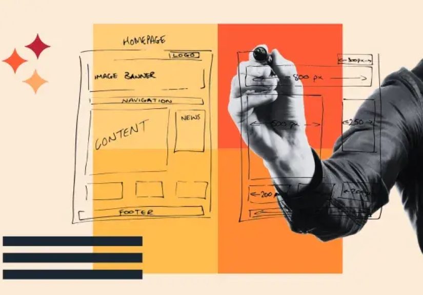
Wireframe fidelity refers to how closely a wireframe resembles the eventual digital product. That resemblance can show up in several ways: visual detail, realistic content, UI components, spacing, branding, and sometimes limited interactivity. In practical terms, fidelity answers a simple question: How finished does this design appear?
Low fidelity wireframes are intentionally simple. They often use boxes, lines, placeholder text, and basic labels. Their job is to capture the skeleton of a page or screen. Mid fidelity wireframes add more accurate layout decisions, recognizable interface elements, and clearer copy. High fidelity wireframes move closer to mockups, often incorporating real content, branded typography, accurate spacing, and interface states that look nearly production-ready.
One important nuance in the UX design process is that teams sometimes blur the line between a high fidelity wireframe and a prototype. A wireframe is usually a static representation of structure and layout. A prototype adds interaction, even if that interaction is limited. In everyday product work, though, people often use the terms loosely. That is why it is helpful to focus less on labels and more on purpose. Ask what the artifact is supposed to do, not just what somebody named it in a meeting.
Low Fidelity Wireframes: Fast, Rough, and Surprisingly Powerful
Low fidelity wireframes are the scrappy heroes of early-stage design. They are simple by design and useful because of that simplicity. A lo-fi wireframe might be a paper sketch, a whiteboard concept, or a digital outline made with grayscale blocks and minimal styling. It does not try to impress anyone visually. It tries to answer the big questions before the expensive questions arrive.
What low fidelity wireframes are best for
Low fidelity wireframes shine when you are exploring ideas, mapping user flows, validating information architecture, or aligning a team around page structure. They are ideal for kickoff workshops, early stakeholder reviews, discovery projects, and fast internal collaboration. Because they are lightweight, they invite change. Nobody feels guilty editing a rectangle. Everybody feels weird about editing a polished design that already looks expensive.
Advantages of low fidelity wireframes
The biggest advantage is speed. Designers can create multiple variations quickly, which makes comparison easier and discussion healthier. Lo-fi work also reduces emotional attachment. When an interface looks rough, feedback tends to stay focused on layout, task flow, and feature priority rather than button radius and font drama. That makes early feedback more strategic.
Limitations of low fidelity wireframes
Low fidelity wireframes can confuse people who struggle to visualize the final result. Some stakeholders need more detail before they can react meaningfully. Lo-fi wireframes may also hide issues related to content density, visual hierarchy, and interaction nuance. A checkout flow that looks perfectly logical as a few boxes on paper may become messy once real form labels, legal copy, and error states enter the room carrying chaos.
Mid Fidelity Wireframes: The Practical Middle Ground
Mid fidelity wireframes do not always get the same spotlight as low fidelity and high fidelity wireframes, but they are often where the real design work becomes useful. A mid-fi wireframe keeps the visual style restrained while adding more realistic structure. Buttons look like buttons. Cards look like cards. Navigation begins to resemble the final system. Copy becomes more specific. Spacing becomes intentional instead of hopeful.
This level is especially useful when the team has agreed on the broad direction but still needs to refine behavior, hierarchy, and usability. Mid fidelity wireframes help bridge the gap between concept and commitment. They let teams test whether a dashboard feels scannable, whether a pricing page communicates value clearly, or whether a mobile onboarding flow is asking for too much too soon.
Why mid fidelity often saves projects
Mid fidelity wireframes are excellent for internal reviews, content planning, feature prioritization, and collaborative problem-solving across product, design, and engineering. They are detailed enough to expose friction, but not so polished that every conversation turns into a debate about gradients. If low fidelity wireframes ask, “What belongs here?” mid fidelity wireframes ask, “Does this actually make sense?”
In many teams, mid-fi is the stage where reality starts tapping the design on the shoulder. Empty placeholder boxes are replaced with actual headlines, realistic data, and interface patterns. That is when designers discover that a card layout looked elegant until the title became twice as long, the pricing disclaimer appeared, and the user had to compare five plans instead of two. Mid fidelity wireframes are where optimism meets screen size.
High Fidelity Wireframes: Detailed, Precise, and Close to the Real Thing
High fidelity wireframes are detailed representations that closely resemble the final product. They often include real content, brand typography, near-final spacing, clear component states, and visual cues that make the interface feel real. Depending on the team, a high fidelity wireframe may overlap with a mockup or become part of an interactive prototype.
When high fidelity wireframes are worth the effort
High fidelity work is most valuable when the team needs realistic feedback. That could mean usability testing before development, sign-off from leadership, demonstration to clients, or handoff to engineers. At this stage, details matter. The difference between a visible link and a subtle text button can change behavior. The order of form fields can affect completion rates. The exact placement of an error message can decide whether a user feels guided or punished.
Strengths of high fidelity wireframes
High fidelity wireframes reduce ambiguity. They help stakeholders understand the intended experience without requiring much imagination. They are also useful for validating micro-level decisions such as visual hierarchy, component consistency, content length, and responsive behavior. For developers, high fidelity artifacts can make implementation smoother because spacing, states, and priorities are clearer.
Limitations of high fidelity wireframes
The downside is time. High fidelity wireframes take longer to create and update. They also invite cosmetic feedback earlier than some teams need. That can be a problem when foundational questions are still unresolved. A polished interface can accidentally create false confidence, making people believe the design is further along than it really is. In plain English, shiny files can trick a room into skipping important conversations.
Low vs. Mid vs. High Fidelity Wireframes
| Fidelity Level | Typical Look | Main Focus | Best Stage | Biggest Risk |
|---|---|---|---|---|
| Low Fidelity | Sketches, boxes, labels, grayscale layouts | Structure, flow, hierarchy, rough concepts | Discovery and early ideation | Too vague for some audiences |
| Mid Fidelity | Cleaner layouts, clearer components, realistic content | Usability, organization, interaction logic | Refinement and cross-functional review | Can fall into limbo if teams never commit |
| High Fidelity | Near-final visuals, detailed spacing, branded UI | Validation, presentation, handoff, precision | Late design and pre-build testing | Too much polish too early |
How to Choose the Right Wireframe Fidelity
Choosing the right fidelity is less about preference and more about uncertainty. The more uncertainty you have, the lower your fidelity should usually be. If the team still does not know what content belongs on the page, whether the navigation should be top or side, or whether the feature is even necessary, there is no point creating a beautiful high fidelity screen. That is like framing a house before you decide where the doors go.
Use low fidelity wireframes when exploring concepts, comparing layouts, or getting fast input on user journeys. Use mid fidelity wireframes when the product direction is set but the experience still needs refinement. Use high fidelity wireframes when you need realistic validation, stronger stakeholder confidence, or a cleaner developer handoff.
A good rule of thumb is this: match fidelity to the question you need answered. If the question is broad, stay rough. If the question is precise, increase detail. If the question is, “Should the dashboard lead with tasks or analytics?” low fidelity is enough. If the question is, “Can users find the export function in under five seconds on desktop and mobile?” then higher fidelity is probably the smarter move.
Common Mistakes Teams Make with Wireframe Fidelity
1. Going high fidelity too early
This is the classic trap. Teams fall in love with polished screens before they have validated the basic structure. The result is often expensive rework and a suspicious number of “minor tweaks” that are somehow very major.
2. Staying low fidelity for too long
The opposite problem also happens. Teams keep sketching forever and never move into detail. At some point, rough layouts stop being efficient and start hiding real problems. Content, responsive behavior, and interaction states need more than doodles.
3. Using the wrong artifact for the audience
Executives, clients, developers, and users do not all react the same way to the same deliverable. Some can interpret a lo-fi wireframe easily. Others need more context. Good teams tailor the fidelity level to the audience without losing control of the process.
4. Confusing wireframes with prototypes
A static wireframe can explain layout. It cannot fully test interaction. If the team wants to evaluate task completion, click behavior, or transition logic, they may need a prototype rather than a prettier wireframe.
A Smart Workflow: From Low to High Without Losing Your Mind
The best UX workflows usually move through fidelity in stages. Start with low fidelity wireframes to explore possibilities and remove bad ideas cheaply. Move into mid fidelity wireframes to pressure-test layout, content, and component choices. Then use high fidelity wireframes or prototypes to validate the details that matter before build.
For example, imagine a team designing a mobile banking app. In low fidelity, they sketch the account overview, transfer flow, and bill-pay entry points. In mid fidelity, they refine labels, information hierarchy, and screen order. In high fidelity, they add realistic balances, branded styles, error states, and tappable interactions so users can complete tasks in testing. Each stage answers different questions, and that is exactly why the progression works.
The goal is not to produce more files. The goal is to reduce risk with the smallest amount of design effort necessary at each moment. Good fidelity choices save time, sharpen feedback, and keep teams from polishing the wrong thing.
Experience Notes: What Teams Learn When Moving from Low to High Fidelity
One of the most common experiences in product design is realizing that each level of wireframe fidelity changes not just the design, but the conversation around the design. In low fidelity sessions, people tend to talk about direction. They ask whether the navigation makes sense, whether the home screen is too crowded, or whether a feature should exist at all. These are healthy early questions. The roughness gives people permission to think big, challenge assumptions, and suggest alternatives without feeling like they are vandalizing finished work.
Once teams move into mid fidelity wireframes, the tone changes. The conversation becomes more practical. Suddenly, people notice that the filter panel needs clearer labels, the account summary needs a better hierarchy, or the search results page needs room for edge cases. Mid fidelity work often reveals the awkward truth that a flow that looked simple in a sketch becomes far more complicated when real content appears. This is the stage where teams usually discover that copywriting, content strategy, and UX design are roommates whether they like it or not.
Then comes high fidelity, and with it, a very human reaction: people assume the design is almost done. That can be good or bad. It is good because realistic screens help users and stakeholders respond to the experience more naturally. It is bad because polished visuals can make unresolved product decisions look settled. Many teams have experienced a meeting where everyone complimented the design, only to discover later that no one had actually discussed the broken flow hiding underneath the attractive interface. A pretty screen can be a charming liar.
Another repeated experience is that fidelity affects confidence. Low fidelity gives teams the confidence to explore. Mid fidelity gives them the confidence to refine. High fidelity gives them the confidence to commit. Problems happen when a team expects one level of confidence from the wrong artifact. A lo-fi wireframe will not reassure a nervous client who needs to picture the final brand experience. A high-fi screen will not help much if the team is still unsure whether the feature solves the right user problem.
Teams also learn that increasing fidelity too fast often leads to wasted effort, while increasing it too slowly creates fuzzy decision-making. The sweet spot is moving up in fidelity when the current artifact can no longer answer the next important question. That is the practical lesson many experienced designers carry from project to project. Fidelity is not decoration. It is decision support. When used well, it helps teams think clearly, collaborate honestly, and build products that work better for real people. When used poorly, it creates expensive theater with nice typography.
Final Thoughts
The differences in wireframe fidelity matter because each level serves a different job in the design process. Low fidelity wireframes help teams think. Mid fidelity wireframes help teams refine. High fidelity wireframes help teams validate and deliver. None of them is universally superior. The right choice depends on what you need to learn, who needs to understand it, and how much ambiguity still exists.
If there is one lesson worth remembering, it is this: do not use a fancy artifact to answer a rough question, and do not use a rough artifact to answer a precise one. Great UX teams move from low to high fidelity with purpose, not ego. They know when to sketch, when to structure, and when to polish. And that is usually the difference between a design process that feels sharp and one that feels like a group project directed by panic.