Table of Contents >> Show >> Hide
- Why This Creative Studio Kitchen Look Feels So Fresh
- The Signature Palette: Gray, Light Wood, and Red
- Materials That Make the Room Feel Collected, Not Generic
- How the Layout Does the Heavy Lifting
- Lighting: The Difference Between “Nice Kitchen” and “Where Did You Get This Look?”
- Open Shelving, But Make It Disciplined
- How to Recreate This Showroom Kitchen Style at Home
- Common Mistakes to Avoid
- Why This London Showroom Kitchen Look Has Staying Power
- Living With the Look: The Experience of a Creative Studio Kitchen
- Conclusion
If most kitchens are the practical shoes of the home, this one is the practical shoe that somehow also made it onto a fashion week street-style roundup. The London showroom kitchen that inspired this look is compact, artistic, and gloriously self-possessed. It does not scream for attention with glitter cannons or fifty pendant lights the size of moons. Instead, it wins the room with control: warm wood, moody gray, flashes of red, stainless steel, clean-lined lighting, and a tiny dining setup that suggests someone here drinks coffee thoughtfully and owns at least one ceramic bowl that costs more than your first toaster.
That is exactly why this look works so well. It blends showroom polish with everyday livability. It feels curated, but not uptight. It looks creative, but it still appears ready to make soup on a Tuesday. In other words, it is the kind of kitchen design that makes you want to cook something rustic and photogenic, even if your usual signature dish is cereal.
In this guide, we are breaking down how to recreate the feel of a creative studio kitchen in a London showroom, using smart design principles, small kitchen ideas, and a few personality-packed details. Whether you are remodeling from scratch or simply trying to coax more style out of a hardworking kitchen corner, this is a look worth stealing.
Why This Creative Studio Kitchen Look Feels So Fresh
The magic of this style is not just in what it includes, but in what it avoids. There is no overdecorating, no trend-chasing panic, and no cold minimalist sterility. Instead, the room feels layered and human. It borrows some of the best ideas from modern kitchen design, small-space planning, and gallery-like styling, then ties them together in a way that feels quietly dramatic.
A creative studio kitchen works because it treats the kitchen as part workspace, part social hub, and part visual composition. That means every surface matters. The lighting is not just functional; it shapes mood. The table is not just where you eat; it becomes a sculptural anchor. The materials do not compete; they collaborate. Gray sets the tone, light wood softens it, stainless steel sharpens it, and red arrives like the punchline of a very stylish joke.
There is also a subtle residential quality to the whole setup. Rather than reading like a sterile showroom display, it feels like an apartment someone genuinely inhabits. That is the real lesson here: a beautiful kitchen should not look staged for a robot. It should look ready for real life, just edited by someone with excellent taste.
The Signature Palette: Gray, Light Wood, and Red
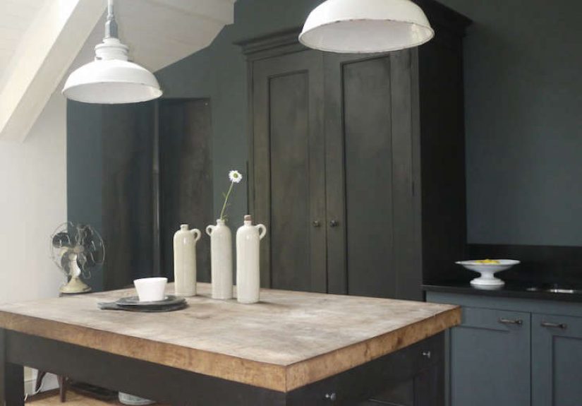
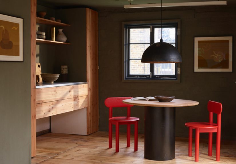
If you want to steal this look without getting lost in the weeds, start with the color palette. The foundation is soft gray. Not a chilly office gray. Not a “we forgot to choose a color” gray. Think of a warm, atmospheric gray that acts like a neutral backdrop while still carrying emotional weight. It gives the kitchen an artful seriousness without making it gloomy.
Next comes light wood, which is the peacekeeper of the palette. Pale oak, ash, birch, or a similar wood tone keeps the space from leaning too industrial or too severe. Wood introduces warmth, texture, and a subtle organic quality. In a compact kitchen, that matters. Hard surfaces alone can make a small room feel overly sharp. Wood softens the whole composition and keeps it inviting.
Then comes red, the rebel in the room. But this is not a red-on-every-wall situation. A creative studio kitchen uses red in a controlled way: chairs, art, a vessel, a lamp, or one small accent that gives the scheme energy. The red works best when it feels deliberate and concentrated, like lipstick with an otherwise simple outfit. One swipe, and suddenly the whole thing has confidence.
That balance is what makes the palette so effective for a modern showroom kitchen. Gray creates calm, wood adds warmth, and red brings pulse. Together, they feel sophisticated, slightly unconventional, and much more interesting than an all-white kitchen trying to survive on good lighting alone.
Materials That Make the Room Feel Collected, Not Generic
Stainless steel for edge and utility
Stainless steel is one of the defining materials in this look, and it earns its place. It gives the kitchen a workshop sensibility, which is exactly what makes the space feel “studio” rather than simply “pretty.” A stainless countertop or work surface looks crisp, practical, and slightly industrial in the best way. It reflects light, pairs beautifully with wood, and signals that this kitchen can do more than pose for photos.
That said, stainless steel looks best when it is not doing a solo act. Pair it with warm cabinetry, hand-thrown ceramics, or textured walls so it reads intentional rather than commercial. You want “creative atelier,” not “back room of a sandwich shop.”
Wood for warmth and rhythm
Light wood should appear somewhere meaningful: cabinet fronts, dining furniture, shelving, stools, or flooring. The point is to create rhythm. A single wood element can feel like an afterthought. Repeating the tone across a few surfaces makes the kitchen feel cohesive and settled.
Ceramics, art, and objects with a pulse
One reason the showroom kitchen feels special is that it is styled like a lived-in creative space. That means accessories are not random filler. A bulbous ceramic vessel, a stack of bowls in a chalky glaze, or a piece of art leaning nearby tells the eye that this is a place with personality. The goal is not clutter. The goal is curation. There is a difference, and your countertop knows it.
How the Layout Does the Heavy Lifting
This style thrives in compact kitchens because it understands scale. Instead of forcing in an island the size of a compact car, it uses a small dining table or compact surface to create flexibility. That is one of the smartest takeaways from the showroom kitchen: a petite table can function as prep zone, coffee spot, meeting corner, and casual dining area all at once.
In a studio-style kitchen, multifunctional design is everything. A one-wall kitchen can feel richer with a freestanding table. A galley kitchen can feel less tunnel-like with a visually light dining setup at the end. A small corner kitchen can become more sociable with seating that does not dominate the room. The message is simple: choose fewer, better pieces that can do more than one job.
If your kitchen is tiny, resist the urge to cram every square inch with cabinetry. Sometimes what makes a room feel high-end is strategic restraint. An open corner, a visible table leg, or a floating shelf can give the eye a place to rest. That breathing room is part of the look.
Lighting: The Difference Between “Nice Kitchen” and “Where Did You Get This Look?”
Lighting is where many otherwise good kitchens wander off the path. A single bright overhead fixture can make a beautifully designed room feel like a dental exam. A creative studio kitchen needs layered lighting. That means ambient light for the room, task light where work happens, and at least one decorative source that adds mood.
A linear pendant, a sculptural ceiling fixture, or slim wall lighting works especially well here because the overall design language is clean and architectural. Under-cabinet lighting can quietly improve function without visually cluttering the room. And if you have the counter space, a small lamp in a corner can make the entire kitchen feel more residential and inviting.
This is one of those design moves that sounds minor until you see it in action. Then suddenly the space looks warmer, calmer, and far more intentional. Lighting, frankly, is the kitchen’s publicist. It can make everything else look better.
Open Shelving, But Make It Disciplined
Open shelving suits this aesthetic because it brings airiness and display potential to a small kitchen. It also helps blur the line between kitchen and studio, since shelves can hold both practical items and decorative pieces. But this only works if you treat the shelf as a composition, not a lost-and-found bin.
Keep the contents edited. Use a limited palette. Repeat materials. Mix bowls, cups, jars, and one or two artful objects. Leave negative space. If you style open shelves well, they look collected and effortless. If you style them badly, they look like you were interrupted mid-unpacking.
If you love the look but not the maintenance, use one short run of open shelving rather than replacing every upper cabinet. That gives you the visual softness without sacrificing all your hidden storage. The best small kitchen ideas are rarely extreme. They are just clever.
How to Recreate This Showroom Kitchen Style at Home
1. Start with the walls
Choose a warm gray, putty, clay, or muted taupe-gray paint. Extend it to trim or window frames if you want a more immersive, custom feel. This instantly sets the tone and makes the room feel more considered.
2. Introduce pale wood
Bring in light wood through cabinet fronts, a table, stools, or shelving. Even one excellent oak or ash dining table can shift the whole mood toward creative studio rather than generic rental.
3. Add a red accent with restraint
Pick one or two red notes only. Dining chairs, a pendant, a framed print, or a lacquered tray can do the trick. The power is in the contrast, not the quantity.
4. Use metal strategically
Stainless steel, brushed nickel, or matte metal hardware helps sharpen the room. You do not need a full commercial-grade kitchen. A metal countertop section, a clean faucet, or a steel shelf can be enough.
5. Create a real dining moment
Even a small kitchen benefits from a place to pause. A compact round or softly shaped table makes the room feel residential and social. It tells guests, “Yes, you may sit here,” which is much friendlier than forcing them to hover near the refrigerator.
6. Style with art, not just kitchen stuff
One of the most charming things about this look is that it does not confine itself to standard kitchen decor. Add artwork, ceramics, books, or sculptural objects. This makes the space feel connected to the rest of the home and less like a zone built only for chopping onions.
Common Mistakes to Avoid
Too much red: A little red is magnetic. Too much and the room starts shouting.
Cold gray paint: The wrong gray can make your kitchen feel flat and lifeless. Always test warm-toned options first.
No visual softness: If every surface is hard, straight, and metallic, the kitchen can feel severe. Add wood, ceramics, textiles, or rounded forms.
Overloaded shelves: Open shelving is not a witness protection program for clutter.
All task, no mood: Functional lighting matters, but a stylish kitchen also needs atmosphere.
Why This London Showroom Kitchen Look Has Staying Power
Trends come and go, often in dramatic fashion. One minute everyone wants ultra-white minimalism; the next, every room is trying to look like a countryside pantry with opinions. What gives this creative studio kitchen style longevity is that it is rooted in principles rather than gimmicks. It values warmth, restraint, usefulness, and personality. Those ideas do not age badly.
It also reflects how people actually want to live now. Kitchens are no longer hidden work rooms. They are social, visual, and often multifunctional. They host coffee, work calls, quick dinners, long chats, and late-night fridge investigations. A kitchen that can support all that while still looking artful is not just trendy. It is smart.
If you love spaces that feel curated but livable, modern but warm, artistic but grounded, this is a kitchen look worth borrowing from with both hands.
Living With the Look: The Experience of a Creative Studio Kitchen
What makes this style so compelling is not only how it photographs, but how it feels to move through. A creative studio kitchen has a kind of low-key theater to it. Morning light hits the gray walls differently than evening light. The wood looks honeyed at breakfast and softer by dusk. A red chair in the corner feels almost quiet at noon and suddenly dramatic at night. The whole room changes personality across the day without ever feeling unstable. It just feels alive.
That matters more than people admit. A kitchen is not a static object. It is a backdrop for routine. You enter half-awake, hunt for coffee, rinse vegetables, answer texts, lean on the counter, and maybe stare into the middle distance while waiting for pasta water to boil. In a room that has been designed thoughtfully, those ordinary moments feel better. Not transformed into cinema, exactly, but upgraded from “functional blur” to “pleasant ritual.” That is no small thing.
A studio-style kitchen is especially good at encouraging that ritual because it invites a slightly slower pace. The small dining table says sit down for five minutes. The open shelf says choose the good bowl, not the sad chipped one from the back. The art on the wall says this room is not just for utility; it is part of your creative life. Even if your creativity currently peaks at arranging toast attractively, the room is rooting for you.
There is also a wonderful psychological trick in the way this style balances work and softness. Stainless steel and clean lines make you feel organized, capable, and maybe even like the kind of person who labels spices. Meanwhile, warm wood, ceramics, and layered lighting keep the room from becoming strict. The result is a kitchen that feels competent without becoming cold. You can cook seriously in it, but you can also linger.
For people in smaller homes, this experience becomes even more valuable. When every square foot counts, beauty is not a luxury add-on. It is part of how a space earns its keep. A tiny kitchen that feels intentional can improve the mood of an entire apartment. It can make entertaining less awkward, daily tasks less annoying, and compact living less compromise-heavy. Instead of apologizing for the size of the room, the design reframes it as intimate, smart, and full of character.
That is ultimately the emotional appeal of stealing this look. You are not copying a showroom to impress strangers on the internet. You are building a kitchen that feels edited, personal, and rewarding to inhabit. A room where materials have texture, colors have mood, and the smallest details carry some charm. A room that works hard without looking exhausted. A room that feels like someone creative lives there, even on the days when dinner is just eggs and whatever cheese is left in the drawer.
And really, that may be the highest compliment a kitchen can get: it makes ordinary life feel a little more composed, a little more beautiful, and a lot less like you are losing a daily battle against clutter, bad lighting, and random plastic packaging.
Conclusion
A creative studio kitchen in a London showroom offers a master class in compact, character-rich design. By pairing warm gray walls with light wood, stainless steel, restrained red accents, layered lighting, and a real dining moment, you can create a kitchen that feels artistic and practical at the same time. It is not about copying every detail. It is about borrowing the atmosphere: thoughtful, edited, welcoming, and just a little bit bold. Steal the spirit of the look, and your kitchen will feel less like a utility zone and more like the most interesting room in the house.