Table of Contents >> Show >> Hide
- What Is a Scatter Plot?
- When Should You Use a Scatter Plot?
- How to Make a Scatter Plot: 10 Steps
- Step 1: Start With a Clear Question
- Step 2: Choose Two Numerical Variables
- Step 3: Collect Paired Data
- Step 4: Clean and Organize Your Data
- Step 5: Decide Which Variable Goes on Each Axis
- Step 6: Set a Useful Scale
- Step 7: Plot Each Data Pair as a Point
- Step 8: Add a Clear Title, Axis Labels, and Units
- Step 9: Look for Patterns, Direction, Strength, and Outliers
- Step 10: Add a Trendline When It Helps
- How to Interpret a Scatter Plot
- Common Mistakes to Avoid
- Example: Making a Scatter Plot From Realistic Data
- Best Practices for Better Scatter Plots
- Experience-Based Tips for Making Scatter Plots That Actually Help
- Conclusion
A scatter plot is one of those graphs that looks simplejust a bunch of dots hanging out on a gridbut it can reveal surprisingly useful stories. Want to know whether more study time is connected with higher test scores? Whether advertising spend rises with sales? Whether daily temperature has anything to do with ice cream sales? A scatter plot is your friendly little data detective.
In plain English, a scatter plot shows the relationship between two numerical variables. Each dot represents one paired observation. One value goes on the horizontal x-axis, the other goes on the vertical y-axis, and the pattern of dots helps you see whether the variables move together, move in opposite directions, or seem to have no clear relationship at all. No magnifying glass requiredalthough dramatic detective music is optional.
This guide explains how to make a scatter plot in 10 practical steps, whether you are drawing one by hand, building one in Excel or Google Sheets, or preparing a chart for a school project, business report, research assignment, or blog post. You will learn how to choose variables, organize your data, plot points accurately, interpret patterns, add a trendline, and avoid common chart mistakes.
What Is a Scatter Plot?
A scatter plot, also called an X-Y plot or scatter chart, is a graph used to compare two sets of numerical data. The x-axis usually shows the independent or explanatory variable, while the y-axis usually shows the dependent or response variable. For example, if you want to explore whether hours studied affect exam scores, “hours studied” would typically go on the x-axis and “exam score” would go on the y-axis.
The goal is not simply to make a pretty chart. The goal is to see a relationship. A scatter plot can show a positive association, a negative association, no obvious association, clusters, unusual points, curved patterns, or a possible linear trend. In other words, it helps you notice things a table of numbers may hide like a raccoon in a garage.
When Should You Use a Scatter Plot?
Use a scatter plot when you have two numerical variables and want to understand how they relate. Scatter plots are especially helpful in statistics, science, business analytics, marketing, education, quality control, finance, and health research.
Good scatter plot examples include height and weight, study hours and test scores, temperature and electricity use, age of a car and resale value, website traffic and conversions, or daily exercise minutes and resting heart rate. A scatter plot is less useful when your data is mostly categories, such as favorite colors, product types, or yes/no survey answers. In those cases, a bar chart or pie chart may be a better choice.
How to Make a Scatter Plot: 10 Steps
Step 1: Start With a Clear Question
Every good scatter plot begins with a question. Without a question, you are just tossing dots onto a grid and hoping they become meaningful. Start by asking what relationship you want to investigate.
For example, instead of saying, “I want to graph student data,” ask, “Is there a relationship between hours studied and exam scores?” Instead of saying, “I want to chart sales,” ask, “Do higher advertising costs relate to higher monthly revenue?”
A clear question helps you decide which variables to use, how to label your axes, and what pattern to look for after the chart is created.
Step 2: Choose Two Numerical Variables
A scatter plot needs two numerical variables. Each dot represents a pair of values. If you only have one numerical variable, you may need a histogram. If you have categories, you may need a bar chart. Scatter plots shine when both variables are numbers.
Suppose your question is whether more study time leads to better exam performance. Your two variables could be:
- X variable: Hours studied
- Y variable: Exam score
The x variable is often the one you think may influence or explain the other variable. The y variable is often the outcome you are measuring. This is not always a strict rule, but it is a helpful starting point.
Step 3: Collect Paired Data
Scatter plots depend on paired data. That means each x value must match the correct y value. If Student A studied 2 hours and scored 72, those two numbers belong together. Accidentally mixing pairs is like putting someone else’s shoes on your dog: confusing, uncomfortable, and not scientifically helpful.
Here is a simple example:
| Student | Hours Studied | Exam Score |
|---|---|---|
| A | 1 | 62 |
| B | 2 | 70 |
| C | 3 | 74 |
| D | 4 | 83 |
| E | 5 | 88 |
In this example, each student produces one point on the scatter plot. Student A becomes the point (1, 62), Student B becomes (2, 70), and so on.
Step 4: Clean and Organize Your Data
Before making a scatter plot, check your data for errors. Look for missing values, duplicate rows, impossible numbers, inconsistent units, and accidental text in number columns. A single typo can make your chart look like your data had too much coffee.
For example, if most exam scores range from 60 to 95 but one score is entered as 870, that is probably a data entry mistake. If some study times are recorded in minutes and others in hours, convert them to the same unit before plotting.
A clean table should have one row per observation and separate columns for each variable. Spreadsheet tools such as Excel and Google Sheets work well for this because they can quickly turn two numeric columns into a scatter chart.
Step 5: Decide Which Variable Goes on Each Axis
The horizontal axis is the x-axis, and the vertical axis is the y-axis. In many scatter plots, the x-axis shows the variable you control, choose, or suspect may explain the change. The y-axis shows the result or outcome.
For a scatter plot about advertising spend and revenue, advertising spend would usually go on the x-axis, while revenue would go on the y-axis. For a chart about temperature and ice cream sales, temperature would usually go on the x-axis, and ice cream sales would go on the y-axis.
If your variables do not have a clear cause-and-effect relationship, choose the arrangement that makes the chart easiest to understand. The goal is clarity, not winning an axis debate at Thanksgiving dinner.
Step 6: Set a Useful Scale
A scatter plot needs scales that fit the data. Choose axis ranges that include all points without squeezing them into a tiny corner. If study hours range from 0 to 10, an x-axis from 0 to 10 makes sense. If exam scores range from 50 to 100, a y-axis from 50 to 100 may be useful.
Be careful with scales that exaggerate or hide patterns. If the axis range is too wide, the points may look flat and meaningless. If it is too narrow, small differences may look overly dramatic. A good scatter plot tells the truth without putting a megaphone in front of one dot.
Step 7: Plot Each Data Pair as a Point
Now it is time to add the dots. Each row in your data table becomes one point on the graph. The first number tells you where to move horizontally, and the second number tells you where to move vertically.
If your data pair is (3, 74), move to 3 on the x-axis and then up to 74 on the y-axis. Place a dot there. Repeat this for every row. If you are using Excel, Google Sheets, Tableau, or another visualization tool, the software will do the plotting for you after you select the correct columns and choose a scatter chart.
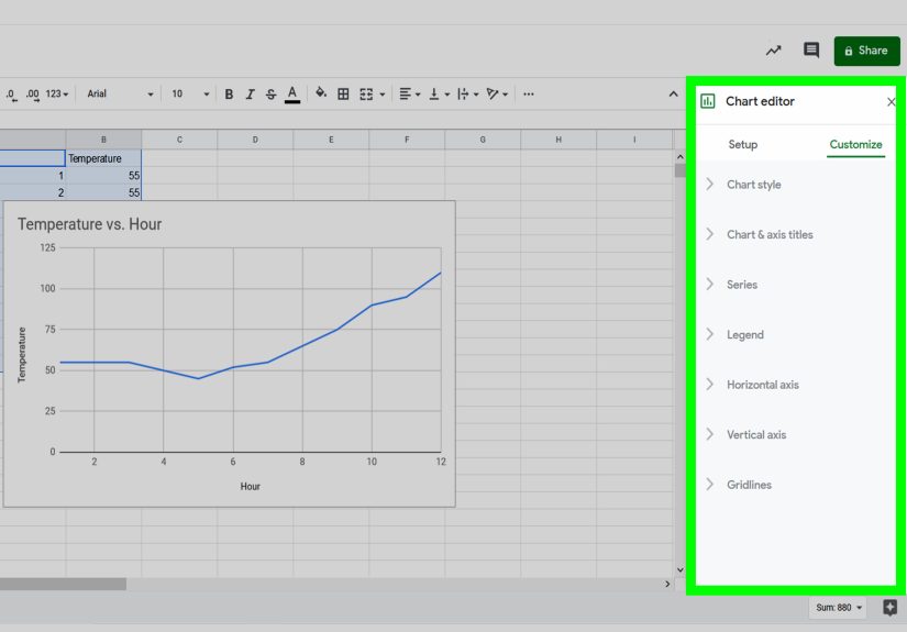
In Excel, the basic process is to select the two numeric columns, go to the Insert tab, choose X Y Scatter, and select a scatter chart style. In Google Sheets, you can select the data, insert a chart, and change the chart type to a scatter chart from the Chart editor.
Step 8: Add a Clear Title, Axis Labels, and Units
A scatter plot without labels is a mystery novel with the last page missing. The viewer may see dots, but they will not know what the dots mean.
Give your chart a specific title. Instead of “Scatter Plot,” write “Hours Studied vs. Exam Score.” Label the x-axis “Hours Studied” and the y-axis “Exam Score.” If units matter, include them. For example, “Advertising Spend ($)” or “Temperature (°F).”
Good labels make your scatter plot readable on its own. A person should understand the chart without needing you to stand beside it giving a dramatic TED Talk with a laser pointer.
Step 9: Look for Patterns, Direction, Strength, and Outliers
Once the dots are plotted, study the pattern. Scatter plot interpretation usually focuses on four major features: direction, form, strength, and outliers.
Direction tells whether the relationship is positive, negative, or unclear. A positive relationship means y tends to increase as x increases. A negative relationship means y tends to decrease as x increases. No clear relationship means the dots do not show an obvious upward or downward trend.
Form describes the shape of the pattern. The dots may form a straight-line pattern, a curve, clusters, or no meaningful shape.
Strength describes how closely the points follow a pattern. If the dots are packed tightly around a line, the relationship is strong. If they are spread widely, the relationship is weaker.
Outliers are points that sit far away from the general pattern. Outliers are not automatically “bad,” but they deserve attention. They may reveal an error, a special case, or an important exception.
Step 10: Add a Trendline When It Helps
A trendline, also called a line of best fit, can help summarize the overall direction of a scatter plot. If the points roughly follow a straight pattern, a linear trendline can make the relationship easier to see.
Many tools can add trendlines automatically. Excel, Google Sheets, Tableau, and other data visualization platforms allow users to add trendlines to scatter charts. Some tools also offer linear, polynomial, exponential, logarithmic, or power trendline options.
However, do not add a trendline just because the button exists. If the relationship is curved, a straight line may oversimplify the data. If the points are completely scattered with no clear pattern, a trendline may give the false impression that something meaningful is happening. A trendline should clarify the story, not invent one.
How to Interpret a Scatter Plot
Positive Correlation
A positive correlation happens when both variables tend to increase together. For example, if more study hours are generally linked with higher test scores, the dots will slope upward from left to right.
Positive correlation does not prove that one variable causes the other. It only shows that they tend to move together. More study time may help scores, but sleep, teaching quality, prior knowledge, and test difficulty may also matter.
Negative Correlation
A negative correlation happens when one variable increases while the other tends to decrease. For example, as the age of a car increases, its resale value may decrease. The dots would slope downward from left to right.
Negative correlation is common in economics, health, engineering, and everyday life. More miles driven may relate to lower car value. More screen brightness may relate to shorter battery life. More forgotten leftovers in the fridge may relate to stronger mysterious smells. Science is everywhere.
No Clear Correlation
Sometimes the dots look random. That means there may be no obvious relationship between the two variables, at least based on the data you collected. For example, shoe size may not have a meaningful relationship with favorite pizza topping, unless your data comes from a very unusual pizza shop.
Common Mistakes to Avoid
Using a Scatter Plot for the Wrong Data
Scatter plots are designed for numerical pairs. If your data is mostly categories, a scatter plot may confuse readers. Use the chart type that matches the data, not the one that looks fanciest.
Forgetting to Label the Axes
Axis labels are not decoration. They are essential. Without labels, readers cannot understand what the chart represents. Always include variable names and units when needed.
Assuming Correlation Means Causation
This is the classic scatter plot trap. Two variables can move together without one causing the other. Ice cream sales and swimming accidents may both rise in summer, but buying a vanilla cone does not magically summon a pool noodle emergency. A third factor, such as hot weather, may influence both.
Ignoring Outliers
Outliers can change how a trendline looks. They may also point to valuable insights. Instead of deleting outliers immediately, investigate them. Ask whether they are data errors, unusual but valid observations, or signals of something important.
Example: Making a Scatter Plot From Realistic Data
Imagine you run a small online store and want to know whether monthly advertising spend is related to monthly sales. Your data might look like this:
| Month | Advertising Spend ($) | Sales ($) |
|---|---|---|
| January | 500 | 4,800 |
| February | 700 | 5,600 |
| March | 900 | 6,300 |
| April | 1,100 | 7,200 |
| May | 1,300 | 8,000 |
To make the scatter plot, put advertising spend on the x-axis and sales on the y-axis. After plotting the points, you may notice an upward pattern. That suggests a positive relationship: months with higher advertising spend also tend to have higher sales.
But be careful. This chart alone does not prove that advertising caused the sales increase. Maybe the store also launched a new product, improved its website, or ran a holiday promotion. A scatter plot helps you ask better questions; it does not answer every question by itself.
Best Practices for Better Scatter Plots
Keep your scatter plot clean and focused. Use simple markers, readable labels, and an honest scale. Avoid unnecessary 3D effects, heavy gridlines, distracting colors, or decorative elements that make the chart harder to read.
If you have groups in your data, consider using different colors or marker shapes. For example, a scatter plot of height and weight could use different colors for age groups. A business chart could use different markers for product categories. Just make sure the legend is clear.
If you have many overlapping points, transparency or smaller markers may help. If the chart contains thousands of observations, consider using density plots, hexbin charts, or interactive tools. The best chart is the one your audience can understand quickly.
Experience-Based Tips for Making Scatter Plots That Actually Help
After working with scatter plots in school assignments, spreadsheets, dashboards, and data reports, one lesson becomes obvious: the chart is only as useful as the question behind it. The biggest mistake beginners make is opening a spreadsheet, selecting two columns, clicking “scatter chart,” and hoping the dots produce wisdom. Sometimes they do. Sometimes they produce what looks like a sneeze on graph paper.
The better approach is to begin with a practical reason. Ask yourself, “What decision could this chart help me make?” If you are a student, maybe the chart helps explain a science experiment. If you are a marketer, maybe it helps compare ad spend and conversions. If you are a teacher, maybe it helps show how attendance relates to performance. When the purpose is clear, the scatter plot becomes much easier to design and interpret.
Another useful habit is to preview the data before charting it. Look at the minimum and maximum values. Sort the columns. Check for missing numbers. Scan for values that look impossible. This small step can save a lot of embarrassment. Nothing ruins a polished report faster than a chart where one data point flies into outer space because someone typed 5000 instead of 50.
Axis labels also deserve more respect than they usually get. A label like “Revenue” is okay, but “Monthly Revenue ($)” is better. “Time” is vague, but “Study Time per Week (Hours)” is clear. The reader should not have to guess what the chart means. Good labels are like good road signs: boring, useful, and deeply appreciated when you are lost.
In real projects, outliers are often the most interesting part of the scatter plot. A strange point may reveal a data entry error, but it may also reveal a hidden opportunity or risk. For example, if one month had low advertising spend but unusually high sales, you might investigate whether a viral post, referral campaign, or seasonal event caused the spike. Outliers are not always troublemakers. Sometimes they are the data’s way of raising its hand.
Trendlines are helpful, but they should be used with judgment. A line of best fit can summarize a pattern beautifully when the dots form a roughly linear shape. But if the data curves, clusters, or spreads wildly, a straight line may oversimplify the story. Before adding a trendline, ask whether it makes the chart clearer. If the answer is no, leave it out. A chart does not become smarter just because it has more buttons clicked.
Finally, remember that a scatter plot is a conversation starter. It can suggest a relationship, highlight a pattern, or expose a surprise. It can help you explain data in a way people can see immediately. But it should be paired with context, common sense, and, when needed, deeper statistical analysis. Think of a scatter plot as the friendly opening chapter of a data storynot the entire book.
Conclusion
Learning how to make a scatter plot is a valuable skill because it turns paired numerical data into a visual story. In 10 steps, you can move from a basic question to a clear, useful chart: define your purpose, choose two numerical variables, collect paired data, clean your table, assign axes, set scales, plot points, label the chart, study the pattern, and add a trendline when it improves understanding.
The best scatter plots are simple, honest, and easy to interpret. They help readers see direction, form, strength, clusters, and outliers without drowning them in unnecessary decoration. Whether you are working in Excel, Google Sheets, Tableau, or by hand, the same core idea applies: each dot tells part of the story, and the overall pattern helps you understand the relationship between two variables.
Use scatter plots wisely, avoid confusing correlation with causation, and do not ignore unusual points. Do that, and your scatter plot will be more than a cloud of dotsit will be a clear, practical tool for exploring data and making better decisions.