Table of Contents >> Show >> Hide
- Why Color Coordination Matters
- 1. Use a Monochromatic Color Scheme for a Clean, Cohesive Look
- 2. Pair Analogous Colors for Easy, Natural Harmony
- 3. Use Complementary Colors for Bold, Controlled Contrast
- 4. Build a Triadic Palette for Balanced Energy
- How to Make Any Color Scheme Work Better
- Common Color Coordination Mistakes to Avoid
- What to Choose If You’re Not Sure
- Experiences That Show How Color Coordination Really Works
- Conclusion
Color coordination sounds simple until you’re standing in front of a paint wall, holding twelve swatches, questioning your life choices, and wondering why “soft beige” somehow looks purple. The good news is that coordinating colors is not magic, and it is definitely not reserved for professional designers who wear dramatic black glasses and say things like, “This room needs more tension.”
In real life, good color coordination comes down to a few tried-and-true methods. Once you understand how colors relate to one another, choosing paint, fabrics, furniture, and accents gets much easier. Better yet, your rooms, outfits, graphics, or DIY projects begin to look intentional instead of accidentally assembled during a power outage.
This guide breaks down four of the most useful ways to coordinate colors, plus practical tips for making each method work in the real world. We’ll also cover undertones, balance, lighting, and the little details that separate a polished palette from a “something went very wrong in aisle seven” situation.
Why Color Coordination Matters
When colors work together, everything looks calmer, cleaner, and more pulled together. That does not mean everything has to match like a hotel lobby from 2004. It means your dominant color, secondary color, and accent shades should relate to one another in a way that feels balanced.
Color coordination affects mood, too. Warm tones such as reds, oranges, and yellow-based neutrals tend to feel cozy, energetic, and welcoming. Cool tones such as blues, greens, and blue-based grays often feel soothing, crisp, and airy. Even neutrals have personalities, which is why one white looks soft and creamy while another feels almost icy.
Once you understand the structure behind color relationships, you can stop guessing and start designing with confidence.
1. Use a Monochromatic Color Scheme for a Clean, Cohesive Look
A monochromatic color scheme uses one base hue in different tints, shades, and tones. In plain English, that means you pick one color family and then vary how light, dark, or muted it appears.
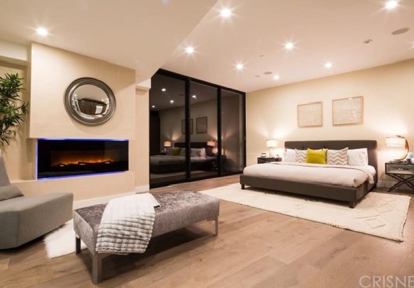
Think navy, dusty blue, and pale sky blue. Or sage, olive, and soft eucalyptus. Because every shade comes from the same family, monochromatic palettes feel naturally coordinated. They are especially useful when you want a room or design to feel calm, elegant, and low-stress.
When monochromatic works best
This method is ideal for bedrooms, bathrooms, reading nooks, minimalist spaces, and anywhere you want a relaxed atmosphere. It also works well if you are nervous about color because it removes a lot of the guesswork.
How to keep it from looking flat
The biggest risk with a monochromatic palette is sameness. If every item is the exact same value and finish, the result can feel bland. The fix is to vary texture and contrast. Pair matte walls with glossy tile. Add linen, wood, velvet, leather, woven baskets, or metal finishes. Let one version of the color go darker for depth and another go lighter for breathing room.
For example, a green monochromatic room might include pale sage walls, olive curtains, a deep forest chair, a natural oak table, and cream textiles to break up the green without ruining the harmony. The result feels layered instead of sleepy.
Monochromatic schemes are a smart choice when you want color coordination that whispers instead of shouts.
2. Pair Analogous Colors for Easy, Natural Harmony
An analogous color scheme uses colors that sit next to one another on the color wheel. Blue, blue-green, and green are a classic example. So are yellow, yellow-orange, and orange.
This is one of the easiest ways to coordinate colors because neighboring hues naturally share visual DNA. They create flow without feeling repetitive, which makes them great for both home interiors and everyday styling. If monochromatic is the quiet cousin, analogous is the charming one who knows how to host brunch.
Why analogous palettes feel so comfortable
Because the colors are closely related, they do not fight for attention. The effect is harmonious, relaxed, and often inspired by nature. Think ocean tones, fall leaves, desert sunsets, or garden greens. Nature rarely throws random color tantrums, and that is part of why analogous palettes feel so right.
How to use analogous colors well
Choose one color to lead, one to support, and one to accent. This is where the 60-30-10 idea becomes useful. Let the dominant color take up most of the visual space, the secondary color support it, and the third color add small pops of interest.
For instance, in a living room you might use soft blue on the walls, blue-green in curtains or upholstery, and green in plants, pillows, or artwork. In a wardrobe, you might combine rust, terracotta, and golden mustard. In both cases, the palette feels coordinated without looking too obvious.
Analogous colors are excellent when you want a space or composition to feel colorful but still restful.
3. Use Complementary Colors for Bold, Controlled Contrast
Complementary colors sit opposite each other on the color wheel. Blue and orange, red and green, and yellow and purple are the classic pairs. These combinations create high contrast and strong visual energy.
Now, before you panic and picture a room that looks like a sports mascot exploded, remember this: complementary color schemes work best when one color takes the lead and the opposite color appears in measured doses.
Why complementary colors work
Opposites create tension, and good design often depends on controlled tension. A blue room feels more vivid when it includes warm orange or cognac accents. A soft green kitchen comes alive with blush, rust, or red-toned accessories. Complementary schemes feel dynamic because each color makes the other appear more intense.
How to avoid visual chaos
Use one color as the main player and the other as an accent. You can also soften the contrast by choosing muted or dusty versions instead of fully saturated ones. Navy and burnt orange feel more sophisticated than bright royal blue and traffic-cone orange. Sage and burgundy often feel richer than crisp green and fire-engine red.
Neutrals help, too. White, cream, tan, greige, charcoal, black, and wood tones act like peacekeepers. They give complementary colors room to breathe and keep the palette from turning into an argument.
This method is perfect when you want personality, drama, and a palette that feels alive without being impossible to live with.
4. Build a Triadic Palette for Balanced Energy
A triadic color scheme uses three colors that are evenly spaced around the color wheel. The traditional examples are red, yellow, and blue, or orange, green, and purple. Triadic palettes are lively, balanced, and flexible, but they require more discipline than monochromatic or analogous schemes.
The reason triadic color coordination works is that no single color is naturally closer to the others. The visual balance is built into the structure. That said, using all three colors at equal strength is often too much. Unless your goal is “daycare mural with espresso,” you should still choose a dominant color.
How to make triadic colors feel sophisticated
Start with one main color, then use the second and third colors in smaller doses. The palette becomes far more usable when you mute the tones or mix them with neutrals. A triadic room might feature a soft clay wall, olive textiles, and dusty lavender accents rather than bright orange, green, and purple everywhere at once.
Triadic palettes shine in creative spaces, children’s rooms, eclectic interiors, branding projects, and anywhere you want cheerful energy with structure. They can feel playful, artistic, and memorable without becoming messy.
If you love color but still want a system, triadic coordination gives you both freedom and guardrails.
How to Make Any Color Scheme Work Better
Pay attention to undertones
This is the part people skip, and then they wonder why their beige sofa hates their gray walls. Every color has an undertone. A white may lean yellow, blue, pink, or gray. A gray may feel warm and taupe-based or cool and blue-based. If your colors share compatible undertones, the palette feels intentional. If they clash, the room can look off even when the main colors seem close on paper.
Use the 60-30-10 rule
This guideline is popular for a reason. About 60 percent of the visual field should be your dominant color, 30 percent your secondary color, and 10 percent your accent. It is not a law carved into marble, but it is a very helpful starting point when a palette feels unbalanced.
Consider lighting before you commit
Light changes everything. North-facing spaces often read cooler, which can make already cool colors feel colder. South-facing rooms usually bring warmer, brighter light. The same paint can look soft in the morning, flat at noon, and dramatic at night. Always test swatches in the actual space and view them at different times of day.
Use texture to support color
Even a great palette can feel dull if every surface has the same finish. Texture adds dimension. Wood warms up cool palettes. Metal adds contrast. Fabric softens sharp lines. Stone, rattan, ceramic, glass, and layered textiles can make a limited color scheme feel rich and complete.
Let existing elements guide you
Flooring, countertops, tile, brick, large rugs, and wood tones are not background noise. They are part of the palette. Before choosing new colors, identify what is staying and build around those fixed elements. This one step can save you from buying a “perfect” paint that turns weird next to your flooring.
Common Color Coordination Mistakes to Avoid
Using too many star players: If every color is bold, nothing feels special. Give the eye a place to rest.
Ignoring undertones: Two neutrals can still clash if one leans pink and the other leans green.
Choosing colors in isolation: A swatch never lives alone. It lives beside floors, fabrics, furniture, trim, and light.
Skipping sample tests: Tiny chips are helpful, but real samples on the wall are better.
Matching instead of coordinating: Good design does not require everything to be identical. Coordination is about relationship, not uniformity.
What to Choose If You’re Not Sure
If you want the safest route, start monochromatic. If you want more interest without stress, go analogous. If you want contrast and energy, choose complementary. If you want playful balance and more color variety, try triadic.
And if you are still stuck, begin with one item you already love. A rug, artwork, throw pillow, dress, or wallpaper sample can become the roadmap. Pull one dominant color, one supporting shade, and one accent from that piece. Suddenly, coordinating colors feels less like guessing and more like translating.
Experiences That Show How Color Coordination Really Works
One of the most common experiences people have with color coordination is realizing that the color they loved in the store behaves very differently at home. A soft gray sample can look sleek under bright showroom lighting, then turn icy blue in a north-facing bedroom. A creamy white can look warm and inviting in the afternoon but surprisingly yellow at night. This is why so many decorating regrets begin with the sentence, “It looked different at the store.” In practice, color coordination is less about picking a “pretty” color and more about watching how that color interacts with light, nearby materials, and the mood you want to create.
Another real-world lesson comes from trying to coordinate colors with fixed features. Many people start by picking wall paint first, only to discover later that their flooring, countertop, tile, or sofa has a strong undertone that changes everything. For example, a homeowner may choose a cool gray paint because it seems modern and safe, but once it goes up next to warm wood floors, the walls suddenly look stark and disconnected. The better experience usually happens in reverse: start with the elements that are hardest or most expensive to change, then choose colors that support them. That approach saves money, prevents frustration, and makes the room feel unified from the start.
There is also the very relatable experience of overcommitting to color. Many people fall in love with a bold shade and then use too much of it too quickly. A dramatic emerald, navy, or terracotta can be stunning, but when it appears on walls, curtains, furniture, pillows, and decor all at once, the room can feel heavy. Experienced decorators often learn that restraint is not boring; it is strategic. One strong color usually performs better when paired with quieter supporting tones. In other words, even bold colors need supporting actors. Not every hue should audition for the lead role at the same time.
Color coordination also becomes much easier once people stop chasing exact matches. In real homes and real outfits, exact matching can feel stiff. A better experience comes from choosing colors that relate by temperature, depth, or undertone instead. A room with warm whites, camel leather, olive accents, and natural wood feels coordinated even though none of those colors are identical. The same goes for personal style. Denim, cream, rust, and brown can look more sophisticated together than four pieces in exactly the same blue. Coordination is about conversation between colors, not forcing them into a uniform.
Finally, many people discover that confidence grows through testing. The first attempt at coordinating colors can feel intimidating, but the process gets easier once you compare swatches, move samples around the room, and live with them for a day or two. You begin to notice which combinations feel calm, which feel energetic, and which feel slightly annoying for reasons you cannot quite explain until you realize the undertones are fighting. That hands-on experience is valuable. It teaches you that successful color coordination is not about having perfect instincts from day one. It is about observing, adjusting, and trusting a few core principles until your eye catches up. Eventually, you stop second-guessing every paint chip and start making choices that feel both personal and polished.
Conclusion
Coordinating colors gets easier once you stop treating it like a mystery and start treating it like a method. Monochromatic palettes create calm. Analogous schemes deliver effortless harmony. Complementary colors add contrast and excitement. Triadic palettes bring balanced energy. Once you layer in undertones, lighting, texture, and proportion, your choices become far more predictable in the best possible way.
The real goal is not perfection. It is connection. When your colors relate well to one another, a room, outfit, or design feels intentional, comfortable, and complete. And that is the sweet spot: enough structure to guide you, enough personality to keep things interesting, and no more staring at paint chips like they just insulted you.