Table of Contents >> Show >> Hide
- What Is Bespoke Color?
- The Charm of the “Accidental Decorator”
- Why Bespoke Color Works So Well in Kitchens
- Lessons from the Plain English and Adam Bray Palette
- How to Create a Bespoke Color Palette at Home
- Bespoke Color Ideas for Different Rooms
- The Psychology of Bespoke Color
- Common Mistakes to Avoid
- Why Personality Beats Perfection
- Experience Notes: Living with Bespoke Color
- Conclusion
Some decorators arrive with a degree, a tape measure, and the calm authority of a person who knows exactly where the sofa should go. Others stumble into the profession sideways, armed with curiosity, a good eye, and the mildly dangerous belief that a cabinet can absolutely be painted green if the room asks nicely. The phrase “Bespoke Color from an Accidental Decorator” captures that second spirit beautifully: color as instinct, history, personality, and a little bit of happy mischief.
The idea was famously associated with Plain English, the beloved kitchen maker known for its understated, Georgian-inspired cabinetry, and Adam Bray, the London designer and antiques dealer often described as an “accidental decorator.” Their collaboration produced a cupboard-focused palette that felt bolder, more eccentric, and more personal than standard showroom neutrals. Names like Dripping Tap, Draughty Passage, Pretty Pickle, and Scullery Latch sound less like paint colors and more like characters in a very stylish British comedy. Yet behind the wit is a serious design lesson: bespoke color works because it tells a story.
In a world where many homes are painted in safe whites, agreeable grays, and beige shades with names that sound like luxury oatmeal, bespoke color gives a room a point of view. It says, “This kitchen belongs to someone who cooks, spills coffee, keeps odd little jars, and has opinions about drawer pulls.” And honestly, that is far more interesting than another wall painted in panic-selected off-white.
What Is Bespoke Color?
Bespoke color is color created or selected for a specific space, personality, material palette, and mood. It is not merely “custom paint” in the technical sense. It is a design decision shaped by architecture, light, history, texture, and human behavior. A bespoke color might be mixed from scratch, chosen from a boutique palette, or selected from a mainstream paint deck with unusual precision. What makes it bespoke is not the price tag; it is the intention.
Think of the difference between buying a suit off the rack and having one tailored. Both can cover the body. Only one notices that your left shoulder sits slightly lower, that you prefer a narrower cuff, and that you secretly want the lining to be a shocking shade of plum. Bespoke color behaves the same way. It notices the room’s quirks. It works with the light instead of fighting it. It makes old wood, stone floors, brass hardware, and inherited furniture feel like they belong in the same conversation.
The Charm of the “Accidental Decorator”
The term “accidental decorator” is appealing because it removes some of the stiffness from interior design. It suggests that style does not always come from rigid rules. Sometimes it comes from antiques, old houses, travel, memory, and the willingness to say, “What if the pantry were the color of oxidized copper?”
Adam Bray’s reputation has long been tied to antiques, textiles, unusual combinations, and a sophisticated sense of color. That matters because antiques teach a decorator something new paint charts alone cannot: color changes with age. A faded rug, an old ledger, a worn leather chair, or a scuffed servant’s stair can offer a more complex palette than a brand-new showroom board. The best bespoke colors often feel as if they have already lived a little.
That lived-in quality is exactly why the Plain English cupboard colors resonated. They were not shiny “trend colors” designed to expire by next spring. They were rooted in utility, memory, and old domestic spaces: backstairs greens, smoky blues, useful reds, chalky neutrals, and warm shades that looked comfortable beside stone, brass, timber, and ceramic.
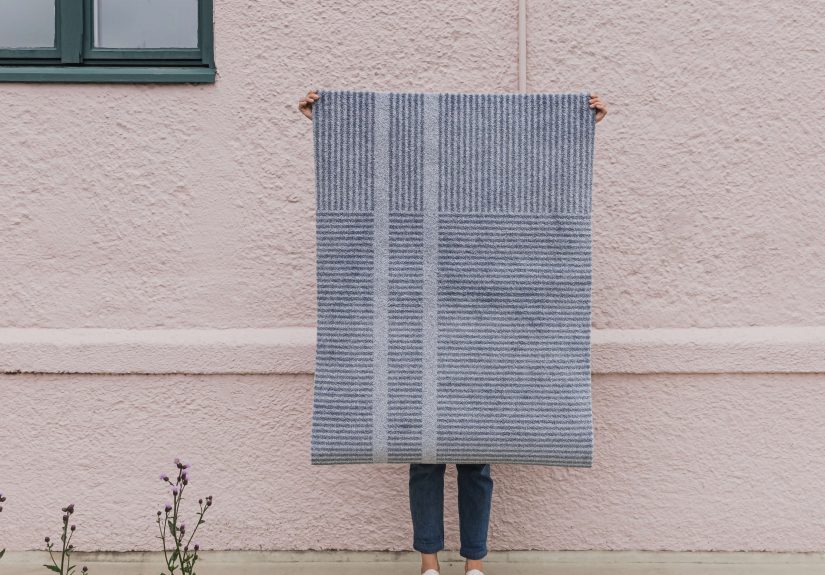
Why Bespoke Color Works So Well in Kitchens
Kitchens are ideal places for bespoke color because they are both hardworking and emotional. They deal with heat, water, crumbs, guests, school bags, midnight snacks, and the occasional dramatic search for the missing corkscrew. A kitchen is not a sterile gallery; it is a daily stage. Color helps set the mood.
Cabinets Carry Color Better Than Walls
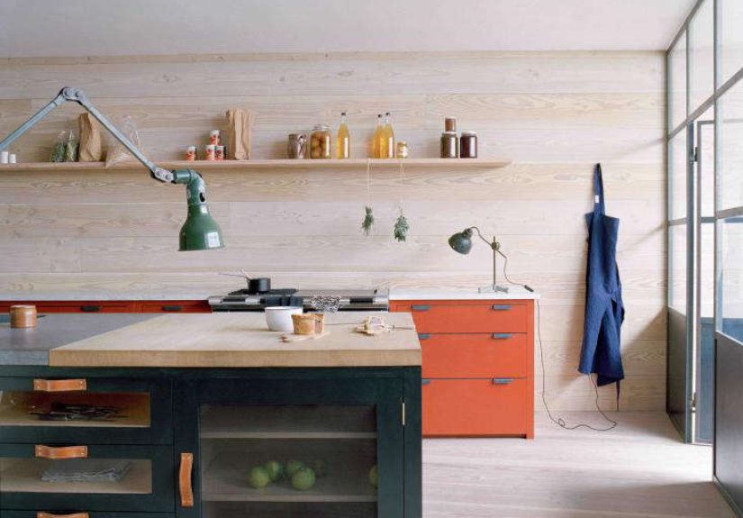
Cabinetry gives color structure. A bold wall can sometimes feel like it is shouting across the room, but a painted cabinet has edges, panels, hardware, shadows, and depth. That makes even strong colors feel architectural. A deep blue-black on tall cupboards can frame a kitchen like built-in furniture. A muted green island can become the room’s anchor. A soft neutral on surrounding cabinets can let stone counters and brass handles do their quiet little tap dance.
Painted Kitchens Age Gracefully
Unlike glossy trends that announce the year they were installed, painted kitchens can evolve. Scuffs can be touched up. Hardware can be changed. A dresser can be repainted. A bespoke color gives the kitchen personality without locking it into a single decade. The right shade feels collected rather than installed.
Color Adds Human Warmth
A kitchen filled with expensive materials can still feel cold if every surface is trying to look perfect. Bespoke color softens that effect. It makes cabinetry feel closer to furniture. It adds the human note: a little humor, a little history, a little “yes, someone actually lives here.”
Lessons from the Plain English and Adam Bray Palette
The Plain English color collection created with Adam Bray and Sue Skeen is a strong example of how narrative can guide color. Rather than relying on generic names, the shades evoke old domestic life: sculleries, aprons, ink, coal, rusty nails, rice pudding, boiled dishcloths. The names are memorable, but they are not just decorative. They help users imagine where the colors belong.
Scullery Latch suggests a chalky blue with a practical, old-house feeling. Inky Nib leans toward a deep blue-black, the sort of shade that can make cabinets feel substantial and quietly dramatic. Pretty Pickle brings a sharp green energy, while Dripping Tap recalls oxidized metal and patinated utility. Draughty Passage has the mood of cool stone and worn floors. These colors are not random. They are tiny design stories with pigment attached.
The lesson is simple: when choosing color, do not begin with the paint chip. Begin with the world you want the room to inhabit. Is it a hardworking farmhouse kitchen? A city apartment with old bones? A cheerful family pantry? A moody dining space for candlelight and gossip? Once the story is clear, the color choices become less overwhelming.
How to Create a Bespoke Color Palette at Home
You do not need a manor house, a London antiques dealer, or a kitchen budget that makes your wallet hide under the bed. You can create a bespoke color palette by looking carefully at what your home already gives you.
1. Start with Permanent Materials
Before choosing paint, study what is not changing: flooring, countertops, tile, stone, brick, exposed beams, windows, and large furniture pieces. These materials already contain colors. Oak may pull golden. Walnut may lean chocolate. Marble may contain blue-gray veining. Terracotta may bring orange or rose undertones. A bespoke palette respects these existing notes instead of pretending they are not there.
2. Pay Attention to Natural Light
Light is the sneaky little magician of interior color. A shade that looks calm in a sunny showroom can turn gloomy in a north-facing room or too warm in a west-facing kitchen at sunset. North-facing rooms often benefit from colors with enough warmth or a higher light reflectance value. West-facing rooms can become warmer later in the day, so cooler undertones may create balance. East-facing rooms receive brighter morning light and cooler afternoon light, which means testing is not optional unless you enjoy surprises with a roller brush.
3. Use LRV Like a Practical Tool
LRV, or Light Reflectance Value, measures how much light a color reflects on a scale from 0 to 100. Lower numbers absorb more light and appear darker. Higher numbers reflect more light and appear brighter. LRV will not choose your color for you, but it can keep you from accidentally turning a narrow hallway into a dramatic cave unless, of course, “dramatic cave” is your design brief.
4. Test Large Samples
Tiny paint chips are charming little liars. They cannot show how color behaves across a cabinet door, next to trim, under evening lamps, or beside a refrigerator with the emotional presence of a small spaceship. Paint large sample boards or test patches. Move them around. Look at them in morning, afternoon, and artificial light. If possible, test the exact sheen you plan to use, because matte, satin, and semi-gloss finishes can change how color reads.
5. Choose the Right Sheen
For walls, matte or eggshell finishes often give a soft, forgiving appearance. For trim, doors, and cabinetry, satin or semi-gloss finishes are commonly selected because they tend to offer more durability and easier cleaning. Cabinets, especially in kitchens, need paint that can handle fingerprints, moisture, and the occasional encounter with olive oil. A beautiful color in the wrong finish is like wearing velvet slippers to hike a muddy trail: elegant, but not wise.
Bespoke Color Ideas for Different Rooms
Kitchen: The Story Cabinet
For a kitchen, try pairing a muted cabinet color with a stronger island shade. A smoky green island against warm neutral perimeter cabinets can feel grounded and inviting. A deep blue-black pantry can add drama without overwhelming the entire room. A soft clay or putty shade can warm up stone countertops and unlacquered brass hardware.
Dining Room: The Candlelight Trick
Dining rooms love depth. Rich colors such as oxblood, olive, aubergine, muddy teal, or tobacco brown can make evening meals feel more intimate. These colors do not need to be loud; they need to be atmospheric. Add warm lighting, linen, wood, and something slightly imperfect, and the room begins to feel like it has hosted better conversations than your phone ever will.
Bedroom: The Quiet Custom Shade
Bedrooms usually benefit from colors that settle the nervous system rather than demand applause. Dusty blues, softened greens, warm grays, clay pinks, and complex neutrals can work beautifully. The bespoke element might come from matching the wall color to an old quilt, a favorite landscape, or the faded inside of a seashell collected on vacation.
Bathroom: The Jewel Box Moment
Small bathrooms are perfect for color bravery. A compact powder room can handle a deep lacquered green, a moody plum, or a mineral blue. Because the room is small, the color feels intentional rather than overwhelming. Add a mirror, good lighting, and hardware with character, and suddenly the tiniest room in the house has main-character energy.
The Psychology of Bespoke Color
Color affects how a room feels before anyone notices the furniture. Greens often feel restorative because they connect visually to nature. Blues can feel calm, serious, or crisp depending on depth and undertone. Reds and terracottas can add appetite, warmth, and energy. Yellows can be cheerful but need careful handling, because too much brightness can feel like living inside a lemon with Wi-Fi.
Bespoke color is powerful because it goes beyond general color psychology. It asks a more personal question: what should this room help you feel? A kitchen might need confidence and warmth. A study might need focus. A hallway might need welcome. A bedroom might need softness. When color is chosen to support a real daily experience, it becomes more than decoration.
Common Mistakes to Avoid
Choosing Color in Isolation
A beautiful color can fail if it ignores the room around it. Always compare paint against flooring, countertops, trim, fabrics, and lighting. Color is social. It behaves differently depending on who it sits beside.
Using Too Many Statement Colors
Bespoke does not mean every surface needs a personality disorder. A strong palette still needs hierarchy. Let one or two colors lead, then support them with quieter tones, natural materials, and texture.
Forgetting Transitions
Rooms do not exist alone. Doorways, hallways, and sightlines matter. A bespoke palette should feel collected across the home, even if each room has its own mood. Repeating a trim color, wood tone, or accent shade can create continuity.
Copying Without Context
That perfect green kitchen on the internet may have twelve-foot ceilings, old limestone floors, and northern European light. Your kitchen may have builder-grade tile, bright western sun, and a toaster shaped like a race car. Inspiration is useful, but translation is everything.
Why Personality Beats Perfection
The most memorable rooms are rarely perfect. They have odd corners, inherited objects, slightly strange art, and colors that would not pass a committee vote. Bespoke color makes room for individuality. It allows a home to feel layered rather than staged.
That is why the “accidental decorator” idea is so refreshing. It reminds us that great decorating can come from attention, taste, experimentation, and courage. You do not need to follow every trend. You need to understand your rooms, your light, your materials, and your own appetite for color. Sometimes the best shade is not the most fashionable one. It is the one that makes the room exhale.
Experience Notes: Living with Bespoke Color
Living with bespoke color is very different from admiring it in a photograph. Online, a deep green cabinet or muddy pink wall looks effortless, as if the homeowner woke up one morning, whispered “heritage charm,” and the room politely arranged itself. In real life, bespoke color is a process of testing, doubting, retesting, and occasionally staring at a painted sample board while holding a cup of coffee like a detective at a crime scene.
One of the most useful experiences is learning that the first color you love may not be the color the room loves. A sample that looks refined in the store can become too cold at home. A neutral that seemed boring on the chip can suddenly look elegant beside old wood. A bold green that felt risky may turn out to be exactly what tired cabinets needed. The room gets a vote, and it is usually more honest than your Pinterest board.
Another real-world lesson is that bespoke color becomes easier when you stop asking, “What color is popular?” and start asking, “What is already happening here?” Maybe the floor has a honey tone. Maybe the stone counter has gray-green veining. Maybe the brass handles are aging into a mellow patina. Maybe the afternoon sun turns everything golden at 5 p.m. These clues are not obstacles; they are instructions. The best color choices often feel discovered rather than imposed.
There is also a confidence curve. At first, people often choose safer colors because they fear making an expensive mistake. That fear is reasonable. Paint is cheaper than new cabinets, but repainting an entire kitchen is still not anyone’s idea of a relaxing weekend. The solution is not reckless bravery. It is controlled experimentation. Paint sample boards. Live with them for several days. Check them near appliances, trim, tile, and flooring. Look at them when the room is clean and when it is full of real life, because a color that only works in silence may not be the right color for a busy home.
Once the right bespoke color is chosen, the reward is surprisingly emotional. A kitchen cabinet in a custom-feeling shade can make everyday routines feel more grounded. Making toast beside a green island or opening a pantry painted in a dark inky blue gives the home a sense of authorship. It no longer feels like a copy of someone else’s taste. It feels specific.
The most satisfying bespoke colors also tend to improve with use. A tiny scuff on a richly painted cabinet may not ruin the room; it may add to the sense that the room is alive. A satin finish on trim catches light differently throughout the day. A deep shade behind open shelves makes white dishes look intentional. A warm neutral on walls can pull mismatched furniture into harmony. These are small pleasures, but homes are built from small pleasures.
The final experience worth mentioning is humor. Good color does not need to be solemn. The Plain English color names prove that beauty can have wit. A shade called Boiled Dishcloth may sound ridiculous until you realize it describes a useful, timeworn neutral better than any luxury marketing phrase ever could. Bespoke color works best when it has personality, and personality often includes a wink.
Conclusion
Bespoke Color from an Accidental Decorator is more than a charming title. It is a design philosophy: choose colors with memory, purpose, and nerve. Let the architecture speak. Let materials guide you. Test in real light. Use finishes wisely. Most of all, allow your home to become more personal than perfect.
The accidental decorator’s great secret is that color does not need to be accidental at all. It can be intuitive, researched, tested, and deeply individual. Whether you are painting kitchen cupboards, refreshing a bedroom, or turning a tiny powder room into a jewel box, bespoke color gives your home something no trend forecast can guarantee: a voice of its own.