Table of Contents >> Show >> Hide
- Why the Wrong Wall Art Size Makes a Home Feel Smaller
- The Designer Rule That Usually Works: The Two-Thirds Guideline
- The Second Mistake: Hanging Art Too High
- How to Tell If Your Wall Art Is Too Small
- Why Too Many Small Pieces Can Create Visual Clutter
- When Oversized Art Works in a Small Room
- Best Wall Art Fixes for Small Living Rooms
- Best Wall Art Fixes for Bedrooms
- Best Wall Art Fixes for Entryways and Hallways
- Frame Size, Matting, and Visual Weight Matter Too
- Common Wall Art Mistakes That Shrink a Room
- How to Fix the Mistake Without Buying New Art
- Designer-Inspired Formula for Getting Wall Art Right
- Experience Notes: What Happens When You Fix the Wall Art Scale
- Conclusion: Bigger, Better-Placed Art Can Make Your Home Feel Larger
Wall art is supposed to make a home feel personal, polished, and pulled together. It should whisper, “A stylish adult lives here,” not shout, “I panic-bought this tiny print at 11:47 p.m. and hoped for the best.” Yet according to designers, one wall art mistake quietly shrinks rooms faster than a dark hallway, a too-small rug, or a sofa shoved sadly against a corner: choosing artwork that is the wrong scale for the wall and furniture around it.
More specifically, the most common offender is artwork that is too small, hung too high, or scattered in little lonely pieces across a large wall. The result is a room that feels visually choppy. Instead of making the eye travel smoothly around the space, undersized wall decor creates awkward blank gaps, weak focal points, and a sense that the furniture is floating without an anchor. In design language, the room loses proportion. In everyday language, it looks like your wall art got lost on the way to a dollhouse.
The good news? This mistake is easy to fix, and you do not need a celebrity designer, a giant budget, or a gallery owner named Sebastian to make it happen. You simply need to understand scale, spacing, placement, and how wall art works with the furniture below it.
Why the Wrong Wall Art Size Makes a Home Feel Smaller
Small rooms do not automatically need small decor. In fact, designers often warn that filling a compact space with tiny furniture, tiny accessories, and tiny wall art can make the room feel even tinier. When everything is small, the eye has no confident visual anchor. The room starts to feel busy, fragmented, and under-decorated at the same time, which is a very impressive kind of chaos.
Wall art has visual weight. A large framed print, an oversized canvas, a woven wall hanging, or a well-planned gallery wall can balance a sofa, bed, console table, fireplace, or dining bench. When the art is too small for the furniture beneath it, the furniture appears larger and heavier by comparison. That imbalance makes the wall look emptier and the room feel tighter.
Imagine an 84-inch sofa with one 16-by-20-inch print floating above it. The sofa becomes the giant in the room, while the art looks like a postage stamp with commitment issues. Now imagine the same sofa with one large piece around 56 inches wide, or a gallery arrangement that visually spans about two-thirds of the sofa. Suddenly, the wall feels intentional. The sofa is grounded. The ceiling feels calmer. The room looks designed, not accidentally assembled during a lunch break.
The Designer Rule That Usually Works: The Two-Thirds Guideline
One of the easiest ways to choose the right wall art size is to use the two-thirds rule. For art above furniture, aim for a piece or grouping that is roughly two-thirds the width of the furniture below it. This guideline works especially well above sofas, beds, credenzas, dining banquettes, desks, and console tables.
Quick Examples
If your sofa is 90 inches wide, look for artwork or a grouping around 60 inches wide. If your queen headboard is 64 inches wide, wall art around 42 inches wide will usually feel balanced. If your console table is 48 inches wide, a 30- to 36-inch piece may work beautifully, depending on the frame, matting, and surrounding decor.
This is not a law carved into marble. It is a starting point. A bold abstract canvas with strong color may need less width because it carries more visual weight. A soft neutral print with lots of white space may need to be larger to make the same impact. A gallery wall can break the rule slightly if the overall arrangement feels cohesive and connected to the furniture below.
The Second Mistake: Hanging Art Too High
Size is the big culprit, but placement is the sneaky accomplice. Designers frequently point out that people hang art too high. The piece ends up hovering awkwardly near the ceiling, disconnected from the furniture and the people in the room. Instead of feeling like part of the design, it feels like it is trying to escape.
A reliable general rule is to hang artwork so the center of the piece is around eye level, often around 57 to 60 inches from the floor. Above furniture, the bottom of the frame typically looks best about 6 to 12 inches above the top of the sofa, headboard, mantel, or console. This keeps the art visually connected to what sits below it.
If art is hung too high, the wall can feel cut in half: furniture below, lonely art above, awkward empty zone in the middle. That empty zone creates visual tension and can make ceilings feel lower, walls feel narrower, and furniture feel squat. Yes, a few inches can make a difference. Interior design is dramatic like that.
How to Tell If Your Wall Art Is Too Small
Not sure whether your wall art is the problem? Stand across the room and take a photo. Designers often recommend using photos because they flatten the scene and make scale issues easier to spot. In person, your brain may politely ignore a too-small print because you like the colors. In a photo, the wall will tell the truth like an honest friend with no filter.
Your art may be too small if:
- It looks like it is floating in the middle of a large blank wall.
- The furniture beneath it looks much wider or heavier than the art.
- The wall still feels empty even after the artwork is hung.
- You used several tiny pieces far apart to “fill” the space.
- The room lacks a clear focal point.
- The art feels decorative but not powerful enough to anchor the area.
If any of these sound familiar, do not panic. Your walls are not judging you. Well, maybe a little. But they are also very forgiving.
Why Too Many Small Pieces Can Create Visual Clutter
A gallery wall can make a small home feel layered, collected, and full of personality. But a random scatter of small frames can have the opposite effect. When tiny pieces are spaced too far apart, the eye has to jump from one frame to another. Instead of one strong statement, you get many little interruptions. That visual noise can make a room feel cramped, even if the floor plan is generous.
The fix is to treat multiple pieces as one larger composition. Keep spacing consistent, usually around 2 to 3 inches between frames for a tight arrangement. Choose a shared element, such as frame color, mat style, subject matter, or color palette. Start with one anchor piece, then build around it. Before making holes in the wall, lay everything on the floor or use painter’s tape and paper templates to test the layout.
A gallery wall should feel like a choir, not a group of strangers clearing their throats in separate corners.
When Oversized Art Works in a Small Room
Many homeowners avoid large artwork in small spaces because they fear it will overwhelm the room. But designers often use one large piece to create the opposite effect. Oversized art can make a compact room feel more confident, more finished, and sometimes even larger.
The trick is choosing a piece with the right breathing room. A large canvas with a calm palette, open composition, or strong vertical movement can visually expand a room. A big landscape, abstract wash, black-and-white photograph, or mirror can create depth. A large mirror placed across from a window can reflect light and make the space feel brighter and more open.
What usually does not work is a huge, visually heavy piece squeezed onto a narrow wall with no margins. Art needs space around it. Think of blank wall space as the pause between sentences. Without it, the room feels like it is talking too fast.
Best Wall Art Fixes for Small Living Rooms
In a small living room, the wall above the sofa is often prime real estate. If the art there is undersized, the whole seating area can feel temporary. Choose one large statement piece, a diptych, a triptych, or a tight gallery arrangement that spans about two-thirds of the sofa width. Hang it low enough to relate to the sofa, not so high that guests need binoculars.
For narrow living rooms, consider horizontal art to stretch the wall visually. For low ceilings, vertical art or a stacked arrangement can draw the eye upward. If the room already has many patterns, choose simpler artwork with a strong shape. If the room is neutral, art can introduce color and personality without eating up floor space.
Best Wall Art Fixes for Bedrooms
Bedrooms often suffer from tiny art above the bed. The bed is usually the largest piece of furniture in the room, so it needs artwork with enough presence. A single narrow print above a king-size bed can look underwhelming. Instead, try a large horizontal piece, two matching frames, three coordinated prints, or a textile wall hanging.
Hang the artwork close enough to the headboard to feel connected. If the headboard is tall, you may need less art or a slimmer piece. If the headboard is low or minimal, the wall art can be larger and more dramatic. The goal is balance, not competition. Your bed and your artwork should look like they are in the same design relationship, not on an awkward first date.
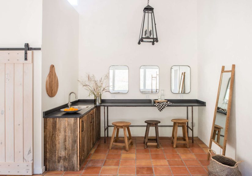
Best Wall Art Fixes for Entryways and Hallways
Entryways and hallways are tricky because they are often narrow. A bulky frame or oversized piece in a tight passage can feel intrusive. But tiny art can disappear. The solution is slim, intentional, and proportional wall decor.
Try a vertical series of frames, a narrow picture ledge, a long landscape print, or a mirror with a clean frame. In a hallway, repeated pieces can create rhythm and visually guide the eye forward. In an entryway, one strong piece above a console can set the tone for the entire home. The first wall guests see should not look like an afterthought. It should say, “Welcome,” not “We ran out of decorating energy here.”
Frame Size, Matting, and Visual Weight Matter Too
Artwork is not just the image. The frame, mat, glass, color, texture, and contrast all affect how large or small the piece feels. A small print with a generous mat and larger frame can have more presence than the print alone. A dark frame on a light wall reads heavier. A frameless canvas may feel softer and less formal. A metallic frame can bounce light. A thick black frame can add definition, but too many heavy frames in a small room may feel busy.
If your art is slightly too small, reframing it with a wider mat can sometimes solve the problem. This is a smart budget-friendly trick. Instead of replacing every piece, upgrade the presentation. A thoughtful frame can make affordable art look custom, and custom-looking art has a magical way of making a room feel more expensive.
Common Wall Art Mistakes That Shrink a Room
1. Using One Tiny Piece on a Large Wall
This is the classic mistake. A single small frame on a big wall makes the wall feel emptier, not decorated. Replace it with a larger piece or group it with other works to create one stronger arrangement.
2. Spacing Gallery Wall Pieces Too Far Apart
Frames that are too spread out do not read as a collection. They read as clutter. Keep spacing tighter and more consistent so the grouping feels intentional.
3. Hanging Art Too Close to the Ceiling
Unless you are creating a floor-to-ceiling gallery effect, art should generally relate to eye level and nearby furniture. High placement can make the lower wall feel abandoned.
4. Ignoring Furniture Width
Art should be scaled to what sits beneath it. A large sofa, bed, or console needs art with enough width and visual strength to create balance.
5. Choosing Art Only by Color
Matching art to pillows is fine, but scale and mood matter more. A perfectly color-coordinated print can still look wrong if it is too small.
How to Fix the Mistake Without Buying New Art
If new artwork is not in the budget, you still have options. Combine smaller pieces into a gallery wall. Add larger mats and frames. Hang art on a picture ledge and layer pieces for depth. Move small art to smaller walls, bathrooms, shelves, or bedside corners where the scale makes more sense. Pair a small framed piece with a wall sconce, mirror, basket, or textile to increase the overall visual footprint.
You can also use painter’s tape to outline a larger “ideal” art size on the wall. Live with it for a day. This helps you see whether the wall needs one big piece, two medium pieces, or a full arrangement. It is cheaper than buying the wrong thing and pretending you meant to do that.
Designer-Inspired Formula for Getting Wall Art Right
Here is a simple formula that works in most homes:
- Measure the furniture below the wall art.
- Choose art or a grouping that is about two-thirds the furniture width.
- Keep the center of standalone art around eye level.
- Above furniture, leave about 6 to 12 inches between the furniture and the bottom of the frame.
- For gallery walls, plan the full arrangement before hanging.
- Use consistent spacing so multiple pieces read as one composition.
- Step back, take a photo, and adjust before committing to more holes.
This process turns wall decor from guesswork into a design decision. Your room will feel more open because the eye understands where to land. Good scale creates calm. Bad scale creates that mysterious “something feels off” feeling that makes people rearrange pillows aggressively.
Experience Notes: What Happens When You Fix the Wall Art Scale
One of the most common experiences homeowners have with wall art is realizing the problem only after everything else in the room is finished. The sofa is comfortable, the rug is decent, the curtains are behaving, the coffee table has one tasteful book nobody reads, and yet the room still feels small or unfinished. Then someone finally notices the little framed print above the sofa, bravely doing the work of a much larger piece. Once the art is resized or regrouped, the whole room seems to exhale.
In a small apartment living room, for example, a person may start with three small prints spaced evenly above a loveseat. Technically, the wall is decorated. Emotionally, it feels like a waiting room that forgot its magazines. When those three prints are moved closer together and placed inside larger matching frames with wide mats, the same art suddenly looks intentional. The loveseat feels anchored, the wall feels fuller, and the room feels less like a collection of separate objects.
Another familiar situation happens in bedrooms. Many people hang art too high above the headboard because they are afraid of hitting it while sitting up in bed. Reasonable fear. Nobody wants to be attacked by a framed landscape at midnight. But when the art floats too close to the ceiling, the bed looks visually heavy and the wall looks awkwardly empty. Lowering the piece slightly or replacing it with a wider horizontal work creates a calmer composition. The bed becomes the focal point, and the artwork supports it instead of hovering like a nervous cloud.
In entryways, the experience is often about first impressions. A small print next to the door may be meaningful, but if it is too small for the wall, guests may not even notice it. Replacing it with a larger mirror, a vertical pair of frames, or a compact gallery wall can make the entry feel brighter and more deliberate. The space may not gain a single square foot, but it feels more generous because the design has confidence.
The best part about correcting wall art scale is that the change is immediate. You do not need to repaint, renovate, or explain to your family why the dining room is suddenly “undergoing a spatial identity refresh.” You can move frames around, test paper templates, reframe favorite pieces, or invest in one larger statement work. Once the proportions improve, the furniture looks better, the ceiling feels taller, and the room feels less cramped. It is one of those rare decorating fixes that is simple, affordable, and deeply satisfyinglike finding the exact right lid for a leftover container on the first try.
Conclusion: Bigger, Better-Placed Art Can Make Your Home Feel Larger
The one wall art mistake that makes your home feel tiny is not having “bad taste.” It is choosing art that is out of scale with the room, especially pieces that are too small, hung too high, or arranged without connection to the furniture below. Designers know that proportion changes everything. The right wall art can anchor a sofa, stretch a hallway, elevate a bedroom, and make a small living room feel polished instead of cramped.
Before you buy another tiny print because it is cute and on sale, measure your wall. Measure your furniture. Think about the room as a whole. Then choose artwork that has enough presence to belong there. Your home does not need more stuff on the walls; it needs the right stuff, in the right size, in the right place. That is how wall art stops shrinking your space and starts making it feel stylish, open, and confidently lived in.