Table of Contents >> Show >> Hide
- Why Orange Plays So Well With Others
- Quick Rules for Making Orange Look Intentional (Not Like a Snack Food Logo)
- 30 Bright, Bold Colors That Go with Orange
- 1. Cobalt Blue
- 2. Navy Blue
- 3. Indigo
- 4. Cornflower Blue
- 5. Cerulean Blue
- 6. Sky Blue
- 7. Turquoise
- 8. Teal
- 9. Aqua
- 10. Emerald Green
- 11. Forest Green
- 12. Kelly Green
- 13. Olive Green
- 14. Lime Green
- 15. Chartreuse
- 16. Canary Yellow
- 17. Sunflower Yellow
- 18. Mustard Yellow
- 19. Gold
- 20. Hot Pink
- 21. Fuchsia
- 22. Magenta
- 23. Raspberry
- 24. Coral
- 25. Electric Purple
- 26. Plum
- 27. Tomato Red
- 28. Cherry Red
- 29. Burgundy
- 30. Black
- How to Use Orange Color Palettes (Without Overdoing It)
- Extra: Practical “Been-There” Lessons for Orange Lovers (About )
- Conclusion
Orange is the extrovert of the color wheel: warm, loud (in a good way), and fully capable of stealing the spotlight.
The trick isn’t “taming” orangeit’s giving it the right supporting cast so it looks intentional, elevated, and not
like your living room is auditioning to become a traffic cone.
Whether you’re styling a burnt orange sofa, picking a tangerine accent wall, or flirting with a punchy persimmon
front door, this guide walks you through 30 bright, bold colors that go with orangeplus practical ways to use
them without overwhelming your space (or your eyeballs).
Why Orange Plays So Well With Others
Orange sits between red and yellow, which means it carries “high energy” in its DNA. Pair it with cooler hues to
balance that heat, or lean into adjacent warm shades for a rich, glowing palette. And don’t forget: “orange” isn’t
one color. A rusty terracotta behaves very differently than a neon citrus pop.
Quick Rules for Making Orange Look Intentional (Not Like a Snack Food Logo)
1) Decide what kind of orange you’re using
Tangerine and safety-orange read playful and modern. Burnt orange, rust, and terracotta read earthy and upscale.
Persimmon and pumpkin land somewhere in the delicious middle.
2) Let one color lead
Orange + another bold hue can be stunningif you let one be the star and the other be the hype person. Think:
mostly navy with orange accents, or mostly orange with teal moments.
3) Balance “temperature” and “value”
“Temperature” means warm vs. cool; “value” means light vs. dark. Orange loves dark anchors (navy, black) and cool
counterweights (teal, turquoise). It also looks great with light brights (sky blue, canary yellow) when you keep
the proportions under control.
4) Use neutrals and texture as the secret sauce
Even if you’re going bold, you don’t need every surface screaming. Natural wood, woven textures, and warm whites
can quietly help orange and its bold buddies look polished rather than chaotic.
30 Bright, Bold Colors That Go with Orange
Below are 30 high-impact colors that pair beautifully with orange. Each includes a quick “why it works” plus an
easy example you can steal for paint, decor, fashion, or branding.
1. Cobalt Blue
Cobalt is orange’s classic power partner: crisp, saturated, and instantly modern. Try cobalt dining chairs with a
burnt orange rug, or cobalt pillows on a tangerine couch for a bold-but-balanced look.
2. Navy Blue
Navy brings instant sophistication and makes orange glow. Think navy built-ins with a persimmon art piece, or navy
bedding with orange accent pillows for a “boutique hotel, but fun” vibe.
3. Indigo
Indigo is the moodier cousin of navydramatic, artsy, and a little mysterious. Pair indigo walls with terracotta
ceramics, or layer an indigo throw over an orange chair to add depth.
4. Cornflower Blue
Cornflower blue is softer than cobalt but still bold enough to play. It works especially well with pumpkin and
rust toneslike a vintage poster palette that somehow still feels fresh.
5. Cerulean Blue
Cerulean reads bright, clean, and coastal. Orange + cerulean feels sunny and optimisticgreat for kitchens, kids’
spaces, or brands that want “friendly energy” without looking childish.
6. Sky Blue
Sky blue cools orange down without dulling it. Use sky blue curtains with a burnt orange sofa, or try a sky blue
backsplash with orange-toned wood accents for a bright, airy contrast.
7. Turquoise
Turquoise + orange is lively, artistic, and slightly retro (in the best way). Picture turquoise bar stools with a
tangerine pendant light, or turquoise jewelry against an orange dress.
8. Teal
Teal is a deep blue-green that makes orange look expensive. A teal velvet sofa with orange artwork? Immediate
“designer did this on purpose” energy.
9. Aqua
Aqua adds brightness without turning the palette into a wrestling match. Try aqua accent pillows with rust-orange
upholstery, or aqua wall art in a room that already has orange wood tones.
10. Emerald Green
Emerald is jewel-toned drama, and orange loves drama. Burnt orange + emerald feels luxuriousgreat for dining rooms,
statement entryways, and outfits that want “confident” without trying too hard.
11. Forest Green
Forest green is grounded and natural, making orange feel earthy rather than neon. Pair it with rust, clay, or
terracotta for an autumnal palette that works year-round.
12. Kelly Green
Kelly green is bright, punchy, and playfulperfect when your orange is equally upbeat (like tangerine). Use it in
small hits: pillows, planters, art, or a single painted chair.
13. Olive Green
Olive is warm-leaning green that makes orange feel less “pop” and more “curated.” Olive cabinetry with a burnt
orange runner looks intentional and subtly modern.
14. Lime Green
Lime and orange are bold friends who should not be left alone unsupervised. Use one as the main color and the other
as an accentlike lime barware in a kitchen with orange-toned wood or tile.
15. Chartreuse
Chartreuse is electric and fashion-forward. With orange, it creates a high-energy palette that works well for
creative studios, playful branding, and accessories (think: chartreuse vase, orange flowers).
16. Canary Yellow
Canary yellow is sunshine with opinions. Pair it with orange when you want the space to feel upbeat and energetic.
A canary throw or lamp can brighten a burnt orange room without competing.
17. Sunflower Yellow
Sunflower yellow is richer and warmer than canary, which makes it great with rust and terracotta. Try sunflower
pillows with a burnt orange sofa and add natural wood for a cozy, golden glow.
18. Mustard Yellow
Mustard brings a vintage warmth that looks fantastic with burnt orange. It’s a go-to for midcentury-inspired rooms:
mustard chair, orange rug, walnut wood, and you’re basically done.
19. Gold
Gold (as a color and finish) makes orange look richerlike it just got upgraded to first class. Use gold picture
frames, hardware, or lighting in orange-heavy spaces to add shine without adding clutter.
20. Hot Pink
Hot pink + orange is unapologetically bold. Keep the background simple (white walls, clean lines) and let the color
pop through art, textiles, or a statement chair.
21. Fuchsia
Fuchsia is slightly deeper than hot pink, giving orange a more “grown-up glamour” feel. Great for maximalist decor,
bold event palettes, and fashion pairings that want runway energy.
22. Magenta
Magenta + orange feels modern and graphic, especially with black or white as a stabilizer. Try a magenta abstract
print above an orange console table, or magenta cushions on a rust chair.
23. Raspberry
Raspberry is warm, punchy, and slightly less neon than fuchsia. Pair raspberry with terracotta for a richly layered
warm palette, or use raspberry accents to keep a bright orange room from feeling too “primary.”
24. Coral
Coral and orange are close cousinsso the combo looks naturally cohesive. Use coral as the softer bridge color:
coral curtains, orange rug, and neutral walls for a warm, inviting room that still feels airy.
25. Electric Purple
Purple and orange can feel theatricalin a good way. Electric purple works best when orange is slightly muted
(burnt, rust, terracotta), so the palette feels curated instead of cartoonish.
26. Plum
Plum is deep, velvety, and luxe. Pair plum with burnt orange for a dramatic, cozy paletteperfect for moody living
rooms, libraries, and bedrooms where you want “warm,” not “hyper.”
27. Tomato Red
Tomato red sits close to orange, so it creates a fiery, energetic gradient. Use it in small dosesart, flowers,
small decorso your room feels vibrant rather than like it’s yelling.
28. Cherry Red
Cherry red is bolder and cooler than tomato, creating sharper contrast with orange. Try cherry red accessories in a
space with terracotta textiles, or use cherry red as a “pop” against an orange-and-neutral base.
29. Burgundy
Burgundy makes orange feel sophisticated and grounded. Think: burgundy velvet pillow + burnt orange leather chair,
or burgundy accent wall with terracotta pottery for a layered, cozy look.
30. Black
Black is the ultimate contrast tool: it outlines orange, sharpens it, and makes it look more modern. Use black
window frames, hardware, or graphic patterns with orange accents to keep the palette crisp and intentional.
How to Use Orange Color Palettes (Without Overdoing It)
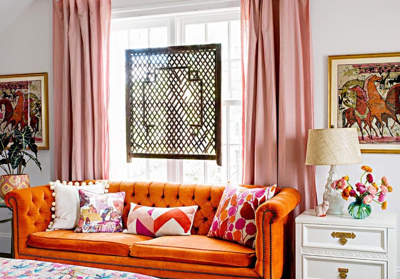
Living room
If orange is your sofa, pick one bold partner color (navy, teal, emerald) and repeat it 2–3 times around the room:
pillows, art, and one small accent piece. This repetition makes the palette feel designed, not accidental.
Kitchen
Orange shines in kitchens because it feels energetic and social. Try orange as a focal point (a hood, island, or
backsplash) and pair it with crisp counterbalance colors like black, navy, or sky blue for a clean, modern finish.
Bedroom
Bedrooms tend to look best when orange is a supporting characterthink: rust throw blanket, terracotta pillow
shams, or orange-toned artpaired with calmer bolds like indigo, forest green, or plum.
Exterior and orange brick
Orange brick and orange-toned stucco love contrast: black trim, deep blue doors, or green landscaping hues. If you
want a more classic look, use black and white; if you want “fresh,” use blues and greens.
Extra: Practical “Been-There” Lessons for Orange Lovers (About )
If you’ve ever fallen in love with orange online and then met it in real life, you already know: orange is a
shapeshifter. It can look like warm apricot in the morning and like a spicy nacho at night. The first “experience”
lesson is painfully simpletest it. Sample paint on multiple walls, or at least tape up large swatches. Orange is
especially sensitive to lighting, and the wrong bulb can make a gorgeous burnt orange go full pumpkin costume.
The second lesson is about scale. Orange has main-character energy, so the bigger the surface area, the more it
dominates. A tiny orange vase is cute. An orange ceiling is a life choice. If you’re new to orange, start with
“soft commitments”: throw pillows, artwork, a rug, or a single accent chair. Then, if you’re still obsessed after
two weeks, you can graduate to paintor at least pretend you’re being “reasonable” while shopping for it.
Another real-world trick: orange looks best when it has something to bounce off. That “something” can be contrast
(navy, black, teal) or harmony (coral, mustard, tomato). The mistake people make is pairing orange with a color
that’s equally loud in equal amounts. That’s how you end up with a room that feels like it’s clapping at you.
Instead, pick a dominant color and let the other be an accent. A navy room with orange pops looks crisp and
intentional. A bright orange room with a few teal accents looks playful and styled. Fifty-fifty is where chaos
lives.
Texture also matters more than people expect. Orange in flat paint can look more intense than orange in velvet,
leather, wood, or woven fabric. If orange feels “too much,” switch the material before you switch the color. A
burnt orange leather chair reads warm and elevated; the same shade in glossy plastic might read like a toy. The
fastest upgrade is mixing orange with natural textureswood, linen, rattan, ceramicsbecause it pushes the palette
toward “earthy” instead of “emergency cone.”
Finally, if orange makes you nervous, anchor it with a dark neutral and repeat it in small moments. Black picture
frames, dark hardware, or a navy rug can keep orange from floating away visually. And repetition is your best
friend: if you have orange once, it can look random; if you have it three times (a pillow, a print, a small object),
it looks like a plan. Orange doesn’t need to be everywhereit just needs to look like it belongs.
Conclusion
Orange is bold, warm, and surprisingly versatile once you stop treating it like a “danger color.” Pair it with deep
blues for timeless contrast, energize it with punchy greens and yellows, or glam it up with pinks and purples. Pick
your orange, choose one strong partner color, and let texture and proportion do the rest. You’ll get a bright,
confident palette that feels designednot accidental.