Table of Contents >> Show >> Hide
- 1. Hanging Wall Art Too High
- 2. Choosing Art That Is Too Small for the Wall or Furniture
- 3. Ignoring Spacing Between Frames
- 4. Forgetting About the Room’s Color Palette
- 5. Using the Wrong Art in the Wrong Place
- 6. Treating Wall Art as an Afterthought
- More Smart Fixes for Better Wall Art Placement
- Experience-Based Tips: What Actually Works When Fixing Wall Art Mistakes
- Conclusion
Wall art has a sneaky superpower: it can make a room feel finished, personal, polished, and expensive-looking without requiring a contractor, a demolition crew, or a dramatic reality-TV reveal. But when it goes wrong, it goes very wrong. A beautiful print hung too high can look like it is trying to escape through the ceiling. A tiny framed photo floating above a huge sofa can feel like a postage stamp on a billboard. A gallery wall with no plan can quickly become less “curated collection” and more “I lost a fight with a hammer.”
The good news? Most wall art mistakes are easy to fix. You do not need a fine arts degree, a museum curator on speed dial, or the ability to “just eyeball it” like your mysteriously talented friend who never measures anything. With a few practical design rules, a tape measure, and a willingness to patch one or two tiny holes, your walls can go from awkward to intentional fast.
Below are six common wall art mistakes and how to fix them, with real-world examples you can use in living rooms, bedrooms, hallways, dining areas, entryways, and home offices. Think of this as a friendly intervention for blank walls, lonely frames, and gallery walls that need a little adult supervision.
1. Hanging Wall Art Too High
The most common wall art mistake is also the most dramatic: hanging artwork too high. When art is placed near the ceiling instead of near eye level, the entire room can feel off-balance. Your guests may not know exactly why the room feels strange, but their necks will have suspicions.
A useful rule is to hang the center of a single artwork around 57 to 60 inches from the floor. This puts the artwork close to average eye level and helps create a gallery-like feeling. The rule also works for many framed prints, paintings, posters, and photographs on open walls.
How to Fix It
Measure from the floor to the center point of the artwork, not the top of the frame. If your picture is 24 inches tall, its center is 12 inches from the top. For a 57-inch center height, the top of that frame should land around 69 inches from the floor, adjusted for the hanging hardware.
When art hangs above furniture, the rules shift slightly. Instead of aiming only for eye level, connect the artwork visually to the furniture below it. In most rooms, the bottom of the frame should sit about 6 to 10 inches above the sofa, headboard, console table, or mantel. Too much empty space between the furniture and art makes the two pieces look unrelated, like strangers standing awkwardly at the same party.
Example: If you have a sofa and a large framed print above it, lower the print until it feels connected to the sofa. If you can fit a basketball between the sofa and the frame, the art is probably too high. Unless your design style is “sports equipment storage,” bring it down.
2. Choosing Art That Is Too Small for the Wall or Furniture
Small wall art is not bad. Small wall art in the wrong place is the problem. A tiny piece on a large blank wall can look accidental, like someone forgot to finish decorating. The same thing happens when a narrow print is placed above a wide sofa, bed, or sideboard. The furniture visually outweighs the art, and the wall looks unfinished.
Scale is one of the biggest secrets to making wall decor look expensive. Even affordable prints can look high-end when they are sized correctly. On the other hand, costly artwork can look underwhelming if it is too small for the space.
How to Fix It
For art above furniture, aim for the artwork or arrangement to span roughly two-thirds the width of the furniture below it. This does not need to be mathematically perfect, but it is a strong starting point.
If your sofa is 84 inches wide, artwork around 56 inches wide will usually feel balanced. That could be one large canvas, two medium prints, three framed pieces, or a gallery wall treated as one large visual unit.
For a large blank wall, consider going bigger than feels comfortable at first. Many people choose art based on how it looks in their hands at the store, not how it will look across the room. A 16-by-20-inch print can seem generous on a shopping cart, then shrink into visual confetti once it is placed on a 12-foot wall.
Quick fix: If you already own art that is too small, do not toss it. Give it more presence with a larger mat and frame, pair it with companion pieces, or move it to a smaller wall, hallway nook, bookshelf, or powder room where its scale makes more sense.
3. Ignoring Spacing Between Frames
Spacing can make or break a gallery wall. Too much distance between frames makes the arrangement feel scattered. Too little space makes the wall look crowded and chaotic. The sweet spot is consistent spacing that allows each piece to breathe while still feeling like part of a group.
Many gallery walls fail because people start hanging one frame at a time without a plan. The first frame looks fine. The second frame looks okay. By frame number seven, the wall has developed a personality disorder.
How to Fix It
For gallery walls, keep about 2 to 3 inches between frames for a clean, connected look. Larger walls or oversized frames may need slightly wider spacing, while smaller groupings can use tighter spacing. The key is consistency.
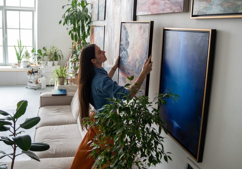
Before putting nails in the wall, lay the frames on the floor and arrange them until the composition feels balanced. You can also cut paper templates the size of each frame and tape them to the wall with painter’s tape. This lets you test the layout, height, and spacing before committing.
Start with the largest or most important piece first. Place it near the center or slightly off-center, then build around it. This gives the gallery wall a focal point and prevents the layout from feeling random. If all the frames are the same size, use a grid. If they vary in size, balance larger pieces with smaller ones across the arrangement.
Example: In a hallway, three evenly spaced black-and-white photos can look crisp and elegant. In a family room, a mixed gallery wall with photos, sketches, small paintings, and a mirror can feel warm and personal. Both workbut only when spacing is intentional.
4. Forgetting About the Room’s Color Palette
Wall art does not have to match your sofa like a bridesmaid dress, but it should have a conversation with the room. When artwork ignores the surrounding color palette completely, it can feel disconnected. A neon orange abstract print in a soft blue and cream bedroom might be exciting, but it may also feel like it wandered in from another house.
Color is one of the easiest ways to make wall art feel intentional. The goal is not to match every shade perfectly. That can look stiff. Instead, repeat one or two colors from the room in the artwork, frame, mat, or surrounding decor.
How to Fix It
Look around the room and identify the main colors already present. Consider upholstery, rugs, curtains, throw pillows, wood tones, metal finishes, and paint colors. Then choose wall art that echoes at least one of those tones.
If your living room has sage green pillows and warm wood furniture, artwork with earthy greens, soft neutrals, or natural textures will likely feel at home. If your dining room has navy chairs and brass lighting, art with deep blues, warm golds, or creamy whites can tie the space together.
Frames matter, too. Black frames can add structure and contrast. White frames feel light and clean. Wood frames bring warmth. Gold or brass frames can add polish. A mismatched frame is sometimes the real culprit, not the artwork itself.
Design tip: If your art feels wrong but you love the piece, try changing the frame before replacing the art. A better frame can make a print look custom, cohesive, and much more expensive than it actually was. The frame is basically the outfit. Even great art deserves pants.
5. Using the Wrong Art in the Wrong Place
Not every piece of wall art belongs in every room. Delicate paper prints, original paintings, photographs, and textiles can be damaged by sunlight, humidity, heat, grease, or heavy traffic. That does not mean you must keep your favorite pieces locked away like museum treasure, but placement matters.
Bathrooms, kitchens, sunrooms, garages, and spaces above active fireplaces can be risky for valuable or fragile art. Moisture can warp paper and mats. Direct sunlight can fade colors. Heat can damage canvases and frames. Busy hallways can lead to bumped corners and crooked frames.
How to Fix It
Choose art based on the room’s conditions. In bathrooms, use inexpensive prints, sealed frames, glass-covered pieces, metal art, ceramic wall decor, or moisture-resistant materials. In kitchens, avoid hanging delicate artwork directly above the stove or sink. In bright rooms, keep valuable pieces out of direct sunlight or use UV-protective glass.
For high-traffic areas, secure frames properly and avoid sharp corners at shoulder height. For children’s rooms, use lightweight frames, acrylic instead of glass, and secure hanging hardware. Safety is part of good design, even if it is less glamorous than choosing the perfect abstract landscape.
Example: A vintage watercolor may be beautiful above a bathtub, but humidity can be brutal. A framed reproduction or digital print is a safer choice. Save the original for a bedroom, hallway, or living room wall where it can live its best, least-steamy life.
6. Treating Wall Art as an Afterthought
Many people decorate a room, then toss art on the walls at the very end as a finishing touch. Sometimes that works. More often, it makes the art feel random. Wall art should support the room’s mood, scale, layout, and personality. It is not just a hole-filler. It is part of the design story.
When wall decor is treated as an afterthought, common problems appear: art is placed wherever there is empty space, pieces do not relate to each other, frames clash with the room, or the subject matter feels disconnected from the home’s style. A beach print in a formal library can work if done intentionally. If not, it may feel like your bookshelf is quietly planning a vacation.
How to Fix It
Choose wall art with the room’s purpose in mind. A bedroom often benefits from calming pieces, soft colors, landscapes, abstract art, or personal photography. A dining room can handle bolder artwork because people gather there and conversation is welcome. A home office may need energizing art, meaningful prints, or a clean arrangement that does not visually clutter your work zone.
Think about the feeling you want before choosing the piece. Do you want the room to feel calm, playful, elegant, modern, cozy, dramatic, collected, or relaxed? Once you know the mood, it becomes easier to choose art that supports it.
Also consider balance. If a room already has patterned rugs, colorful curtains, and busy furniture, simple artwork may be best. If the room is neutral and minimal, bold wall art can become the star. A good room needs rhythm, not every element shouting, “Look at me!” like toddlers after dessert.
More Smart Fixes for Better Wall Art Placement
Once you understand the six major mistakes, a few extra tricks can help your wall decor look even better. First, use the right hardware. Heavy frames need anchors, studs, or picture-hanging hardware rated for the weight. Adhesive strips can work well for lightweight pieces, but they are not a universal solution. Gravity is patient, and it always wins eventually.
Second, consider lighting. Art looks better when it is properly lit. Picture lights, sconces, recessed lighting, or nearby lamps can highlight texture, color, and detail. Avoid harsh glare, especially on glass-covered frames. If the room has natural light, watch how it changes throughout the day before choosing the final spot.
Third, do not be afraid to lean art instead of hanging it. A large framed piece leaned on a console table, mantel, shelf, or dresser can feel relaxed and stylish. This is especially helpful for renters or anyone who changes decor often. Just make sure the piece is stable, especially in homes with pets, kids, or enthusiastic vacuuming habits.
Finally, mix personal and decorative pieces. A home filled only with generic prints can feel showroom-perfect but emotionally flat. Add family photos, travel sketches, vintage finds, children’s art, local artwork, or meaningful objects. The best wall art does not just match the room. It says something about the people who live there.
Experience-Based Tips: What Actually Works When Fixing Wall Art Mistakes
After helping rooms look more balanced, one lesson becomes clear: wall art mistakes usually happen because people decorate too quickly. They buy a piece they love, bring it home, hold it against the wall for twelve seconds, and then start hammering. That is how you end up with a frame that is slightly too high, slightly off-center, and somehow tilted even though you used a level. The fix is to slow down just enough to make the wall part of the plan.
A practical experience is to photograph the wall before hanging anything. Stand across the room and take a straight-on picture. Then use your phone’s markup tool to sketch where the art might go. This simple step makes scale problems obvious. A piece that seemed large in your hands may look tiny in the photo. A gallery wall that seemed balanced in your imagination may need a stronger center. This trick costs nothing and can prevent unnecessary holes.
Another useful habit is to test art at different times of day. Morning light, afternoon glare, and evening lamplight can completely change how a piece looks. A dark painting may disappear in a dim hallway. A glossy photograph may reflect a window so strongly that all you see is your own confused face. Before hanging valuable or highly reflective art, place it temporarily on a chair or lean it against the wall for a day. Walk past it in real life, not just in “decorating mode.”
For gallery walls, the biggest improvement often comes from editing. People usually hang too many similar-sized pieces or include items that do not contribute to the overall look. A strong gallery wall has variety, but it also has discipline. Try removing one or two weaker pieces and increasing the spacing consistency. The arrangement may instantly look more expensive. Editing is not failure; it is design with better manners.
When working above a sofa or bed, it helps to center the artwork over the furniture rather than the entire wall. This is a common real-life mistake, especially in rooms where furniture is not centered on the wall. If the sofa is shifted to one side, center the art over the sofa. The furniture and art should read as one unit. The wall may be asymmetrical, but the seating area will feel intentional.
One more experience-based tip: do not buy art only because it fills a blank space. Blank walls are not emergencies. It is better to live with an empty wall for a few weeks than to rush into buying something you do not care about. The pieces that work best are usually the ones with a little story: a print from a favorite city, a photo from a memorable trip, a painting from a local artist, or even a framed textile with texture and warmth. A home becomes more interesting when the art feels collected, not panic-purchased.
Also, remember that frames can change everything. Many people blame the print when the real problem is the frame size, mat width, or finish. A small photo with a wide mat can suddenly look refined. A basic poster in a thin black frame can feel modern. A warm wood frame can soften a plain white wall. Before replacing art, experiment with presentation.
The best wall art fix is not about following every rule perfectly. It is about making the room feel balanced, personal, and comfortable. If the height feels right, the scale supports the furniture, the colors connect to the room, and the art makes you happy, you are already winning. And if one frame is still a little crooked? That is what levels, museum putty, and conveniently tall houseplants are for.
Conclusion
Wall art can transform a room, but only when height, scale, spacing, color, placement, and purpose work together. The most common wall art mistakeshanging pieces too high, choosing art that is too small, spacing frames poorly, ignoring the room’s palette, placing delicate art in damaging locations, and treating artwork as an afterthoughtare all fixable.
Start with the basics: hang art close to eye level, size it to the furniture or wall, plan gallery walls before making holes, repeat colors from the room, protect valuable pieces from sunlight and humidity, and choose art that supports the mood of the space. Once those pieces fall into place, your home will feel more polished, more personal, and far less like the walls are still waiting for instructions.
Note: This article is original editorial content written for web publishing and based on widely used interior design principles, practical art-hanging guidance, and common home decor best practices.