Table of Contents >> Show >> Hide
- Why the Color Wheel Works So Well in Interior Design
- Color Wheel Basics You Actually Need
- How to Build a Room Palette Using the Color Wheel
- Warm vs. Cool Colors and Room Mood
- A Step-by-Step Method to Design Your Room With the Color Wheel
- Room-by-Room Color Wheel Cheat Sheet
- Common Color Wheel Mistakes to Avoid
- Smart Tools That Make Color Planning Easier
- Conclusion
- Experience-Based Lessons From Real Room Color Projects (Extended Section)
Choosing paint colors can feel weirdly high-stakes. One minute you’re saying, “I just want a calm bedroom,” and the next minute you’re holding 47 swatches that all look like “slightly confused gray.” That’s exactly why the color wheel is so useful. It takes the guesswork out of color pairing and gives you a clear system for building a room palette that looks intentional, balanced, and actually livable.
In interior design, the color wheel is more than art-class nostalgia. It helps you understand which colors naturally work together, how much contrast to use, and how to control the mood of a space. Once you know a few simple ruleslike monochromatic, analogous, complementary, and triadic schemesyou can design a room with much more confidence (and a lot less paint panic).
This guide breaks down how to use the color wheel in a practical, room-by-room way, with easy examples, designer-friendly strategies, and real-world advice for lighting, undertones, and paint finishes. Let’s make your room look like you planned it on purpose.
Why the Color Wheel Works So Well in Interior Design
The color wheel organizes colors by relationship, which is exactly what you need when designing a room. Instead of picking random shades that “seem nice,” you can choose combinations based on structure: neighbors for harmony, opposites for contrast, or evenly spaced colors for energy.
It also helps you make better decorating decisions beyond paint. Your sofa, rug, curtains, art, wood tones, and even metal finishes all contribute to the palette. When you use the color wheel, you can spot why something clashes (hello, mystery undertones) and fix it before spending money.
Best of all, the color wheel gives you a starting point, not a prison. You can follow classic color theory and still make the room feel personal, cozy, and not like a textbook diagram.
Color Wheel Basics You Actually Need
Primary, Secondary, and Tertiary Colors
Most interior color planning starts with the standard 12-color wheel:
- Primary colors: red, yellow, and blue
- Secondary colors: orange, green, and violet (made by mixing primaries)
- Tertiary colors: colors like blue-green, red-orange, and yellow-green (made by mixing a primary and a nearby secondary)
Knowing these categories matters because color schemes are built from their positions on the wheel. If two colors sit next to each other, they usually feel smoother and calmer. If they sit opposite each other, they create more drama and contrast.
Hue, Saturation, Tints, Shades, and Tones
This is where room design gets good. “Blue” is not just blue. A color’s behavior changes depending on:
- Hue: the pure color family (blue, green, red-orange, etc.)
- Saturation: how intense or muted it is
- Tint: the hue plus white (softer, lighter)
- Shade: the hue plus black (deeper, moodier)
- Tone: the hue plus gray (more subdued and flexible)
If you’ve ever painted a room “green” and ended up with “neon smoothie,” saturation was the issue. The color wheel helps you choose the right hue, but the tint/shade/tone choice is what makes it work in a real home.
How to Build a Room Palette Using the Color Wheel
These are the most useful color wheel schemes for decorating. Think of them as recipes: once you know the formula, you can customize the ingredients.
1) Monochromatic Color Scheme
A monochromatic palette uses one hue in different tints, shades, and tones. For example: pale blue walls, medium blue curtains, and a navy accent chair. This is one of the easiest ways to make a room look polished because everything already relates.
Monochromatic rooms can look flat if you ignore texture, so mix materials: linen, velvet, wood, boucle, metal, ceramic, and natural fiber rugs. Same color family, different surfaces. That’s the trick.
Best for: bedrooms, offices, reading rooms, minimalist spaces
2) Analogous Color Scheme
Analogous colors sit next to each other on the wheellike blue, blue-violet, and violet, or yellow, yellow-green, and green. These palettes feel cohesive and relaxing because the colors share base pigments.
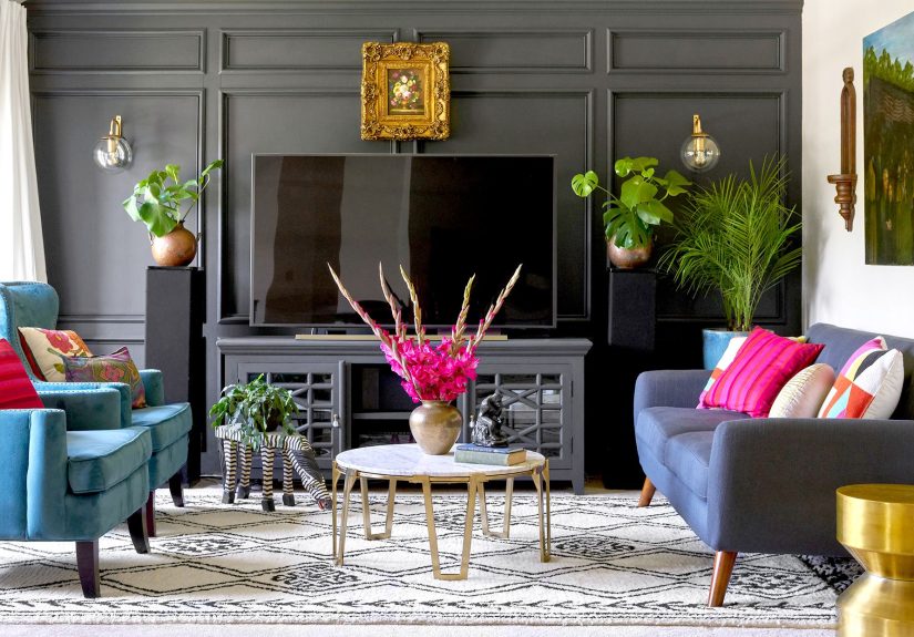
This is a favorite for people who want color without chaos. A great example is a living room built around dusty purple, with fuchsia and blue accents. It sounds bold on paper, but it works because the shades share undertones.
Best for: living rooms, bedrooms, guest rooms, cozy family spaces
3) Complementary Color Scheme
Complementary colors are opposites on the wheel (blue/orange, red/green, yellow/violet). These pairings create contrast and energy. Used well, they make a room feel dynamic. Used badly, they make a room feel like a sports mascot exploded.
The solution is proportion. Let one color dominate and use the opposite as an accent. For example, deep blue walls with orange pillows and art can look sophisticated, while a 50/50 split may feel too loud.
Best for: dining rooms, creative studios, statement living rooms, kids’ spaces (in controlled doses)
4) Split-Complementary Color Scheme
This is a designer favorite because it gives you contrast without full color combat. Start with one main color, find its opposite, then use the two colors next to that opposite. The result is more nuanced and easier to balance.
Example: Start with blue. Instead of pairing with pure orange, use yellow-orange and red-orange accents. You still get contrast, but it feels richer and less “look at me.”
Best for: people who want a bold room that still feels grown-up
5) Triadic Color Scheme
Triadic palettes use three colors evenly spaced around the wheel. They’re vibrant and playful, but they can be surprisingly elegant if you vary the intensity. A triadic combo like turquoise, fuchsia, and yellow-orange can feel lively and happyespecially when one shade is muted and another is used sparingly.
When using triadic color schemes, don’t let all three colors shout at once. One lead, one support, one accent. Think band, not karaoke contest.
Best for: eclectic interiors, playrooms, creative home offices, cheerful kitchens
6) Tetradic Color Scheme (Advanced)
Tetradic palettes combine two complementary pairs (four colors total). They can look amazing, but they’re harder to control. If you try this, anchor the room with a neutral and keep at least two of the four colors muted.
Best for: experienced decorators, maximalist rooms, spaces with lots of pattern
Warm vs. Cool Colors and Room Mood
The color wheel is also a mood map. Warm colors (reds, oranges, yellows) generally feel energetic, social, and stimulating. Cool colors (blues, greens, violets) tend to feel calming and restorative.
That doesn’t mean every bedroom must be blue and every kitchen must be red. It means you should match the color temperature to the job of the room:
- Bedroom: cool tones, muted analogs, soft neutrals, or low-saturation greens/blues
- Dining room: warm accents can add energy and make the space feel lively
- Home office: balanced palettes (soft green, warm white, muted blue) support focus
- Playroom: higher contrast and brighter accents can feel fun without painting every wall neon
Also, remember that color intensity matters. A muted terracotta and a bright orange are both “warm,” but they create very different moods. Same family, very different personality.
A Step-by-Step Method to Design Your Room With the Color Wheel
Step 1: Start With What You Already Have
Before choosing a paint color, identify your fixed elements: flooring, countertops, sofa, tile, brick, wood trim, or a large rug. These items already have color and undertones. Your wall color should work with them, not fight them.
If your room has warm wood floors and cream upholstery, a cool icy gray might look off. A warmer greige, muted olive, or soft beige may make everything feel more connected.
Step 2: Pick a Main Hue From the Color Wheel
Choose the dominant color family first (blue, green, yellow, etc.). Then decide which scheme to use: monochromatic, analogous, complementary, split-complementary, or triadic.
If you’re nervous, start with analogous or monochromatic. They’re easier to control and more forgiving with furniture and decor.
Step 3: Use the 60-30-10 Rule
This rule is a lifesaver. It helps you distribute color so your room feels balanced:
- 60% = dominant color (often walls, large rug, or large furniture)
- 30% = secondary color (curtains, chairs, bedding, casegoods)
- 10% = accent color (pillows, art, lamps, decorative objects)
These percentages are flexible, but they’re a great starting point. They stop the common mistake of giving every color equal attention, which usually makes a room feel visually noisy.
Step 4: Test Samples in the Actual Room
This part is non-negotiable. Colors shift based on natural and artificial light, room direction, and time of day.
- North-facing rooms: colors often read cooler
- South-facing rooms: light can be brighter and warmer
- East-facing rooms: morning light is stronger
- West-facing rooms: afternoon/evening light changes the mood
Paint sample boards or swatches, move them around the room, and check them morning, afternoon, and night. A color that looks dreamy at 10 a.m. can turn into “hospital hallway” by sunset.
Step 5: Check Undertones Before You Commit
Two “beige” paints can behave completely differently. One may lean pink, another yellow, another green. Undertones are the quiet troublemakers of interior design.
To keep the room cohesive, match undertones across your palette. If your main paint is a warm greige, your secondary and accent colors should generally play well with warm undertones toounless you’re intentionally creating contrast.
Step 6: Choose the Right Paint Sheen
Color is only half the story. Finish changes how color reflects light and how polished the room feels.
- Flat/Matte: soft look, great for ceilings and low-traffic rooms
- Satin: subtle sheen, common for walls in many living spaces
- Semi-gloss: durable, good for trim and some kitchens/baths
- Gloss: high shine, dramatic but less forgiving
A deep color in matte can look moody and luxurious. The same color in gloss can look brighter and more reflective. Same hue, different vibe.
Room-by-Room Color Wheel Cheat Sheet
Living Room
Try an analogous palette for a relaxed feel (sage, olive, and warm beige) or a complementary palette for more punch (navy with rust accents). Keep the largest furniture pieces in your 60% and use accent colors in art, pillows, and lamps.
Bedroom
Monochromatic and analogous palettes shine here. Blues, blue-greens, lavenders, and muted earthy tones create a calm atmosphere. Use texture to prevent a sleepy palette from feeling flat.
Kitchen
Kitchens can handle more personality. Warm accent colors (like ochre, terracotta, or coral) work well with neutral cabinets. If you want a clean look, use a monochromatic scheme and add color through bar stools, backsplash tile, or small appliances.
Bathroom
Cool and clean works well: soft blue, sea-glass green, gray-blue, or a crisp neutral with a high-contrast accent. Bathrooms are great for testing bolder complementary color pairings in a small dose.
Home Office
Use a controlled palette with one grounding color and one energizing accent. Example: soft green walls (60%), walnut and cream furnishings (30%), and ochre or rust accessories (10%). It looks thoughtful without distracting you every time you open your laptop.
Common Color Wheel Mistakes to Avoid
- Using every color at full intensity: Even bold palettes need restraint. Mute at least one player.
- Ignoring lighting: Always sample in the actual room.
- Forgetting undertones: “Neutral” does not mean “matches everything.”
- Skipping texture in monochromatic rooms: Layer fabrics and finishes.
- Using too many unrelated colors: Limit the palette so the room feels cohesive.
- Choosing paint before a large rug or sofa: It’s usually easier to match paint to textiles than the other way around.
Smart Tools That Make Color Planning Easier
You do not need to guess everything by eye. Paint brands and design tools can help you preview palettes and narrow options faster.
- Color wheel generators: Great for testing harmonies like analogous, complementary, triadic, and tetradic combinations
- Paint brand color collections: Helpful when you want curated palettes instead of starting from scratch
- Sample tools and visualizers: Useful for seeing colors in your actual space before painting
- Paint chips in one hue family: An easy way to build a monochromatic palette that already feels unified
Use the color wheel to choose the palette structure, then use paint tools to refine the exact shades. That combo is practical, fast, and much cheaper than repainting a whole room twice.
Conclusion
The color wheel is one of the simplest tools in design, but it solves some of the biggest decorating problems: what colors go together, how much contrast to use, and how to make a room feel intentional. Start with a clear mood, choose a color scheme from the wheel, balance it with the 60-30-10 rule, and test everything in your real lighting.
You don’t need a design degree to build a beautiful room palette. You just need a system, a little patience, and the courage to sample paint before making dramatic life choices. Once you start using the color wheel this way, color stops feeling randomand starts feeling fun.
Experience-Based Lessons From Real Room Color Projects (Extended Section)
One common real-world experience is the “I loved it in the store” mistake. Homeowners often pick a color under bright retail lighting, then bring it home and wonder why it looks completely different. In north-facing rooms, colors frequently read cooler and grayer than expected, which can make a soft beige feel flat or a green look too icy. In west-facing rooms, late-day sunlight can warm everything up and push peachy or yellow undertones forward. The lesson is simple: sample first, and sample big. A small paint chip can’t show what a full wall does.
Another frequent experience happens with complementary colors. People love the idea of contrastblue and orange, green and red, yellow and violetbut the first attempt sometimes feels too intense. The fix is usually not changing the palette, but adjusting the ratio. When one color dominates (walls, rug, sofa) and the opposite color appears in smaller accents, the room feels intentional instead of chaotic. This is where the color wheel and the 60-30-10 rule work beautifully together. The palette stays exciting, but your eyes still get a place to rest.
Monochromatic rooms also teach a valuable lesson: color alone is not enough. A room painted in layered shades of blue can look elegant, but if every surface is smooth and every fabric is similar, it may feel flat. In successful projects, the difference comes from texturelinen drapes, boucle chairs, a wool rug, matte walls, glazed ceramics, and maybe a little brass. Same hue family, totally different visual depth. This is why many designer spaces look “expensive” even when the palette is simple.
Analogous color schemes tend to create the happiest surprises, especially for beginners. People often expect them to look boring because the colors are neighbors on the wheel, but in real rooms they usually feel rich and layered. A blue-green wall, green upholstery, and yellow-green accents can look fresh and natural, especially with wood tones and white trim. The key experience here is that undertones matter more than people think. When the colors share undertones, even bold choices feel connected.
There’s also a practical lesson that shows up in almost every project: fixed materials win. If the room has warm oak floors, cream stone counters, or a patterned rug with tan and rust tones, the smartest palette starts there. Fighting those elements with cool pink-gray walls or a blue that clashes with the flooring usually creates frustration. Successful room designs often begin by pulling one or two colors from what already exists, then using the color wheel to build out the rest. It’s less glamorous than starting with a trendy paint color, but it works better.
Finally, one of the most useful long-term experiences is learning to create a whole-home color flow. Instead of treating each room like a separate universe, the strongest homes repeat color families and undertones from room to room. That doesn’t mean every room looks the same. It means the colors feel related. A soft green in the entry, a warmer olive in the dining room, and a deep moss accent in the living room can create variety while still feeling cohesive. The color wheel helps you map those relationships so the house feels designed, not accidental.