Table of Contents >> Show >> Hide
When Stanley dropped its limited-edition Barbie tumbler collection, it did not simply release another pink cup and call it a day. It launched a full-blown nostalgia event disguised as hydration gear. The collaboration blended Stanley’s wildly popular Quencher formula with Barbie’s fashion history, pop-culture pull, and 65-year legacy. The result was a collection that felt equal parts practical drinkware, collector bait, and “I absolutely do not need this, but I deeply want it” energy.
That combination explains why the Barbie x Stanley launch landed with such force. Stanley already had a loyal fan base that treats limited drops like sporting events with straws. Barbie, meanwhile, remains one of the most recognizable lifestyle brands on earth, capable of turning nearly anything into a conversation starter. Put those two together, and you get a tumbler release that felt bigger than a water bottle. It became a style moment, a fandom moment, and for many shoppers, a race against the clock.
If you are wondering whether these limited-edition Barbie tumblers were mostly about looks or actually worth the buzz, the answer is: a little bit of both. Yes, the designs were the headline. But the real story was how cleverly Stanley used Barbie’s visual history to turn everyday hydration into a collectible experience. Suddenly, sipping water looked less like a healthy habit and more like an accessory with a backstory.
Why the Stanley x Barbie Collaboration Made So Much Sense
Some brand collaborations feel random, as if two marketing teams met in an elevator and made a legally binding decision. This one was not random at all. Stanley had already evolved from a heritage thermos company into a full-scale lifestyle brand, with limited releases, influencer attention, and a customer base that cares as much about colorways as cold retention. Barbie has spent decades representing reinvention, fantasy, and recognizable style eras. Together, they speak the same modern language: self-expression with a side of aesthetics.
That is what made the collection feel smarter than a standard logo swap. Stanley did not just slap Barbie branding onto an existing tumbler and hope consumers would squint generously. The collaboration leaned into specific Barbie eras and character cues, giving the collection more storytelling power. Buyers were not merely choosing a cup. They were choosing a vibe, a decade, a fashion memory, or in some cases, the exact kind of pink that makes your inner 9-year-old and present-day desk setup equally happy.
There was also a timing advantage. Barbie’s 65th anniversary gave the launch a built-in narrative, and Stanley’s history with limited-edition drops meant the brand already knew how to create urgency. It was a perfect storm of nostalgia, scarcity, and social-media-ready design. In plain English: the internet never stood a chance.
What Was in the Barbie x Stanley Collection?
The collection was built around Stanley’s Quencher format and rolled out across a week of daily drops. That slow-release strategy mattered. Instead of one giant launch where every design hit at once, Stanley turned the collection into a mini event calendar. Fans could circle dates, compare favorites, and panic in stages. Very considerate, really.
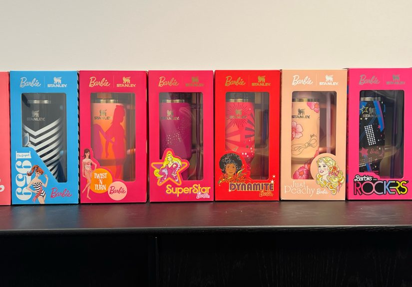
The Barbie x Stanley lineup included designs inspired by different Barbie eras and characters, including:
Barbie Icon
The showstopper of the bunch. This glossy, signature-pink design featured unmistakable Barbie branding and delivered the most immediately recognizable look in the collection. It was also the only style offered in both 30-ounce and 40-ounce sizes, which made it the obvious pick for shoppers who wanted the most classic “Barbie x Stanley” statement without needing to memorize the doll archive.
1959 Original
This design nodded to the first Barbie doll and leaned into the black-and-white visual cues associated with the original swimsuit era. It felt retro, graphic, and slightly more collector-minded than the louder pink-forward options. In other words, this was the tumbler for people who love Barbie history and also enjoy saying things like “Actually, I prefer the original concept.”
’60s Twist ‘N Turn
Bright, lively, and unapologetically playful, this design reflected the mod energy of the 1960s Barbie era. It was a reminder that Barbie has never been afraid of color, movement, or a little bit of extra. The cup practically winked at you.
’70s Superstar
This tumbler drew from the glamorous appeal of 1970s Barbie and fit neatly into the collection’s broader “decades of style” idea. It helped round out the line by giving shoppers a design that felt more classic-glam than sugary-sweet.
’80s Dynamite
One of the most visually energetic entries, this design leaned into bold graphics and celebrated the first Black Barbie through the lens of big 1980s confidence. If subtlety is not your hydration style, this one was ready to disco straight into your cart.
’80s Rockers
For shoppers who like their accessories with a little attitude, this design brought a more rebellious edge to the collection. It tapped into the louder, music-inspired side of Barbie’s image and gave the lineup some welcome contrast.
’80s Peaches ‘N Cream
Soft glam met collector nostalgia here. This design was tailored to fans who love Barbie at her most dreamy, polished, and unmistakably doll-like. It felt sweet without being childish, which is harder to pull off than many brands realize.
’80s Western Ken
Yes, Ken got in on the action too. The Western-inspired design brought darker tones, graphic contrast, and a more fashion-forward cowboy vibe to the collection. It also kept the lineup from becoming a wall of same-ish pink, which was a smart move. A Barbie collection with no Ken cameo would have felt like forgetting the best supporting actor at the awards show.
The collection also stood out for presentation. Reports around the launch highlighted collectible packaging elements, including a display box and stickers, which pushed the collaboration even further into giftable and collectible territory. That matters because a lot of Stanley buyers are not just purchasing utility. They are buying the entire experience around the product.
Why Shoppers Were So Obsessed
The obsession was not only about Barbie. It was about the way Stanley has trained its audience to view launches as limited cultural moments. The brand’s strategy depends on scarcity, color storytelling, and the knowledge that some drops vanish fast. In that kind of environment, every collaboration feels a little more dramatic than it would in a fully stocked big-box aisle.
The Barbie collection amplified that effect because it offered more than one emotional entry point. Some shoppers wanted the pure nostalgia of a childhood icon. Others wanted a stylish tumbler that looked different from the sea of neutral cups on office desks. Some collectors wanted multiple designs because each one represented a different era. And some people, let’s be honest, simply saw shiny pink and immediately blacked out.
There is also the social factor. Stanley tumblers have become visible objects. People carry them to work, school, errands, gym classes, and road trips. They are both container and accessory. A Barbie-themed Stanley tumbler is even more visible because it telegraphs taste, humor, and a willingness to be at least a little extra in public. For many buyers, that is not a downside. That is literally the point.
Were the Barbie Tumblers Actually Practical?
Underneath the nostalgia and glossy finishes, these were still Stanley Quenchers. That means they delivered the familiar features that helped make the silhouette famous in the first place: generous capacity, an easy-carry handle, straw-based sipping, and cupholder-friendly proportions that fit daily routines surprisingly well. The Barbie collection worked because it did not sacrifice function for theme. It dressed up a format people already liked.
That practicality is what separates these tumblers from novelty merchandise that looks great in photos and then immediately retires to the back of a cabinet next to the popcorn bucket you swore you would use all the time. The Barbie x Stanley cups were collectible, yes, but they were also usable. You could take one to the office, keep one in the car, gift one to a Barbie superfan, or display one on a shelf without it feeling ridiculous. That flexibility broadened the audience.
It also helped justify the emotional response. People were not just buying a commemorative object. They were buying something they could interact with every day. There is a psychological difference between “I own this cool item” and “I use this cool item every morning before 9 a.m.” The second one tends to feel a lot more satisfying.
Who This Collection Was Really For
The obvious audience was Barbie fans, but the collection reached further than that. It appealed to Stanley collectors, trend-conscious shoppers, gift buyers, and people who enjoy limited-edition products with a built-in story. It also hit a sweet spot for adults who grew up with Barbie and now enjoy products that let them revisit that nostalgia in a more design-forward, grown-up format.
That is an important distinction. These tumblers were not framed like children’s merchandise. They were positioned as premium lifestyle items with collectible appeal. That made the collaboration feel current rather than costume-y. Stanley understood that nostalgia works best when you treat the audience like adults with taste, not just consumers who will buy anything in bright pink. Barbie, for her part, remains uniquely good at moving between kid culture and adult fandom without losing her identity.
In that sense, the collaboration was not just cute. It was well targeted. It respected both brands’ audiences and gave them a product that made cultural sense. That is rarer than it should be in the collaboration economy.
The Experience of Chasing a Barbie x Stanley Drop
For many shoppers, the real story was the experience of trying to get one. The Barbie x Stanley release felt less like casually buying drinkware and more like preparing for concert tickets, except the prize was a tumbler that matched your manicure and could survive a long commute. People set reminders. They opened multiple tabs. They debated whether to go for the obvious favorite or the sleeper pick that might age better. The launch invited strategy, which is a hilarious sentence to write about water cups, but here we are.
The daily-drop format added suspense. On Monday, shoppers could grab the Barbie Icon and immediately feel victorious, or immediately feel regret that they had not waited for another design later in the week. By Tuesday and Wednesday, the conversation shifted from “Should I buy one?” to “Which era feels most like me?” Suddenly, hydration became a personality quiz. Are you a black-and-white retro purist? A mod-color optimist? An ’80s glam maximalist? A cowboy-Ken wildcard? Few products manage to make indecision this entertaining.
Then came the social experience. A collection like this does not live only on product pages. It lives in group chats, unboxing clips, desk photos, car-cupholder selfies, and the universal text message of modern consumer desire: “Do you think this one will sell out?” Limited-edition Stanley releases have a way of turning otherwise rational adults into amateur retail analysts. The Barbie collab pushed that behavior into high gear because every design had a slightly different emotional appeal. One person wanted the most iconic logo-heavy cup. Another wanted the doll-history reference. Another wanted the design nobody else in the friend group picked.
And once a cup actually arrived, the experience kept going. Packaging mattered. The themed presentation made the tumbler feel like more than a standard online order. It felt like an event in a box. For gift buyers, that meant less work. For collectors, it meant more delight. For everyone else, it meant the unboxing had enough flair to justify a dramatic “She’s here” post, which is basically the modern version of ringing the town bell.
Using the tumbler day to day created a second kind of experience: the small, silly pleasure of carrying something functional that also makes people smile. A Barbie Stanley on a conference table says something different from a plain black travel mug. It is playful. It is confident. It has main-character energy without requiring a monologue. That kind of product can brighten routine moments, and that is a bigger selling point than many brands realize.
There is also a deeper emotional layer to nostalgia-driven products like this. For some buyers, the appeal is not just color or trendiness. It is the feeling of reconnecting with a version of themselves that loved Barbie’s imagination, outfits, and world-building. A tumbler cannot transport you back in time, obviously. But it can tap into memory in a way that feels unexpectedly personal. That is why these collaborations work. They are not really selling stainless steel. They are selling familiarity, delight, identity, and the very satisfying fantasy that even your water bottle can have a point of view.
So yes, the experience around the Barbie x Stanley launch mattered almost as much as the product itself. The countdown, the choosing, the checkout rush, the unboxing, the everyday carrying, the compliments from strangers who notice the design from three feet away; all of that became part of the value. In the best-case scenario, buyers did not just end up with a tumbler. They ended up with a story attached to it. And in a market crowded with lookalike drinkware, that story is exactly what made the collection stand out.
Final Thoughts
The limited-edition Barbie tumblers proved that Stanley understands exactly what modern shoppers want from a collaboration: recognizable design, a clear story, genuine collectibility, and enough everyday usefulness to keep the purchase from feeling frivolous. Barbie brought the legacy, the color history, and the emotional pull. Stanley brought the format, the hype machine, and the lifestyle credibility. Together, they created a launch that felt playful but strategic, nostalgic but current, and stylish without losing the practical appeal that made the Quencher famous.
In the end, the Barbie x Stanley collection was not just a cute internet moment. It was a lesson in how to design a collaboration people actually care about. Give them a functional product. Give it a cultural hook. Make the visuals memorable. Add scarcity. Stir in nostalgia. Then stand back and watch adults sprint toward hydration with the urgency of bargain hunters at dawn. Barbie would approve.