Table of Contents >> Show >> Hide
- The First Thing You Notice Is the Light
- A Dutch Artist’s Home Is Usually Also a Workspace
- Color Is Used with Courage, Not Chaos
- Objects Matter More Than Perfection
- History Never Fully Leaves the Room
- Practicality Is Not the Enemy of Beauty
- What “At Home with a Dutch Artist” Really Means
- Experience Section: Spending a Day at Home with a Dutch Artist
There are homes that look decorated, and then there are homes that look lived in by people who make things for a living. A Dutch artist’s home often lands firmly in the second category. It is rarely precious in the intimidating, velvet-rope way. Instead, it feels alert. A chair might be sculptural, but it still gets sat on. A lamp may look like it wandered in from a gallery opening, but it still has the humble job of helping someone find their tea after dark. The mood is practical, playful, and just a little bit rebellious.
Spend enough time studying the homes and studios of Dutch artists and designers, and a pattern begins to emerge. Light matters. Space matters. Materials matter. So do wit, reuse, and the quiet thrill of making something unusual feel completely normal. The result is an interior language that is unmistakably Dutch: visually sharp but emotionally warm, disciplined but never boring, and clever without turning into a lecture from a particularly smug coffee table.
This is not one literal house tour of one specific person. It is a richly reported portrait of a recurring kind of place: the Dutch artist home as seen through real homes, studios, and creative spaces across Amsterdam, Rotterdam, Eindhoven, Arnhem, Breda, and beyond. Think of it as a composite visit, built from real examples and real design habits. The front door is open. Try not to trip over the prototype.
The First Thing You Notice Is the Light
If there is a patron saint of the Dutch interior, it is probably daylight. The Netherlands has a long visual relationship with light, and not just in the art-history-textbook sense. Yes, the Dutch masters knew what they were doing with windows and shadow, but contemporary Dutch creatives still behave as if natural light is both roommate and collaborator. In artist homes and design studios alike, sunlight is less a nice bonus and more a working material.
That helps explain why so many Dutch creative spaces feel open, airy, and honest. In Rotterdam, designer Sabine Marcelis has described her studio as a little oasis inside an industrial zone, and the space is defined by the way light moves through colored glass, resin, and polished surfaces. In Zaandam, Joris Laarman’s former factory studio opens toward a garden and communal table, proving that a workspace can be both high-tech and deeply human. The message is clear: let the light in, and let it do some of the heavy lifting.
At home, that same instinct shows up in broad windows, pale walls, reflective finishes, and the careful choreography of furniture placement. Dutch artists do not always live in giant lofts; in fact, many do not. But even in compact spaces, the arrangement often protects the path of light. Heavy objects are used with intention. Curtains soften rather than smother. Mirrors are placed not to show off but to bounce brightness farther into the room. It is less about minimalism as a trend and more about visual oxygen.
Why It Works
For an artist, good light is not decoration. It is infrastructure. It affects color mixing, mood, photography, reading, making, and thinking. That is why Dutch artist homes often feel so calm even when they are packed with personality. The light organizes everything before the owner has to.
A Dutch Artist’s Home Is Usually Also a Workspace
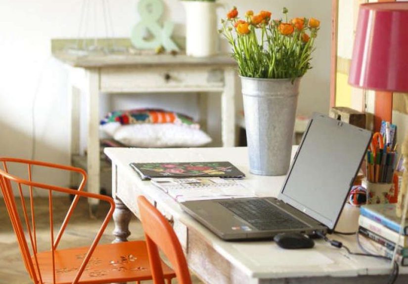
One of the most revealing things about Dutch creative interiors is how often they blur the line between living and working. The dining table might double as a sketching station. A guest room becomes a textile lab. The hallway hosts framed experiments that did not quite become final pieces but were too interesting to hide. The home is not merely where the artist rests. It is often where the next idea begins its awkward little life.
That spirit comes alive in Eindhoven, long associated with experimental design culture. Nacho Carbonell once described the heart of his studio as a simple worktable covered in samples, fragments, and triggers for imagination. That image says a lot about the Dutch approach: creativity is not always polished at the start. It may begin with plywood, wire, a weird stone, a promising offcut, or something rescued from the edge of irrelevance.
Even homes that are not full-time studios often borrow the same logic. Rooms stay flexible. Furniture moves. Shelves hold books, ceramics, tools, and objects without pretending those categories are separate species. In a Dutch artist’s home, the studio is not always a dedicated room with dramatic northern light and an Instagram-worthy apron hanging nearby. Sometimes it is simply wherever the work can happen honestly.
That is part of the charm. These interiors rarely feel over-zoned or over-programmed. They leave room for life to improvise. A corner can be a breakfast nook at 8 a.m., a still-life setup at 11, and a place to panic quietly before a deadline at 4. Functional? Yes. Glamorous? Occasionally. Real? Always.
Color Is Used with Courage, Not Chaos
There is a lazy stereotype that northern European interiors are all beige restraint and one tragic candle. Dutch artist homes cheerfully ignore that memo. Color often appears boldly, but it is usually handled with an artist’s eye rather than a daredevil’s impulse. That means the palette may be intense, but it still feels composed.
A colorful Amsterdam home belonging to Carice van Houten and Guy Pearce showed how Dutch interiors can embrace saturated hues without tipping into visual nonsense. Pink entry walls, a purple carpet, chartreuse in a study, floral fabrics, vintage pieces, and avant-garde accents all coexisted because the choices were grounded in feeling rather than formula. The rooms did not scream, “Look at my palette!” They said, “A real person lives here, and that person is not afraid of delight.”
Photographer Jan Hoek’s small Amsterdam apartment offers a different but equally Dutch kind of lesson. In just 430 square feet, color and pattern become a running conversation rather than a neat design solution. The home is quirky, self-aware, and willing to be strange. That willingness matters. Dutch artist homes often avoid showroom stiffness by allowing taste to remain in motion. A room does not have to be “finished” to be good. It just has to feel alive.
This is where many artist homes beat trend-driven interiors by several bike lengths. They are not trying to photograph well first and live well later. They are trying to make daily life more vivid. The best of them use color the way painters use contrast: to direct emotion, sharpen attention, and create rhythm. The effect can be playful, moody, or electrifying, but it is rarely bland.
The Secret Ingredient: Restraint in One Area, Freedom in Another
Often the room works because something else holds steady. Maybe the architecture is simple. Maybe the floor is quiet. Maybe the furniture silhouettes are disciplined. Dutch artist homes often balance one wild move with one calm move. That is how a yellow stairwell, a candy-colored artwork, or a gloriously odd lamp gets to feel intentional rather than accidental.
Objects Matter More Than Perfection
Walk into a Dutch artist’s home and you quickly realize the objects are not there just to fill surfaces. They carry a biography. A chair may have been thrifted, repaired, inherited, or rescued from a flea market before being paired with a contemporary table that looks as if it was designed on another planet. A ceramic bowl might be handmade, slightly uneven, and therefore more lovable than anything factory-perfect.
This affection for meaningful objects runs through Dutch design culture. At one end, you have the witty theatricality associated with Moooi and the playful, high-concept spirit seen in homes connected to its founders. At the other, you find artists and designers deeply invested in material origins and responsible making. Christien Meindertsma’s work tracing the afterlives of a single pig became iconic precisely because it exposed the hidden systems behind everyday objects. In a Dutch artist home, that kind of material awareness often filters down into ordinary decisions: reuse the lamp, keep the vintage chair, buy less but buy smarter, and let patina do its beautiful work.
That also helps explain why these interiors often feel collected instead of “completed.” A Dutch artist does not necessarily want a room that looks new. New can be useful, but old can be eloquent. Antiques, found pieces, handmade textiles, industrial leftovers, and practical shelving all mingle in a way that suggests curiosity rather than consumerism. The space says, “I chose this,” not, “I bought the whole room in one Saturday afternoon and now fear sitting in it.”
History Never Fully Leaves the Room
The Netherlands has a dense architectural and artistic memory, and Dutch interiors tend to negotiate with that memory instead of bulldozing it. Canal houses, old townhouses, former shops, brownstones, converted industrial sites, and compact urban apartments all bring some inherited character to the party. Many artist homes respond by preserving what is useful and reimagining what is not.
Apartment tours of Dutch homes repeatedly show the same pattern: old bones, new energy. A ceramicist’s restored house in Amersfoort kept the dignity of a 1930s structure while introducing fresh color, modern comfort, and better flow. A cross-stitch artist’s townhouse in Arnhem used eclectic layers rather than sterile renovation logic. In these spaces, renovation is not about erasing time; it is about collaborating with it.
Piet Mondrian’s studios remain a wonderful historical example of how deeply a Dutch artist might shape a room into an extension of vision. Before his later abstract spaces became famous, his Amsterdam studio still reflected the evolution of his eye. Later, his studios became environments that almost behaved like paintings one could walk into. That idea still lingers in contemporary Dutch artist homes: walls, furniture, placement, and emptiness all participate in the work of expression.
In other words, a Dutch artist’s home is rarely just a backdrop. It is a medium.
Practicality Is Not the Enemy of Beauty
One of the most endearing things about Dutch creative interiors is how unashamedly practical they are. The bike has to fit somewhere. Storage has to work hard. The kitchen should function. The table needs to survive actual meals, not just dramatic fruit bowls. This practicality does not dilute beauty; it sharpens it.
There is a distinctly Dutch confidence in letting useful things remain visible. Open shelving, stacked books, material samples, studio jars, hooks, baskets, and multipurpose benches all show up often. Rather than pretending life is frictionless, these homes design for real routines. The beauty comes from how gracefully those routines are held.
That may be why Dutch artist homes feel so inviting. Even when the design is striking, you can still imagine making coffee there, sorting brushes there, airing out linens there, or arguing amiably over where to hang one more painting. Beauty is not displayed at a distance. It is woven into use.
What “At Home with a Dutch Artist” Really Means
To be at home with a Dutch artist is not merely to stand inside a pretty room in Amsterdam and admire a vase while trying not to breathe on anything expensive. It is to enter a worldview. In that worldview, home is a workshop for living. Light is a tool. Color is a mood language. Objects have histories. Old buildings deserve second acts. Experimentation belongs not only in museums and fairs, but also beside the sofa, over the mantel, and near the coat rack where a half-finished idea waits for tomorrow.
That is why these spaces linger in the imagination. They are not perfect. Thank goodness. They are edited, but not sterilized. They are artful, but not humorless. They know how to host contradiction: thrift and sophistication, structure and spontaneity, industry and tenderness. A Dutch artist’s home can be crisp, cluttered, theatrical, quiet, or gloriously odd. But at its best, it always feels inhabited by attention.
And maybe that is the real takeaway for the rest of us. You do not need a canal house, a design degree, or a resin prototype glowing in the corner to borrow something from this way of living. Start with the light. Keep what matters. Use color bravely. Let your objects tell the truth. Make room for work, imagination, and a little imperfection. Suddenly, your home stops acting like a catalog and starts acting like a life.
Experience Section: Spending a Day at Home with a Dutch Artist
You notice it before you even sit down: the house feels awake. Not loud, not chaotic, not trying too hard. Just awake. Morning light slides across the floorboards and catches the rim of a ceramic cup left near a stack of books. A chair in the corner looks sculptural enough for a gallery, but there is a sweater hanging over it, which is somehow reassuring. This is not a “look but do not touch” kind of interior. This is a place where ideas and ordinary life keep bumping shoulders.
Breakfast is rarely dramatic, but the surroundings make it feel cinematic anyway. Bread, cheese, coffee, fruit, perhaps something suspiciously healthy, all set against shelves lined with objects that seem to have arrived from different decades and different moods. A handmade bowl sits next to a flea-market candlestick. A serious art book leans against a childlike drawing. Nothing matches in the obvious sense, yet everything belongs. That is one of the strangest and nicest things about being at home with a Dutch artist: you start to understand that coherence is not sameness. It is conviction.
As the day moves on, the home reveals its second identity. A laptop opens on the dining table. Samples appear. A drawer produces tape, pencils, thread, postcards, a ruler, and one mysterious object that no one explains but everyone respects. The artist moves through the house as if each room offers a slightly different kind of thinking. The window seat is for looking. The kitchen is for talking. The worktable is for beginning badly until something better happens. Even tidying has a creative rhythm to it. Things are not hidden so much as rearranged into temporary peace treaties.
By afternoon, the house feels warmer, fuller, more layered. Light hits differently. Colors deepen. A hallway that seemed simple in the morning suddenly looks theatrical. You begin to see why Dutch artist homes are so memorable. They do not reveal themselves all at once. They unfold. A surface you barely noticed turns out to be painted in a subtly strange shade. A lamp throws a shadow that feels intentional. A tiny corner holds a vase, a torn note, and a found object that together look more composed than many formal displays.
Then evening arrives, and the most impressive thing happens: the home remains beautiful without becoming performative. Dinner can be casual. Someone lights a candle. Music goes on. A pile of sketches may still be sitting nearby, and nobody panics. The art is not staged away from life; it lives among it. You leave with the feeling that creativity here is not a grand event that descends with thunder and a grant application. It is built into the habits of the day. Open the curtains. Move the chair. Keep the odd lamp. Start the sketch. Reheat the soup. Change the painting. Notice the light. In a Dutch artist’s home, that is more than a routine. It is a philosophy with very good windows.