Table of Contents >> Show >> Hide
- What Is a Gradient in Google Slides?
- Why Use a Gradient Instead of a Solid Color?
- How to Create a Gradient Background in Google Slides
- How to Add a Gradient to a Shape in Google Slides
- How to Create a Gradient Text Effect in Google Slides
- How to Apply Gradient Styling Across Multiple Slides
- Best Gradient Color Combinations for Google Slides
- Common Mistakes to Avoid
- When a Gradient Works Best in Google Slides
- Quick Example: Building a Stylish Title Slide
- Real-World Experiences and Lessons from Actually Using Gradients in Google Slides
- Conclusion
Let’s be honest: a plain white slide can do the job, but it rarely gets a standing ovation. If your presentation looks like it got dressed in the dark, a gradient can fix that fast. A well-made gradient adds depth, energy, and a polished feel without turning your slide into a neon puddle. The trick is knowing how to use it without making your audience squint like they’re solving a mystery.
In this guide, you’ll learn exactly how to create a gradient in Google Slides, when to use one, how to fake gradient text when Google Slides gets a little stubborn, and how to make your deck look modern instead of “I finished this five minutes before the meeting.” Whether you’re building a class presentation, sales deck, portfolio, or social-style slide design, this tutorial will help you create gradients that look intentional, clean, and web-ready.
What Is a Gradient in Google Slides?
A gradient is a smooth transition between two or more colors. Instead of a flat solid fill, you get movement, mood, and a little visual drama. In Google Slides, gradients are most useful for slide backgrounds, shapes, overlays, and design accents. They can help a layout feel softer, more dimensional, and much more expensive than it actually is.
There are two main ways people use gradients in Google Slides:
- Background gradients to give an entire slide a stylish base.
- Shape gradients to create buttons, banners, highlight boxes, overlays, and visual anchors.
You can also create a gradient-like effect for text, but that requires a workaround because Google Slides is still a bit conservative when it comes to native text effects. Think of it as having great fashion sense but refusing to buy glitter shoes.
Why Use a Gradient Instead of a Solid Color?
A solid color is simple and safe. A gradient is simple and interesting. That’s a very important difference.
Here’s what a good gradient can do for your slide design:
- Add depth without clutter.
- Make headlines and images feel more intentional.
- Create contrast behind text.
- Guide the viewer’s eye across the slide.
- Make a basic presentation feel more branded and modern.
For example, a soft blue-to-purple gradient can make a startup pitch feel sleek and current. A pale peach-to-cream gradient can warm up a creative portfolio. A dark navy-to-black gradient can make charts or quotes look sharp and premium. The point is not to show off every color known to humanity. The point is to support the message.
How to Create a Gradient Background in Google Slides
If your goal is to add a gradient to the entire slide, this is the easiest and cleanest method.
Step 1: Open Your Slide
Launch Google Slides and open the presentation you want to edit. Select the slide where you want the gradient background to appear.
Step 2: Open the Background Settings
Click Slide in the top menu and choose Change background. You can also right-click a blank area of the slide and open the background settings from there, depending on your layout and interface.
Step 3: Choose the Color Menu
Inside the background panel, click the background color dropdown. This is where the gradient magic begins.
Step 4: Select Gradient
Choose Gradient. Google Slides usually offers preset gradients first, which is great when you want something fast and reasonably attractive. If the preset options feel too generic, move on to custom settings.
Step 5: Customize the Gradient
Select Custom if available in your gradient options. From there, you can adjust the direction, color stops, and overall look. A subtle diagonal or vertical blend often looks cleaner than anything too dramatic.
Step 6: Click Done or Apply to All
If you want the gradient only on the current slide, click Done. If you want the same background across your full presentation, use Add to theme or apply it through your theme setup, depending on your workflow.
Pro tip: Start with two colors that are related, not opposites in a cage match. For instance:
- Sky blue to indigo
- Lavender to midnight blue
- Mint to teal
- Warm beige to soft peach
How to Add a Gradient to a Shape in Google Slides
Sometimes a full-slide gradient is too much. In that case, add the gradient to a shape instead. This works beautifully for title boxes, callout sections, dividers, labels, and image overlays.
Step 1: Insert a Shape
Go to Insert > Shape and pick the shape you want. Rectangles with rounded corners are a favorite because they look clean, modern, and hard to mess up.
Step 2: Select the Shape
Click the shape so the toolbar options become active.
Step 3: Open Fill Color
Click the Fill color icon in the toolbar. Then switch to the Gradient tab.
Step 4: Choose a Preset or Create a Custom Gradient
You can select a preset gradient or click Custom to build your own. Custom gradients are the better choice when you want your slides to match a brand palette, website colors, or a specific mood.
Step 5: Adjust Transparency if Needed
This is one of the most useful design tricks in Google Slides. A semi-transparent gradient shape placed over an image can improve text readability and make the whole slide feel more polished. It’s like putting a nice blazer on your content.
For example, if you have a busy photo background, place a rectangle over the bottom half, fill it with a dark transparent gradient, and place white text on top. Suddenly the slide looks deliberate instead of chaotic.
How to Create a Gradient Text Effect in Google Slides
Now for the question everybody asks: can you make gradient text in Google Slides?
The honest answer is: not in the same direct, native way you can in some other design tools. Regular text formatting in Google Slides is built around solid text colors, so you usually need a workaround.
Here are the most practical methods.
Method 1: Use WordArt with a Gradient Shape Behind It
Insert WordArt by going to Insert > Word art. Type your title, then style it with a clean outline or no fill. Place it over a gradient-filled shape or banner so the overall text area feels like it has a gradient identity, even if the letters themselves are not fully gradient-filled.
This method works especially well for title slides, section dividers, and social-media-inspired layouts.
Method 2: Create Gradient Text Outside Google Slides
If you want true gradient lettering, create it in a graphic tool, export it as a transparent PNG, and insert it into Google Slides. This gives you more control over the exact gradient style, curve, glow, and contrast.
This is the best option when branding matters and your headline needs to look perfect.
Method 3: Fake the Effect with Layering
Another workaround is to stack shapes, use partial transparency, and crop images behind text. It takes more patience, but it can produce a custom look for headers and hero slides. Not exactly one-click simple, but neither is making good lasagna.
How to Apply Gradient Styling Across Multiple Slides
If you create one beautiful gradient slide and then ignore the rest of the deck, congratulations: you now own a presentation identity crisis. Consistency matters.
To keep the style unified:
- Use the same two or three core gradient palettes throughout the presentation.
- Edit theme colors so supporting elements match your gradient choices.
- Reuse the same gradient direction for similar sections.
- Duplicate styled slides instead of rebuilding them from scratch.
Google Slides also lets you edit theme colors, which is useful if you want your accent colors, shapes, and text highlights to work with the gradients instead of fighting them.
Best Gradient Color Combinations for Google Slides
You do not need forty-seven colors. You need restraint and decent taste.
Professional and Clean
- Navy to royal blue
- Charcoal to slate gray
- Deep green to teal
Creative and Modern
- Purple to pink
- Blue to violet
- Coral to orange
Soft and Minimal
- Beige to cream
- Blush pink to peach
- Mint to pale aqua
A smart rule is to test your text contrast right away. If your headline disappears into the gradient like it’s playing hide-and-seek, the colors need adjusting.
Common Mistakes to Avoid
Using Too Many Colors
A gradient should feel smooth, not confused. Two colors are often enough. Three can work. Nine is a cry for help.
Making the Gradient Too Bright
High-saturation colors can overwhelm your content. If the background is louder than your message, the background wins.
Ignoring Readability
Every design choice should help the audience absorb information. Use overlays, darker tones, or high-contrast text to keep things legible.
Overusing Special Effects
Gradients already add personality. You usually do not need shadows, glowing text, five icons, and a dramatic stock photo all competing for attention.
When a Gradient Works Best in Google Slides
Gradients shine in these situations:
- Title slides
- Section divider slides
- Quote slides
- Portfolio intros
- Product showcase slides
- Social media mockups
- Minimal data slides with one key message
They are less effective when a slide is already dense with charts, tables, tiny labels, and too much text. In those cases, simplicity usually beats style.
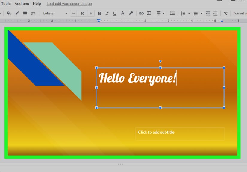
Quick Example: Building a Stylish Title Slide
Imagine you’re creating a presentation called 2026 Marketing Trends.
- Set the slide background to a dark blue-to-purple gradient.
- Add a semi-transparent black rectangle at the bottom third of the slide.
- Insert a bold white headline.
- Add a small accent line in a bright complementary color, like aqua or coral.
- Use one clean sans-serif font and leave generous spacing.
The result feels current, branded, and easy to read. It also avoids the classic mistake of making a slide look like a software demo from 2009.
Real-World Experiences and Lessons from Actually Using Gradients in Google Slides
One of the funniest things about learning how to create a gradient in Google Slides is that the first attempt often looks amazing for about six seconds. Then you add text, an image, maybe a chart, and suddenly the slide looks like a smoothie exploded behind your content. That is a normal part of the process. Most people do not fail because gradients are hard. They fail because gradients are easy enough to overdo.
In real-world use, the best gradients are usually the ones you barely notice at first. They quietly support the layout. For example, when building a business presentation, a subtle dark gradient behind a title can make the entire deck feel more premium without distracting from the information. In classroom presentations, lighter gradients can make slides friendlier and more visual, especially when students want something more exciting than plain white but less chaotic than full-image backgrounds.
Another common experience is realizing that gradients solve one problem while creating another. Yes, they make a slide look better. But they also force you to think harder about readability. White text on a soft pastel gradient may look trendy in theory, but in practice it can vanish the second you present on a low-quality projector. That is why many experienced users end up adding transparent overlays, darkening one side of the gradient, or keeping text inside a solid or semi-transparent shape.
People also discover that gradients are incredibly useful for branding. If a company uses two core brand colors, blending them into a consistent background or shape style can make a Google Slides deck look more custom and professional. It is one of the fastest ways to make a template feel less generic. Instead of starting from a default theme and hoping for the best, you start creating a recognizable visual system.
There is also a practical lesson many users learn the hard way: duplicate your best gradient slides. Once you get one slide looking right, reuse that structure. Trying to recreate the same blend, direction, transparency, and spacing over and over is a fabulous way to waste an afternoon. A duplicated slide keeps the presentation cohesive and saves time.
And finally, there is the great gradient truth: just because Google Slides lets you make something flashy does not mean your audience needs to see it. The most successful gradients are often subtle, deliberate, and a little restrained. In other words, use gradients like good cologne: enough to make an impression, not enough to make people back away slowly.
Conclusion
If you want your presentation to look more polished, learning how to create a gradient in Google Slides is absolutely worth the effort. It is one of the simplest ways to make slides feel modern, layered, and more professional without using complicated design software. Whether you add a gradient background, style a shape, create a soft overlay, or fake a gradient text effect with a clever workaround, the key is balance. Keep it readable, keep it consistent, and keep the spotlight on the message.
Done well, gradients make your slides feel designed rather than assembled. And that, dear presenter, is the difference between “nice deck” and “who made this?”