Table of Contents >> Show >> Hide
- Why Neisha Crosland Tile Feels So Distinctive
- The De Ferranti Connection: Craft, Surface, and Soul
- How to Use Neisha Crosland for De Ferranti Tile in a Kitchen
- Color Palettes That Work Beautifully
- Installation and Maintenance: The Practical Side of Pretty
- Why This Tile Style Still Feels Relevant
- Design Experience: Living With a Patterned Kitchen Tile
- Conclusion
Some kitchens whisper. Others clear their throat politely and say, “Please notice my backsplash.” A kitchen featuring Neisha Crosland for De Ferranti tile belongs to the second group, but in the most elegant way possible. It is not loud for the sake of being loud. It is patterned, crafted, and quietly confident, like a dinner guest who knows exactly which fork to use but still laughs at the wrong moment.
The phrase “Kitchen: Neisha Crosland for De Ferranti Tile” may sound like a niche design note, yet it opens the door to a much bigger conversation about pattern, handmade surfaces, British decorative craft, and the modern return of expressive kitchen tile. At its heart, this design idea is about turning a functional surface into a visual story. Instead of treating the backsplash or floor as background, Crosland’s tile work invites it to become part of the room’s architecture, rhythm, and personality.
Neisha Crosland, a London-based textile and surface designer, is known for sophisticated pattern work that balances order and surprise. De Ferranti, a specialist in artisan floors, antique stone, ceramics, and bespoke surfaces, brings the material intelligence. Together, their tile collaborations feel decorative without being flimsy, traditional without being dusty, and bold without shouting over the soup pot.
Why Neisha Crosland Tile Feels So Distinctive
Neisha Crosland’s design language has always been rooted in pattern. Her work spans textiles, wallpaper, rugs, flooring, and interior products, but the common thread is a fascination with repetition, geometry, and emotional connection. A good pattern does more than fill space. It creates movement. It catches the eye, releases it, then pulls it back again like a tiny visual tide.
That is why her tile designs work especially well in kitchens. Kitchens are full of grids already: cabinet doors, drawer fronts, shelving, windows, floor lines, appliance edges, and countertops. A patterned tile adds another layer to that grid, but it softens the machine-like feeling of the room. Suddenly, the kitchen is not just a place where the dishwasher hums and someone forgets to close the cereal box. It becomes a composed interior.
Pattern With Discipline
What separates a Neisha Crosland tile from a generic patterned tile is restraint. The motifs are often graphic, but they are not chaotic. They may suggest stripes, botanicals, repeated marks, lattice structures, or modernist forms, yet they remain balanced. In kitchen design, that matters. Too much pattern can feel like visual static. Too little can feel flat. Crosland’s work often lands in the middle: lively enough to be memorable, controlled enough to live with every day.
This is especially important for a backsplash, which sits at eye level. It is one of the few surfaces in a kitchen that can be both practical and expressive. Cabinets may need to store things. Countertops need to survive lemon juice, coffee spills, and the occasional suspiciously heavy grocery bag. The backsplash, however, has a little more freedom to flirt with beauty.
The De Ferranti Connection: Craft, Surface, and Soul
De Ferranti is known for materials that feel collected rather than merely purchased. Its world includes antique stone, reclaimed floors, hand-finished ceramics, and bespoke surfaces with texture and provenance. When paired with Neisha Crosland’s pattern vocabulary, the result is tile that feels both designed and touched by hand.
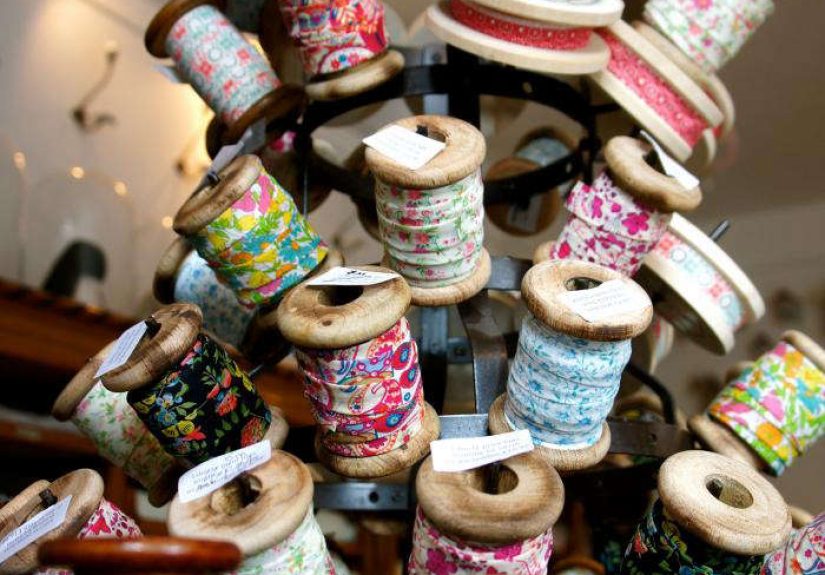
One of the best-known references to the partnership appeared in the design world through a kitchen backsplash comparison: a sophisticated graphic black-and-white kitchen by French designer Pierre Yovanovitch reminded editors of Neisha Crosland’s work for De Ferranti. The referenced tiles included Crosland’s Beaded Stripe pattern etched on De Ferranti tile and stenciled limestone tiles from the collection. That detail is important because it explains the appeal: the tiles are not merely printed decorations. They are pattern translated through stone, ceramic, surface, and craft.
Modernist, Haveli, Botanica, and Floris Influences
Neisha Crosland’s tile portfolio through De Ferranti includes several collections and designs with names that already sound like a well-traveled design notebook: Modernist, Haveli, Botanica, Floris, and more. The Modernist collection, for example, includes handmade and hand-painted terracotta tiles in several designs and colorways. The hand-applied glaze and terracotta body give the tiles warmth, patina, and small variations that mass-produced surfaces often lack.
Designs such as D-Bar, Limpet, Radar, Shuttle, Tectonic, and Vector offer a more geometric direction, while names like Gardenia, Lily Pond, Tulip, Dog Rose, Marigold, and Dandelion lean into botanical rhythm. This variety makes the collaboration useful for different kitchen styles. A sleek urban kitchen might benefit from a graphic Modernist tile behind the range. A cottage-inspired kitchen might prefer a botanical or hand-painted feeling. A transitional kitchen could use just a border or accent panel, keeping the rest calm.
How to Use Neisha Crosland for De Ferranti Tile in a Kitchen
The beauty of a patterned tile is also the trap. Use it thoughtfully and the kitchen looks curated. Use it everywhere without a plan and the room may start to resemble a very expensive optical illusion. The goal is not to cover every possible surface. The goal is to let the tile create a focal point and then give it room to breathe.
1. Create a Statement Backsplash
The most natural place to use Neisha Crosland for De Ferranti tile is the backsplash. A patterned backsplash can transform a plain kitchen faster than almost any other permanent design move. It sits between the work surface and wall cabinets, which means it is visible, useful, and protected from heavy foot traffic.
For a dramatic look, carry the tile from countertop to ceiling behind open shelves or a range hood. For a quieter approach, use it only behind the stove and surround it with plain tile or painted plaster. The second option works especially well when using a highly detailed pattern. It gives the design a framed moment without turning the kitchen into a tile showroom that accidentally sells coffee mugs.
2. Pair Patterned Tile With Plain Field Tile
One smart approach is to mix decorative tiles with simpler “blank” tiles. This keeps costs manageable and allows the patterned tile to stand out. For example, a run of plain cream, chalk, soft gray, or warm white tile can create a calm base, while a band of Crosland pattern adds rhythm. This is especially effective in galley kitchens or small apartments, where too much pattern can compress the space visually.
Imagine a kitchen with painted cabinets in mushroom gray, honed marble counters, brass pulls, and a narrow stripe of Beaded Stripe or a graphic Modernist motif running behind the sink. The effect is subtle but distinctive. It says, “Yes, I own a vegetable brush, but I also have taste.”
3. Use Tile as a Floor Moment
Patterned tile on the floor can be stunning, especially in a kitchen that opens into a dining area or garden room. De Ferranti’s surface expertise makes this idea especially relevant because the company’s broader identity is tied to floors, antique materials, and architectural surfaces. A patterned floor can make simple cabinetry feel intentional and layered.
For best results, keep the cabinet fronts quiet. Flat-front painted cabinets, simple Shaker doors, or natural wood units allow the floor to become the feature. If the pattern is strong, avoid competing with busy countertops. A calm stone, butcher block, or matte composite surface will help the room stay balanced.
4. Frame the Range or Sink Area
A decorative tile panel behind the range is a classic move, but it needs a modern hand. Avoid overly fussy borders that trap grease visually and physically. Instead, use the pattern as a clean rectangular field or allow it to run naturally with the rest of the backsplash. Neisha Crosland’s disciplined motifs are strong enough to hold attention without needing a heavy frame.
Behind the sink, patterned tile can also be delightful. The sink area gets daily attention, so why not make it attractive? Washing a colander of strawberries feels more charming when the wall behind it has a little visual music. Still, choose a finish that can handle splashes and cleanups, and always discuss sealing and maintenance with the supplier or installer.
Color Palettes That Work Beautifully
Neisha Crosland for De Ferranti tile can support a range of kitchen color palettes, from monochrome to earthy, botanical, and jewel-toned. The key is to choose one lead idea and let everything else support it.
Black and White: Graphic and Timeless
A black-and-white patterned tile is the design equivalent of a crisp white shirt with excellent shoes. It rarely looks wrong. In kitchens, black-and-white tile works with white cabinets, dark wood, stainless steel, marble, soapstone, and brass. It can feel Parisian, modern, vintage, or slightly theatrical depending on the surrounding materials.
To keep the look fresh, avoid making every element high contrast. Add wood, aged metal, warm lighting, or creamy paint so the room does not become too stark. Pattern has more charm when it has something soft to lean against.
Olive, Mustard, Denim, and Sepia: Warm Modernist Energy
The Modernist tile direction includes earthy and expressive color families such as olive, mustard, denim, sepia, yellow, black, and white. These tones are excellent for kitchens because they feel grounded rather than sugary. Olive can connect the room to garden views. Mustard adds warmth without going full sunshine parade. Denim brings depth. Sepia softens the graphic edge.
These colors pair well with natural oak, walnut, unlacquered brass, plaster walls, and stone counters with warm veining. They also work beautifully in kitchens that aim for a collected, lived-in feeling rather than a brand-new showroom glow.
Botanical Colors: Jade, Bluebell, Coral, Rose, and Gold
For a softer kitchen, Crosland’s botanical-inspired patterns can introduce color without losing sophistication. Jade and blue tones can make a kitchen feel calm and fresh. Coral and rose add warmth. Gold and ochre bring a historic, sunbaked quality. These colors are particularly effective in kitchens with open shelving, handmade dishes, copper pans, or painted furniture.
The trick is moderation. A floral or botanical tile does not require floral curtains, floral plates, floral wallpaper, and a floral apron hanging heroically by the stove. One leading pattern is enough. Let it be the star, not the opening act for twelve other flowers.
Installation and Maintenance: The Practical Side of Pretty
Beautiful tile still has to survive real life. Kitchens involve steam, oil, tomato sauce, coffee, and mysterious crumbs that appear five minutes after sweeping. Before choosing any handmade, hand-painted, limestone, terracotta, or decorative tile, confirm the recommended use, sealing requirements, grout type, and cleaning method.
Handmade or rustic tiles may vary in size, thickness, surface texture, and edge profile. That variation is part of the charm, but it also affects grout joints and installation. A skilled installer will understand how to work with irregular edges and how to lay out the pattern so it feels intentional rather than slightly tipsy.
Choose Grout Carefully
Grout can change the entire look of patterned tile. A matching grout color softens the grid and allows the pattern to read more smoothly. A contrasting grout emphasizes each tile shape and can create a busier appearance. For Crosland-style patterns, a quieter grout is often the better choice unless the tile design specifically benefits from a visible grid.
In a cooking zone, stain resistance matters. Ask about sealed grout, high-performance grout, and cleaning recommendations. A decorative backsplash should not require a monastic cleaning ritual every time someone makes pasta.
Plan the Layout Before Installing
Patterned tile must be planned, not guessed. Before installation, dry-lay the tiles or request a layout drawing. Check where the pattern begins, where it ends, how it turns corners, and what happens around outlets. Nothing humbles a beautiful tile faster than a badly placed electrical outlet slicing through the motif like a tiny plastic villain.
For backsplashes, center the pattern behind the range, sink, or main sightline. For floors, consider what is visible from adjoining rooms. Pattern placement should feel calm from the doorway, not only from directly above with a tape measure and a hopeful attitude.
Why This Tile Style Still Feels Relevant
The renewed interest in handmade, hand-painted, and patterned tile reflects a broader design shift. Homeowners are moving away from anonymous surfaces and toward materials with character. Kitchens no longer need to look like laboratories with barstools. They can feel warm, layered, artistic, and personal.
Neisha Crosland for De Ferranti tile fits this mood perfectly. It offers pattern with intelligence, craft with history, and color with restraint. It can make a simple kitchen memorable and a grand kitchen more human. Most importantly, it supports the idea that practical rooms deserve beauty too.
A kitchen backsplash protects the wall, yes. But it can also set the tone for the whole room. It can make white cabinets feel bespoke, make wood cabinets feel lighter, make stone counters feel more relaxed, and make everyday routines feel a bit more designed. That is the quiet power of a well-chosen tile.
Design Experience: Living With a Patterned Kitchen Tile
In real-life kitchen planning, the biggest surprise with a tile like Neisha Crosland for De Ferranti is how much influence it has over everything else. A patterned tile is not just one material decision. It becomes the room’s visual anchor. Once the tile is chosen, cabinet color, hardware, lighting, wall paint, countertop material, and even the shape of the range hood start lining up around it like polite design soldiers.
One useful experience is to bring a tile sample into the kitchen at different times of day. Morning light can make a glaze look crisp and bright, while evening light may bring out warmer undertones. A color that looks dramatic in a showroom may become softer at home. A pattern that seems subtle under store lighting may suddenly become the lead singer once it is placed between cabinets. Samples are not optional; they are the design equivalent of meeting someone for coffee before agreeing to a road trip.
Another practical lesson is that patterned tile often looks better with fewer competing finishes. If the tile has a strong graphic repeat, choose cabinet hardware with simple lines. If the tile has a botanical motif, consider quieter countertops. If the tile has handmade texture, let the lighting emphasize that surface rather than flatten it. Small under-cabinet lights can make a backsplash glow, but harsh lighting may exaggerate every bump and grout line. Warm, even lighting is usually kinder.
Homeowners also tend to underestimate the emotional value of a beautiful backsplash. It is seen every day while making coffee, rinsing dishes, packing lunches, or pretending that a bowl of cereal counts as dinner. A thoughtful tile choice can make these ordinary moments feel more pleasant. The kitchen becomes less like a utility zone and more like a room with a point of view.
There is also a confidence curve. At first, a patterned tile may feel daring. People often worry, “Will I get tired of it?” The better question is, “Does the pattern feel connected to the architecture and the way I live?” A trendy pattern chosen only because it is everywhere online may age quickly. But a pattern with balance, craft, and personal appeal can feel satisfying for years. Neisha Crosland’s work has that advantage because it draws on classic principles: rhythm, repetition, proportion, and surprise.
For smaller kitchens, the experience is slightly different. Pattern can actually help a compact room feel intentional, as long as the palette is controlled. A small kitchen with plain cabinets and a strong backsplash can feel jewel-box charming rather than cramped. The secret is to avoid clutter around the tile. Keep countertop objects edited. Let the backsplash do its job. Not every toaster, jar, and decorative cutting board needs to audition for attention.
For larger kitchens, patterned tile can prevent the space from feeling too empty. Big kitchens sometimes suffer from “airport lounge syndrome”: impressive, expensive, and strangely impersonal. A handcrafted tile introduces human scale. The eye notices small variations, brush marks, color shifts, and the rhythm of the repeat. These details make the room feel warmer and more lived in.
The final experience worth mentioning is installation patience. Patterned tile rewards careful layout. Rushing the process can lead to awkward cuts, broken rhythm, and corners that feel unresolved. Work with an installer who respects handmade material and understands pattern matching. The best result should look relaxed, not random. Like good cooking, good tile installation depends on preparation, timing, and not panicking halfway through.
Conclusion
Kitchen: Neisha Crosland for De Ferranti Tile is more than a design reference. It is a reminder that the kitchen can be practical and poetic at the same time. Crosland’s pattern intelligence and De Ferranti’s material craft create tiles that bring movement, warmth, and artistry into one of the hardest-working rooms in the home.
Whether used as a bold backsplash, a quiet decorative border, a floor statement, or a framed range feature, these tiles offer a rare combination: they are useful, beautiful, and full of personality. In a world of safe white boxes and copy-paste renovations, that feels refreshingly human. After all, if you are going to stand in front of a wall every morning making coffee, it may as well be a wall with excellent taste.
Note: This article is written as original, publication-ready web content based on real design information and practical kitchen tile guidance, with no inline source links or unnecessary reference markers included in the HTML body.