Table of Contents >> Show >> Hide
- Why Color Swatches Matter More Than You Think
- Step 1: Start Wider Than Feels Comfortable
- Step 2: Learn to Spot Undertones Before They Sneak Up on You
- Step 3: Take Swatches Out of the Store and Into the Room
- Step 4: Check the Color Under Your Actual Light Bulbs
- Step 5: Narrow Your Swatches to Three Finalists
- Step 6: Paint Large Samples, Not Tiny Dabs
- Step 7: Think About Finish Before You Commit
- Step 8: Use the Whole-House View
- Common Mistakes When Using Color Swatches
- A Simple Formula for Picking Paint With Swatches
- Final Thoughts
- Experiences: What Using Color Swatches Really Feels Like in Real Homes
- SEO Tags
Choosing paint should be simple. You see a lovely little swatch, whisper “that’s the one,” and skip off to the register like a confident home-improvement hero. Then you paint the wall and discover your “soft greige” looks suspiciously like damp oatmeal with a hint of regret. If that sounds familiar, welcome to the club. Paint swatches are helpful, but only when you know how to use them properly.
The good news is that picking paint colors does not require psychic powers, a design degree, or a dramatic fainting spell in the paint aisle. It does require a method. Once you understand how color swatches behave in different light, against different surfaces, and at a larger scale, the process becomes much easier. This guide breaks down exactly how to use color swatches to choose paint colors with more confidence and fewer expensive mistakes.
Why Color Swatches Matter More Than You Think
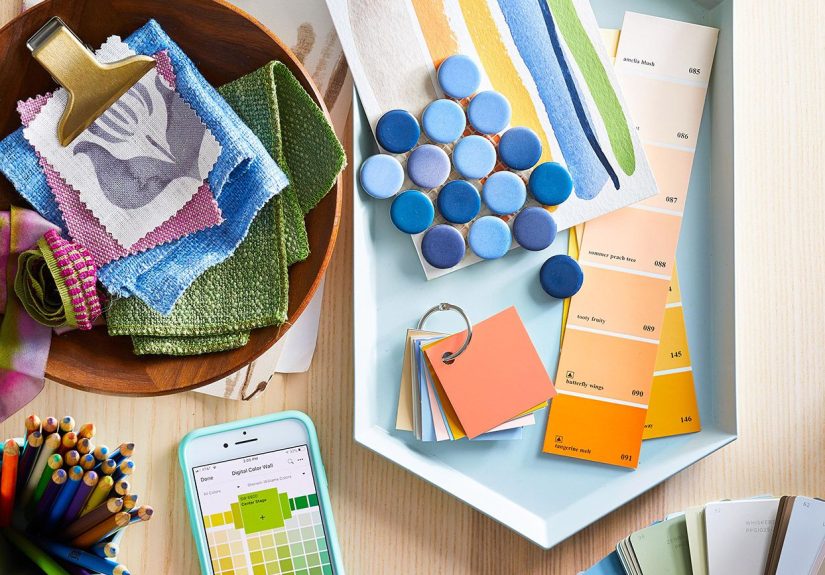
A paint swatch is not just a pretty rectangle. It is your first clue about a color’s undertone, depth, brightness, and flexibility. The problem is that a swatch is tiny, and walls are not. A color that looks calm and subtle on a chip can feel much stronger when it covers 200 square feet. A shade that seems warm in the store might look cool in your living room. And the one that looked perfect under retail lighting may betray you at sunset.
That is why smart paint selection starts with swatches but never ends there. Use swatches as a screening tool, not as the final verdict. Their job is to help you narrow the field before you test larger samples in your actual space.
Step 1: Start Wider Than Feels Comfortable
Most people make the same first mistake: they grab one or two swatches, fall in love too fast, and call it research. Instead, start broad. Pull several swatches in the general family you like, even if they look almost identical at first glance. Those subtle differences are exactly what matter later.
For example, if you want a warm white, do not pick just one warm white. Compare creamy whites, soft off-whites, whites with beige undertones, and whites with a faint peach or yellow cast. If you want a green-gray, gather versions that lean sage, olive, blue-gray, and neutral gray-green. Tiny shifts in undertone can completely change how a room feels.
This is the stage where you should let yourself be a little extra. Grab more swatches than you think you need. Paint stores expect this behavior. You are not being dramatic. You are being strategic.
Step 2: Learn to Spot Undertones Before They Sneak Up on You
Undertones are the hidden color influences beneath the main shade. They are the reason one beige looks rosy, another looks buttery, and another looks almost gray. They are also the reason paint choices go sideways so often.
Here is a practical way to read undertones with color swatches:
Compare similar swatches side by side
A single swatch can be hard to judge in isolation. Put three to five similar options next to each other and the differences become obvious. One gray may suddenly look purple. Another may reveal a green cast. A white may go from “clean” to “surprisingly vanilla.”
Use a sheet of plain white paper
Hold the swatch against bright white paper or a true white trim sample. This strips away some visual confusion and helps the undertone stand out. It is one of the easiest tricks for spotting whether a neutral leans pink, yellow, blue, green, or violet.
Match undertones with fixed elements
Before you choose a paint color, look at what is not changing in the room: flooring, countertops, backsplash tile, cabinets, stone, brick, and large furniture. Those elements already carry undertones. Your paint swatch should cooperate with them, not pick a fight.
If your hardwood floors are golden, an icy gray may feel disconnected. If your kitchen countertop has cool veining, a creamy yellow-white may clash. Paint looks best when its undertone relates naturally to the surfaces around it.
Step 3: Take Swatches Out of the Store and Into the Room
Store lighting is useful for buying snacks and regrettable impulse purchases, but it is not the ideal judge of wall color. Paint swatches need to be reviewed in the room where they will live.
Tape your swatches to different walls and move them around. Check them near windows, in corners, beside trim, and against the biggest furniture pieces. A color can look fresh and balanced on one wall and weirdly gloomy on another.
Pay close attention to the room’s natural light:
North-facing rooms
These usually have cooler, grayer light. Warm whites, warm neutrals, and colors with soft golden or beige undertones often feel friendlier here.
South-facing rooms
These get stronger, warmer daylight for much of the day. Many colors look bright and lively, so even muted shades can appear more energetic than expected.
East-facing rooms
Morning light can feel warm and cheerful, while later in the day the room may become cooler. A swatch that looks sunny at breakfast may feel more subdued by dinner.
West-facing rooms
These rooms can shift dramatically, often looking softer in the morning and much warmer by late afternoon. That warm evening glow can make some colors richer and others downright bossy.
The lesson is simple: do not judge a swatch once and call it done. Look at it several times throughout the day. Paint colors are shape-shifters.
Step 4: Check the Color Under Your Actual Light Bulbs
Natural light gets most of the attention, but artificial lighting matters just as much. The same swatch can read softer, yellower, grayer, or crisper depending on the bulbs in your lamps and fixtures.
If your home uses warm bulbs, whites and neutrals may feel creamier. With cooler daylight-style bulbs, some grays and whites can look sharper or more blue. That means the right swatch is not just the one you like in daylight. It is the one you still like after sunset, when the lamps come on and the room becomes your actual lived-in space.
Test swatches during the day, in the evening, and on a cloudy day if possible. A good paint color survives all three.
Step 5: Narrow Your Swatches to Three Finalists
Once you have lived with your swatches for a bit, narrow them down to your top three. Do not rush this step. If two colors still seem neck and neck, that means you need a larger test, not a coin flip.
At this point, ask yourself a few helpful questions:
- Which color works best with the fixed finishes in the room?
- Which one looks best in both natural and artificial light?
- Which one fits the mood you want: cozy, airy, dramatic, calm, cheerful, or sophisticated?
- Which one still looks good when viewed next to trim, ceiling, and nearby rooms?
If a swatch only looks good under perfect conditions, it is not the one. The winner should look dependable, not needy.
Step 6: Paint Large Samples, Not Tiny Dabs
Once you have your finalists, buy sample pots or removable sample sheets and go bigger. Much bigger. Tiny painted patches are not enough because they do not show how the color behaves at scale.
Paint large sample areas on the wall or on poster boards that you can move around the room. Use at least two coats so the color reads accurately. Place the samples near trim, doors, floors, cabinets, and furnishings. This is where the truth comes out.
Large samples help answer questions that swatches alone cannot:
- Does the color still feel balanced at wall size?
- Does it turn more colorful than expected?
- Does it become dull in low light?
- Does it make white trim look dirty or too stark?
- Does it connect nicely with adjacent rooms?
Many homeowners are shocked at how often their favorite small swatch loses the competition once it becomes a large sample. This is normal. Annoying, yes. But normal.
Step 7: Think About Finish Before You Commit
Paint color is only half the story. Finish matters too. The same color can look slightly different in matte, eggshell, satin, or semi-gloss because sheen affects how light reflects off the surface.
In general, flatter finishes soften the look of a color and hide wall imperfections better. Higher sheens reflect more light, which can make color appear slightly brighter or more active. That is why trim often looks crisper in a glossier finish, even when it is technically the same color as the wall.
So when you test your finalists, think about the final finish you plan to use. Do not choose a color in theory and ignore how sheen will change the result in practice.
Step 8: Use the Whole-House View
Even if you are painting only one room, the new color should make sense with nearby spaces. Open-concept homes especially demand a little diplomacy between rooms. A paint color can be lovely on its own and still feel random in context.
Hold your swatches where sightlines connect. Stand in the hallway and look into the room. Stand in the room and look out. If your dining room opens into the living area, your paint choices should feel related, even if they are not identical.
A simple approach is to repeat undertones throughout the house. You can vary color depth and intensity while keeping the overall palette connected. That creates flow without making every room look like it was dipped in the same bucket.
Common Mistakes When Using Color Swatches
Choosing under store lighting only
Your home lighting wins. Always.
Testing only one swatch
You need comparison to spot undertones and subtle shifts.
Ignoring fixed finishes
Floors, stone, tile, and cabinets are part of the color story whether you invite them or not.
Using samples that are too small
A postage-stamp test patch is not a decision-making tool. It is decoration for confusion.
Forgetting adjacent rooms
A paint color should work with the house, not just the wall you are staring at.
Rushing the decision
The right color usually reveals itself after a little time and repeated viewing. The wrong one often looks great for five minutes and suspicious forever after that.
A Simple Formula for Picking Paint With Swatches
If you want the entire process in one neat sequence, here it is:
- Choose a general color family.
- Gather several swatches, not just one favorite.
- Compare undertones side by side.
- Hold swatches against white paper and fixed room finishes.
- Tape them up in the actual room.
- Review them in morning, afternoon, evening, and artificial light.
- Narrow to three finalists.
- Test large painted samples or removable sample boards.
- Consider the final sheen.
- Pick the color that performs best all day, not the one that had one magical moment at 2:14 p.m.
Final Thoughts
Using color swatches to pick paint colors is less about guessing what looks pretty and more about learning how color behaves in real life. The best paint choice is rarely the first swatch that catches your eye. It is the one that works with your light, your finishes, your furnishings, your layout, and your daily routines.
So yes, trust your taste. But also trust the process. Compare more swatches, test larger samples, and give the color time to prove itself. That extra effort is the difference between a room that feels intentionally designed and one that leaves you staring at the wall wondering why your “soft neutral” suddenly looks like refrigerated mushroom soup.
Experiences: What Using Color Swatches Really Feels Like in Real Homes
One of the most useful lessons people learn from color swatches is that paint is never just paint. It is mood, light, architecture, furniture, and timing all rolled into one small rectangle. A lot of homeowners begin the process feeling confident because the swatches seem straightforward in the store. Then they get home and discover the room has opinions.
Take a small north-facing home office, for example. A pale gray swatch may look sleek and modern under bright store lighting, but once taped to the office wall it can turn cold and flat by noon. Put a slightly warmer gray beside it and suddenly the difference becomes obvious. The first color feels stiff; the second feels calm and usable. That kind of side-by-side comparison is where swatches become incredibly valuable. You are not just choosing a color. You are choosing how you want the room to feel while you actually live in it.
In family rooms, the experience is often even more dramatic. A beige that seems boring on a paint chip can become rich and welcoming when it is surrounded by wood flooring, woven baskets, and afternoon sun. Meanwhile, a trendy greige that looked sophisticated online may take on a purple cast once it is placed near a brown sofa. This is why people who use swatches well tend to move them all over the room. They check them beside curtains, next to trim, behind lamps, and near the biggest furniture pieces. They let the room help make the decision.
Kitchens bring their own comedy. Under cabinet lighting, stainless steel appliances, and glossy backsplashes can all influence how a swatch is perceived. A white that looked crisp in the aisle can suddenly feel blue next to creamy cabinets. A green-gray can become more green than gray after sunset. People who skip swatch testing in kitchens often end up repainting sooner than they planned because the finished color does not relate well to the hard surfaces around it.
Bedrooms are another interesting case because the desired mood matters so much. Many people start with a color they think they should like, such as a fashionable neutral or a designer-approved green. But when they live with the swatches for a few days, they realize a softer, dustier, quieter version feels better in the morning and more relaxing at night. That is the hidden magic of swatches: they give you time to react emotionally, not just visually.
Even experienced decorators use swatches because they know the final choice is rarely about one dramatic “aha” moment. It is usually about consistency. The winning color is the one that keeps looking good over time, in changing light, and in everyday life. It survives coffee at sunrise, laundry at 3 p.m., and lamp glow at 9 p.m. without becoming weird. That may not sound glamorous, but it is exactly what makes a paint color successful.
In the end, people who have the best experience with color swatches tend to treat them as tools, not trophies. They compare, edit, retest, and observe. They do a little extra work upfront and avoid months of side-eyeing a wall that somehow turned minty, muddy, or mysteriously lavender. And honestly, that is one of the most satisfying home wins there is.